Scroll
The <Scroll> component scrolls the content when the layout size of a component exceeds the size of its parent component.
NOTE
- This component is supported since API version 7. Updates will be marked with a superscript to indicate their earliest API version.
- When nesting a <List> within this component, specify the width and height for the <List> under scenarios where consistently high performance is required. If the width and height are not specified, this component will load all content of the <List>.
- This component can scroll only when the size on the main axis is less than the content size.
- This component can produce a bounce effect only when there is more than one screen of content.
Child Components
This component supports only one child component.
APIs
Scroll(scroller?: Scroller)
Attributes
In addition to the universal attributes, the following attributes are supported.
| Name | Type | Description |
|---|---|---|
| scrollable | ScrollDirection | Scroll direction. Default value: ScrollDirection.Vertical |
| scrollBar | BarState | Scrollbar status. Default value: BarState.Auto |
| scrollBarColor | string | number | Color | Color of the scrollbar. |
| scrollBarWidth | string | number | Width of the scrollbar. |
| edgeEffect | EdgeEffect | Scroll effect. For details, see EdgeEffect. Default value: EdgeEffect.None |
ScrollDirection
| Name | Description |
|---|---|
| Horizontal | Only horizontal scrolling is supported. |
| Vertical | Only vertical scrolling is supported. |
| None | Scrolling is disabled. |
| Free(deprecated) | Vertical or horizontal scrolling is supported. This API is deprecated since API version 9. |
Events
| Name | Description |
|---|---|
| onScrollBegin9+(event: (dx: number, dy: number) => { dxRemain: number, dyRemain: number }) | Invoked when scrolling starts. Parameters: - dx: amount to scroll by in the horizontal direction. - dy: amount to scroll by in the vertical direction. Return value: - dxRemain: remaining amount to scroll by in the horizontal direction. - dyRemain: remaining amount to scroll by in the vertical direction. |
| onScroll(event: (xOffset: number, yOffset: number) => void) | Invoked to return the horizontal and vertical offsets during scrolling when the specified scroll event occurs. |
| onScrollEdge(event: (side: Edge) => void) | Invoked when scrolling reaches the edge. |
| onScrollEnd(event: () => void) | Invoked when scrolling stops. |
NOTE
If the onScrollBegin event and scrollBy API are used to implement nested scrolling, you must set edgeEffect of the scrolling child node to None. For example, if a <List> is nested in the <Scroll> component, the edgeEffect attribute of the <List> must be set to EdgeEffect.None.
Scroller
Implements a controller for a scrollable container component. You can bind this component to a container component and use it to control the scrolling of that component. Currently, this controller can be bound to the <List>, <Scroll> and <ScrollBar> components. One controller can control only one container component.
Objects to Import
scroller: Scroller = new Scroller()
scrollTo
scrollTo(value: { xOffset: number | string, yOffset: number | string, animation?: { duration: number, curve: Curve } }): void
Scrolls to the specified position.
Parameters
| Name | Type | Mandatory | Description |
|---|---|---|---|
| xOffset | Length | Yes | Horizontal scrolling offset. |
| yOffset | Length | Yes | Vertical scrolling offset. |
| animation | { duration: number, curve: Curve } |
No | Animation configuration, which includes the following: - duration: scrolling duration. - curve: scrolling curve. |
scrollEdge
scrollEdge(value: Edge): void
Scrolls to the edge of the container.
Parameters
| Name | Type | Mandatory | Description |
|---|---|---|---|
| value | Edge | Yes | Edge position to scroll to. |
scrollPage
scrollPage(value: { next: boolean, direction?: Axis }): void
Scrolls to the next or previous page.
Parameters
| Name | Type | Mandatory | Description |
|---|---|---|---|
| next | boolean | Yes | Whether to turn to the next page. The value true means to scroll to the next page, and false means to scroll to the previous page. |
| direction(deprecated) | Axis | No | Scrolling direction: horizontal or vertical. This API is deprecated since API version 9. |
currentOffset
currentOffset()
Obtains the scrolling offset.
Return value
| Type | Description |
|---|---|
| { xOffset: number, yOffset: number } |
xOffset: horizontal scrolling offset. yOffset: vertical scrolling offset. |
scrollToIndex
scrollToIndex(value: number): void
Scrolls to the item with the specified index.
NOTE
Only the <List> component is supported.
Parameters
| Name | Type | Mandatory | Description |
|---|---|---|---|
| value | number | Yes | Index of the item to be scrolled to in the list. |
scrollBy9+
scrollBy(dx: Length, dy: Length): void
Scrolls by the specified amount.
NOTE
Only the <Scroll> component is supported.
Parameters
| Name | Type | Mandatory | Description |
|---|---|---|---|
| dx | Length | Yes | Amount to scroll by in the horizontal direction. The percentage format is not supported. |
| dy | Length | Yes | Amount to scroll by in the vertical direction. The percentage format is not supported. |
Example
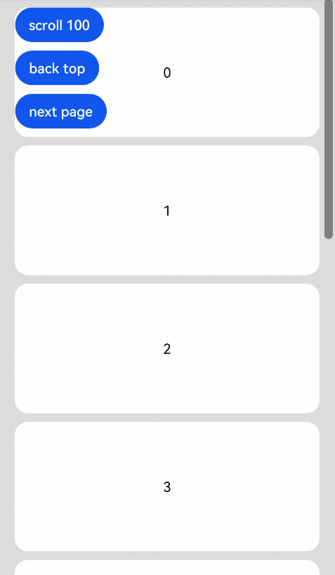
Example 1
// xxx.ets
@Entry
@Component
struct ScrollExample {
  scroller: Scroller = new Scroller();
  private arr: number[] = [0, 1, 2, 3, 4, 5, 6, 7, 8, 9];

  build() {
    Stack({ alignContent: Alignment.TopStart }) {
      Scroll(this.scroller) {
        Column() {
          ForEach(this.arr, (item) => {
            Text(item.toString())
              .width('90%')
              .height(150)
              .backgroundColor(0xFFFFFF)
              .borderRadius(15)
              .fontSize(16)
              .textAlign(TextAlign.Center)
              .margin({ top: 10 })
          }, item => item)
        }.width('100%')
      }
      .scrollable(ScrollDirection.Vertical)  // The scrollbar scrolls in the vertical direction.
      .scrollBar(BarState.On)  // The scrollbar is always displayed.
      .scrollBarColor(Color.Gray)  // Color of the scrollbar.
      .scrollBarWidth(30) // Width of the scrollbar.
      .edgeEffect(EdgeEffect.None)
      .onScroll((xOffset: number, yOffset: number) => {
        console.info(xOffset + ' ' + yOffset);
      })
      .onScrollEdge((side: Edge) => {
        console.info('To the edge');
      })
      .onScrollEnd(() => {
        console.info('Scroll Stop');
      })

      Button('scroll 150')
        .onClick(() => { // Click to scroll down to 150.0 vp.
          this.scroller.scrollBy(0,150);
        })
        .margin({ top: 10, left: 20 })
      Button('scroll 100')
        .onClick(() => { // Click to scroll down by 100.0 vp.
          this.scroller.scrollTo({ xOffset: 0, yOffset: this.scroller.currentOffset().yOffset + 100 });
        })
        .margin({ top: 60, left: 20 })
      Button('back top')
        .onClick(() => { // Click to go back to the top.
          this.scroller.scrollEdge(Edge.Top);
        })
        .margin({ top: 110, left: 20 })
      Button('next page')
        .onClick(() => { // Click to go to the next page.
          this.scroller.scrollPage({ next: true });
        })
        .margin({ top: 170, left: 20 })
    }.width('100%').height('100%').backgroundColor(0xDCDCDC)
  }
}
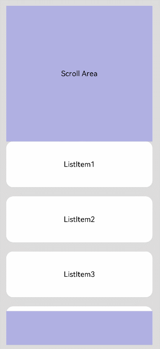
Example 2
@Entry
@Component
struct NestedScroll {
  @State listPosition: number = 0; // 0 indicates scrolling to the top of the list, 1 indicates scrolling to the middle of the list, and 2 indicates scrolling to the bottom of the list.
  private arr: number[] = [1, 2, 3, 4, 5, 6, 7, 8, 9, 10];
  private scroller: Scroller = new Scroller();

  build() {
    Flex() {
      Scroll(this.scroller) {
        Column() {
          Text("Scroll Area")
            .width("100%").height("40%").backgroundColor(0X330000FF)
            .fontSize(16).textAlign(TextAlign.Center)

          List({ space: 20 }) {
            ForEach(this.arr, (item) => {
              ListItem() {
                Text("ListItem" + item)
                  .width("100%").height("100%").borderRadius(15)
                  .fontSize(16).textAlign(TextAlign.Center).backgroundColor(Color.White)
              }.width("100%").height(100)
            }, item => item)
          }
          .width("100%").height("50%").edgeEffect(EdgeEffect.None)
          .onReachStart(() => {
            this.listPosition = 0;
          })
          .onReachEnd(() => {
            this.listPosition = 2;
          })
          .onScrollBegin((dx: number, dy: number) => {
            if ((this.listPosition == 0 && dy >= 0) || (this.listPosition == 2 && dy <= 0)) {
              this.scroller.scrollBy(0, -dy);
              return { dxRemain: dx, dyRemain: 0 };
            }
            this.listPosition = 1;
            return { dxRemain: dx, dyRemain: dy };
          })

          Text("Scroll Area")
            .width("100%").height("40%").backgroundColor(0X330000FF)
            .fontSize(16).textAlign(TextAlign.Center)
        }
      }
      .width("100%").height("100%")
    }.width('100%').height('100%').backgroundColor(0xDCDCDC).padding(20)
  }
}