chart
The <chart> component displays line charts, gauge charts, and bar charts.
Permission List
None
Child Component
Not supported
Attribute
Chart type. Dynamic modification is not supported. Available values include: |
||||
Chart parameters. You must set parameters for bar charts and line charts. Parameter settings for gauge charts do not take effect. You can set the minimum value, maximum value, scale, and line width of the x-axis or y-axis, whether to display the x-axis and y-axis, and whether the line is smooth. Dynamic modification is not supported. |
||||
Array<ChartDataset> |
Data set. You must set data sets for bar charts and line charts. Data set for a gauge chart does not take effect. You can set multiple datasets and their background colors. |
|||
DataSegment | Array<DataSegment> |
Data structures used by progress, loading, and rainbow charts. DataSegment is available for progress and loading charts. Array<DataSegment> is available for rainbow charts. A maximum of nine DataSegment are supported in the array. |
|||
Whether to enable the effects for progress and rainbow charts. |
||||
Style class of a component, which is used to refer to a style table. |
||||
Used to register reference information of child elements or child components. The reference information is registered with the parent component on $refs. |
||||
Whether a component is disabled. If it is disabled, it cannot respond to user interaction. |
||||
Attribute set for a component to facilitate data storage and reading. |
Table 1 ChartOptions
Table 2 ChartDataset
Fill color. For line charts, the value indicates the gradient color to fill. |
||||
Array<number> | Array<Point>5+ |
||||
Table 3 ChartAxis
Table 4 ChartSeries
Line style, such as the line width and whether the line is smooth. |
||||
Table 5 ChartLineStyle
Table 6 PointStyle
Shape of the highlight point. Available values are as follows:
|
||||
Table 7 ChartLoop
Table 8 Point5+
Table 9 DataSegment5+
For gauge charts, the following attribute is supported.
Percentage of the current value to the total value. The value ranges from 0 to 100. |
Method
Event
Style
Start angle of the scale bar for gaugeand rainbow charts, which starts from the direction of zero o'clock. The value ranges from 0 to 360. |
||||
Total length of the scale bar for gauge and rainbow charts. The value ranges from –360 to 360. A negative number indicates the anticlockwise direction. |
||||
Center of the scale bar of the gauge component. This style is supported by the gauge chart only. This style takes precedence over the position style in the common styles, and must be used together with center-y and radius. |
||||
Center of the scale bar of the gauge component. This style is supported by the gauge chart only. This style takes precedence over the position style in the common styles, and must be used together with center-x and radius. |
||||
Radius of the scale bar of the gauge component. This style is supported by the gauge chart only. This style takes precedence over the width and height in the common styles, and must be used together with center-x and center-y. |
||||
Color of each section for the scale bar of the gauge component. For example, colors: #ff0000, #00ff00. This style is supported by the gauge chart only. |
||||
Weight of each section for the scale bar of the gauge component. For example, weights: 2, 2. This style is supported by the gauge chart only. |
||||
Font style of the description text. You can use Custom Font Styles. |
||||
|
If this attribute is not set, the width required for the element content is used. |
||||
|
If this length attribute is not set, the length required for the element content is used. |
||||
Shorthand attribute to set all padding attributes. The attribute can have one to four values:
|
||||
Shorthand attribute to set margins for all sides in a declaration. The attribute can have one to four values:
|
||||
Shorthand attribute to set all borders. You can set border-width, border-style, and border-color in sequence. Default values are used for attributes that are not set. |
||||
Shorthand attribute to set the style for all borders. Available values are as follows: |
||||
Styles of the left, top, right, and bottom borders. The available values are dotted, dashed, and solid. |
||||
Shorthand attribute to set the borders for every side respectively. You can set border-width, border-style, and border-color in sequence. Default values are used for attributes that are not set. |
||||
Shorthand attribute to set the width of all borders, or separately set the width of each border. |
||||
Attribute to set widths of left, top, right, and bottom borders. |
||||
Shorthand attribute to set the color of all borders, or separately set the color of each border. |
||||
Attribute to set colors of left, top, right, and bottom borders. |
||||
Attribute to set the radius of round borders of an element. This attribute cannot be used to set the width, color, or style of a specific border. To set the width or color, you need to set border-width, border-color, or border-style for all the borders at the same time. |
||||
Attribute to receptively set the radii of upper-left, upper-right, lower-right, and lower-left rounded corners |
||||
This attribute supports Gradient Styles only but is not compatible with background-color or background-image. |
||||
Background image. Currently, this attribute is not compatible with background-color or background. Local image resources are supported. |
||||
|
|
|||
How a background image is repeatedly drawn. By default, a background image is repeated both horizontally and vertically. |
||||
|
|
|||
Transparency of an element. The value ranges from 0 to 1. The value 1 means opaque, and 0 means completely transparent. |
||||
How and whether to display the box containing an element. Available values are as follows: |
||||
Whether to display an element. Invisible borders occupy layout space. (To remove the borders, set the display attribute to none.) Available values are as follows: |
||||
How to divide available space of the parent component for a child component. You can set one, two5+, or three5+ values for this style. Set one value in either of the following ways: Set two values5+ in the following ways: The first value must be a unitless number used to set flex-grow. The second value must be either of the following: Set three values5+ in the following ways: The first value must be a unitless number used to set flex-grow. The second value must be a unitless number used to set flex-shrink. The third value must be a valid width value used to set flex-basis. |
||||
How much a child component will grow. The value specifies allocation of the remaining space on the main axis of the parent component. Size of available space = Container size - Total size of all child components. Value 0 indicates that the child component does not grow. |
||||
How much a child component will shrink. The shrink occurs only when the sum of default child component widths is greater than that of the parent component. Value 0 indicates that the child component does not shrink. |
||||
Positioning type of an element. Dynamic changes are not supported. |
||||
left|top|right|bottom must be used together with position to determine the offset position of an element.
|
Example Code
-
Line chart
<!-- xxx.hml -->
<div class="container">
  <stack class="chart-region">
    <image class="chart-background" src="common/background.png"></image>
    <chart class="chart-data" type="line" ref="linechart" options="{{lineOps}}" datasets="{{lineData}}"></chart>
  </stack>
  <button value="Add data" onclick="addData"></button>
</div>
/* xxx.css */ .container { flex-direction: column; justify-content: center; align-items: center; } .chart-region { height: 400px; width: 700px; } .chart-background { object-fit: fill; } .chart-data { width: 700px; height: 600px; }// xxx.js export default { data: { lineData: [ { strokeColor: '#0081ff', fillColor: '#cce5ff', data: [763, 550, 551, 554, 731, 654, 525, 696, 595, 628, 791, 505, 613, 575, 475, 553, 491, 680, 657, 716], gradient: true, } ], lineOps: { xAxis: { min: 0, max: 20, display: false, }, yAxis: { min: 0, max: 1000, display: false, }, series: { lineStyle: { width: "5px", smooth: true, }, headPoint: { shape: "circle", size: 20, strokeWidth: 5, fillColor: '#ffffff', strokeColor: '#007aff', display: true, }, loop: { margin: 2, gradient: true, } } }, }, addData() { this.$refs.linechart.append({ serial: 0, data: [Math.floor(Math.random() * 400) + 400] }) } }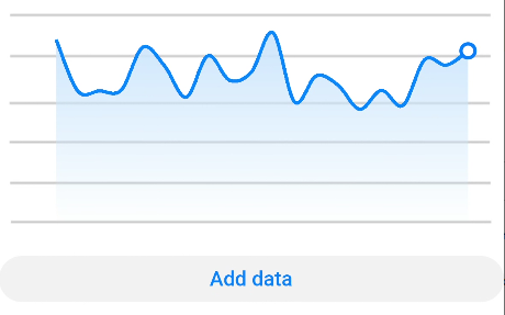
-
Bar chart
<!-- xxx.hml -->
<div class="container">
  <stack class="data-region">
    <image class="data-background" src="common/background.png"></image>
    <chart class="data-bar" type="bar" id="bar-chart" options="{{barOps}}" datasets="{{barData}}"></chart>
  </stack>
</div>
/* xxx.css */ .container { flex-direction: column; justify-content: center; align-items: center; } .data-region { height: 400px; width: 700px; } .data-background { object-fit: fill; } .data-bar { width: 700px; height: 400px; }// xxx.js export default { data: { barData: [ { fillColor: '#f07826', data: [763, 550, 551, 554, 731, 654, 525, 696, 595, 628], }, { fillColor: '#cce5ff', data: [535, 776, 615, 444, 694, 785, 677, 609, 562, 410], }, { fillColor: '#ff88bb', data: [673, 500, 574, 483, 702, 583, 437, 506, 693, 657], }, ], barOps: { xAxis: { min: 0, max: 20, display: false, axisTick: 10, }, yAxis: { min: 0, max: 1000, display: false, }, }, } }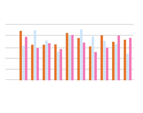
-
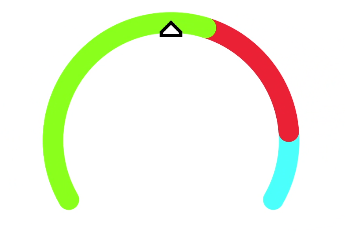
Gauge chart
<!-- xxx.hml -->
<div class="container">
  <div class="gauge-region">
    <chart class="data-gauge" type="gauge" percent = "50"></chart>
  </div>
</div>
/* xxx.css */ .container { flex-direction: column; justify-content: center; align-items: center; } .gauge-region { height: 400px; width: 400px; } .data-gauge { colors: #83f115, #fd3636, #3bf8ff; weights: 4, 2, 1; }