CSS
- Size Unit
- Style Import
- Style Declaration
- Selector
- Selector Specificity
- Pseudo-classes
- Precompiled Styles
Cascading Style Sheets (CSS) is a language used to describe the HML page structure. All HML components have default styles. You can customize styles for these components using CSS to design various pages.
Size Unit
-
Logical px set by <length>:
- The default logical screen width is 720 px (for details, see the "window" section in config.json). Your page will be scaled to fit the actual width of the screen. For example, on a screen with the actual width of 1440 physical px, 100 px is displayed on 200 physical px, with all sizes doubled from 720 px to 1440 px.
- If you set autoDesignWidth to true (for details, see the "window" section in config.json), the logical px are scaled based on the screen density. For example, if the screen density is 3x, 100 px will be rendered on 300 physical px. This approach is recommended when your application needs to adapt to multiple devices.
-
Percentage set by <percentage>: The component size is represented by its percentage of the parent component size. For example, if the width <percentage> of a component is set to 50%, the width of the component is half of its parent component's width.
Style Import
CSS files can be imported using the @import statement. This facilitates module management and code reuse.
Style Declaration
The .css file with the same name as the .hml file in each page directory describes the styles of components on the HML page, determining how the components will be displayed.
-
Internal style: The style and class attributes can be used to specify the component style. Example:
<!-- index.hml -->
<div class="container">
  <text style="color: red">Hello World</text>
</div>
/* index.css */ .container { justify-content: center; } -
External style files: You need to import the files. For example, create a style.css file in the common directory and import the file at the beginning of index.css.
/* style.css */
.title {
  font-size: 50px;
}
/* index.css */ @import '../../common/style.css'; .container { justify-content: center; }
Selector
A CSS selector is used to select elements for which styles need to be added to. The following table lists the supported selectors.
The following is an example:
<!-- Page layoutxxx.hml -->
<div id="containerId" class="container">
  <text id="titleId" class="title">Title</text>
  <div class="content">
    <text id="contentId">Content</text>
  </div>
</div>
/* Page style xxx.css */
/* Set the style for all <div> components. */
div {
  flex-direction: column;
}
/* Set the style for the component whose class is title. */
.title {
  font-size: 30px;
}
/* Set the style for the component whose id is contentId. */
#contentId {
  font-size: 20px;
}
/* Set padding for all components of the title or content class to 5 px. */
.title, .content {
  padding: 5px;
}
/* Set the style for all texts of components whose class is container.
 */
.container text {
  color: #007dff;
};
/* Set the style for direct descendant texts of components whose class is container.
*/
.container > text {
  color: #fa2a2d;
}
The above style works as follows:
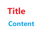
In the preceding example, .container text sets title and content to blue, and .container > text sets title to red. The two styles have the same priority, but .container > text declares the style later and overwrites the former style. (For details about the priority, see Selector Specificity.)
Selector Specificity
The specificity rule of the selectors complies with the W3C rule, which is only available for inline styles, id, class, tag, grandchild components, and child components. (Inline styles are those declared in the style attribute.)
When multiple selectors point to the same element, their priorities are as follows (in descending order): inline style > id > class > tag.
Pseudo-classes
A CSS pseudo-class is a keyword added to a selector that specifies a special state of the selected element(s). For example, :disabled can be used to select the element whose disabled attribute is true.
In addition to a single pseudo-class, a combination of pseudo-classes is supported. For example, :disabled:checked selects the element whose disabled and checked attributes are both set to true. The following table lists the supported single pseudo-class in descending order of priority.
The following is an example for you to use the :active pseudo-class to control the style when a user presses the button.
<!-- index.hml -->
<div class="container">
  <input type="button" class="button" value="Button"></input>
</div>
/* index.css */
.button:active {
  background-color: #888888;/* After the button is activated, the background color is changed to #888888. */
}
NOTE: Pseudo-classes are not supported for the <popup> component and its child components, including, <dialog>, <menu>, <option>, and <picker>.
Precompiled Styles
Precompilation is a program that uses specific syntax to generate CSS files. It provides variables and calculation, helping you define component styles more conveniently. Currently, Less, Sass, and Scss are supported. To use precompiled styles, change the suffix of the original .css file. For example, change index.css to index.less, index.sass, or index.scss.
-
The following index.less file is changed from index.css.
/* index.less */ /* Define a variable. */ @colorBackground: #000000; .container { background-color: @colorBackground; /* Use the variable defined in the .less file. */ } -
Reference a precompiled style file. For example, if the style.scss file is located in the common directory, change the original index.css file to index.scss and import style.scss.
/* style.scss */
/* Define a variable. */
$colorBackground: #000000;
Reference the precompiled style file in index.scss:
/* index.scss */
/* Import style.scss. */
@import '../../common/style.scss';
.container {
  background-color: $colorBackground; /* Use the variable defined in style.scss. */
}
NOTE:
Place precompiled style files in the common directory.