toolbar-item
The <toolbar-item> component displays an operation option on the toolbar. This component is the child component of <toolbar>.
NOTE: This component is supported since API version 5.
Permission List
None
Child Component
None
Attribute
Style
Whether the text size changes with the system's font size settings. |
||||
Text font style. Available values are as follows: |
||||
Text font weight. The number value must be an exact multiple of 100 ranging from 100 to 900. The default value is 400. A larger value indicates a bigger weight. Available values of the string type are lighter, normal, bold, or bolder. |
||||
Text modifier. Available values are as follows: |
||||
Font family, in which fonts are separated by commas (,). Each font is set using a font name or font family name. The first font in the family or the font specified by Custom Font Styles is used for the text. |
||||
This attribute supports Gradient Styles only but is not compatible with background-color or background-image. |
||||
Background image. Currently, this attribute is not compatible with background-color or background. Local image resources are supported. |
||||
|
|
|||
Repeating attribute of a background image. By default, a background image is repeated both horizontally and vertically. |
||||
|
|
|||
Transparency of an element. The value ranges from 0 to 1. The value 1 means opaque, and 0 means completely transparent. |
||||
Type of the box containing an element. Available values are as follows: |
||||
Whether to display the box containing an element. The invisible box occupies layout space. (To remove the box, set the display attribute to none.) Available values are as follows: |
Event
Method
None
Example Code
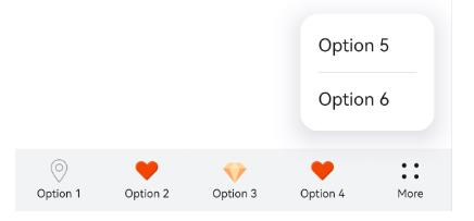
<toolbar style="position: fixed; bottom: 0px; ">
   <toolbar-item icon='common/Icon/location.png' value='Option 1' >   </toolbar-item>
   <toolbar-item icon='common/Icon/heart.png' value='Option 2'>   </toolbar-item>
   <toolbar-item icon='common/Icon/diamond.png' value='Option 3'  >   </toolbar-item>
   <toolbar-item icon='common/Icon/heart.png' value='Option 4' >   </toolbar-item>
   <toolbar-item icon='common/Icon/heart.png' value='Option 5' >   </toolbar-item>
   <toolbar-item icon='common/Icon/heart.png' value='Option 6'>   </toolbar-item>
</toolbar>