list-item-group
<list-item-group> is a child component of <list> and is used to group items in a list. By default, the width of <list-item-group> is equal to that of <list>.
NOTE:
- To use this component, you must set the columns attribute of the parent component <list> to 1. Otherwise, <list-item-group> is not displayed.
- You can customize the width of each <list-item-group>. However, if you retain the default value stretch of align-items for the parent component <list>, the width of <list-item-group> is equal to that of <list>. You can set align-items to other values rather than stretch to make the customized <list-item-group> width take effect.
Permission List
None
Child Component
Only <list-item> are supported.
Attribute
id in the common attributes is used to identify a group. The input parameters of related functions and event information in the list also use id to uniquely identify a group.
Event
Style
Main axis direction of the flex container. Available values are as follows: |
||||
How items are aligned along the main axis of the current line in a flex container. Available values are as follows:
|
||||
How and whether to display the box containing an element. Available values are as follows: |
||||
|
If this attribute is not set, the width required for the element content is used. |
||||
|
If this length attribute is not set, the length required for the element content is used. |
||||
Shorthand attribute to set all padding attributes. The attribute can have one to four values:
|
||||
Shorthand attribute to set margins for all sides in a declaration. The attribute can have one to four values:
|
||||
Shorthand attribute to set all borders. You can set border-width, border-style, and border-color in sequence. Default values are used for attributes that are not set. |
||||
Shorthand attribute to set the style for all borders. Available values are as follows: |
||||
Styles of the left, top, right, and bottom borders. The available values are dotted, dashed, and solid. |
||||
Shorthand attribute to set the borders for every side respectively. You can set border-width, border-style, and border-color in sequence. Default values are used for attributes that are not set. |
||||
Shorthand attribute to set the width of all borders, or separately set the width of each border. |
||||
Attribute to set widths of left, top, right, and bottom borders. |
||||
Shorthand attribute to set the color of all borders, or separately set the color of each border. |
||||
Attribute to set colors of left, top, right, and bottom borders. |
||||
Attribute to set the radius of round borders of an element. This attribute cannot be used to set the width, color, or style of a specific border. To set the width or color, you need to set border-width, border-color, or border-style for all the borders at the same time. |
||||
Attribute to receptively set the radii of upper-left, upper-right, lower-right, and lower-left rounded corners |
||||
This attribute supports Gradient Styles only but is not compatible with background-color or background-image. |
||||
Background image. Currently, this attribute is not compatible with background-color or background. Local image resources are supported. |
||||
|
|
|||
How a background image is repeatedly drawn. By default, a background image is repeated both horizontally and vertically. |
||||
|
|
|||
Transparency of an element. The value ranges from 0 to 1. The value 1 means opaque, and 0 means completely transparent. |
||||
How and whether to display the box containing an element. Available values are as follows: |
||||
Whether to display an element. Invisible borders occupy layout space. (To remove the borders, set the display attribute to none.) Available values are as follows: |
||||
How to divide available space of the parent component for a child component. You can set one, two5+, or three5+ values for this style. Set one value in either of the following ways: Set two values5+ in the following ways: The first value must be a unitless number used to set flex-grow. The second value must be either of the following: Set three values5+ in the following ways: The first value must be a unitless number used to set flex-grow. The second value must be a unitless number used to set flex-shrink. The third value must be a valid width value used to set flex-basis. |
||||
How much a child component will grow. The value specifies allocation of the remaining space on the main axis of the parent component. Size of available space = Container size - Total size of all child components. Value 0 indicates that the child component does not grow. |
||||
How much a child component will shrink. The shrink occurs only when the sum of default child component widths is greater than that of the parent component. Value 0 indicates that the child component does not shrink. |
||||
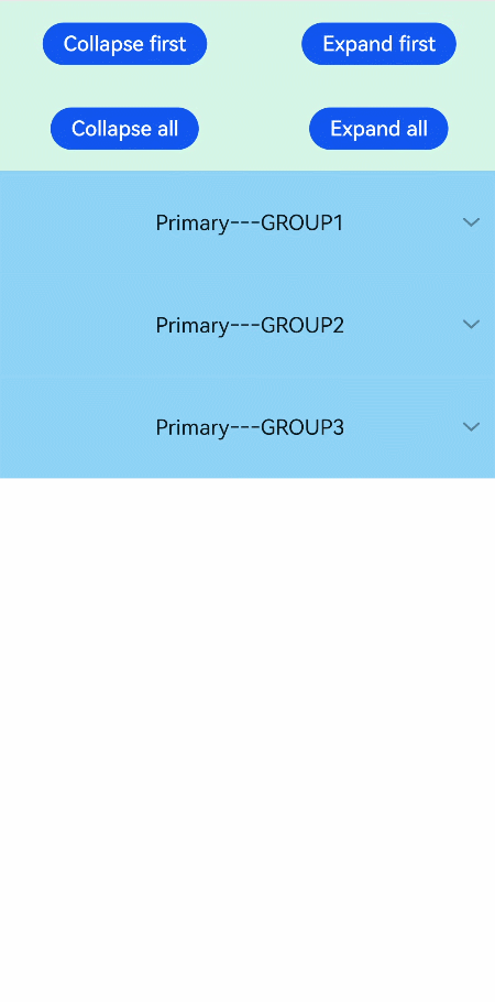
Example Code
<!-- xxx.hml -->
<div class="doc-page">
  <list style="width: 100%;" id="mylist">
    <list-item class="top-list-item" clickeffect="false">
      <div class="item-div">
        <div class="item-child">
          <button type="capsule" value="Collapse first" onclick="collapseOne"></button>
          <button type="capsule" value="Expand first" onclick="expandOne"></button>
        </div>
        <div class="item-child">
          <button type="capsule" value="Collapse all" onclick="collapseAll"></button>
          <button type="capsule" value="Expand all" onclick="expandAll"></button>
        </div>
      </div>
    </list-item>

    <list-item-group for="listgroup in list" id="{{listgroup.value}}" ongroupcollapse="collapse" ongroupexpand="expand">
      <list-item type="item" style="background-color:#FFF0F5;height:95px;">
        <div class="item-group-child">
          <text>One---{{listgroup.value}}</text>
        </div>
      </list-item>
      <list-item type="item" style="background-color: #87CEFA;height:145px;" primary="true">
        <div class="item-group-child">
          <text>Primary---{{listgroup.value}}</text>
        </div>
      </list-item>
    </list-item-group>
  </list>
</div>
/* xxx.css */
.doc-page {
  flex-direction: column;
}

.top-list-item {
  width:100%;
  background-color:#D4F2E7;
}

.item-div {
  flex-direction:column;
  align-items:center;
  justify-content:space-around;
  height:240px;
}

.item-child {
  width:100%;
  height:60px;
  justify-content:space-around;
  align-items:center;
}

.item-group-child {
  justify-content: center;
  align-items: center;
  width:100%;
}
// xxx.js
import prompt from '@system.prompt';

export default {
  data: {
    direction: 'column',
    list: []
  },
  onInit() {
    this.list = []
    this.listAdd = []
    for (var i = 1; i <= 3; i++) {
      var dataItem = {
        value: 'GROUP' + i,
      };
      this.list.push(dataItem);
    }
  },
  collapseOne(e) {
    this.$element('mylist').collapseGroup({
      groupid: 'GROUP1'
    })
  },
  expandOne(e) {
    this.$element('mylist').expandGroup({
      groupid: 'GROUP1'
    })
  },
  collapseAll(e) {
    this.$element('mylist').collapseGroup()
  },
  expandAll(e) {
    this.$element('mylist').expandGroup()
  },
  collapse(e) {
    prompt.showToast({
      message: 'Close ' + e.groupid
    })
  },
  expand(e) {
    prompt.showToast({
      message: 'Open ' + e.groupid
    })
  }
}