image-animator
The <image-animator> component is used to provide an image frame animator.
Child Component
Not supported
Attribute
Image frame information. The frame information includes the image path, size, and location. Currently, the following image formats are supported: PNG and JPG. For details about ImageFrame, see Table 1. |
||||
Number of times that the frame animation is played. number indicates a fixed number of playback operations, and infinite indicates an unlimited number of playback operations. |
||||
Playback sequence. The value false indicates that images are played from the first one to the last one, and true indicates that images are played from the last one to the first one. |
||||
Whether the image size is fixed to the widget size. true: The image size is the same as the widget size. In this case, the width, height, top, and left attributes of the image are invalid. false: The width, height, top, and left attributes of each image must be set separately. |
||||
Single video playback duration. The unit can be s (standing for seconds) or ms. The default unit is ms. If the value is 0, no image is played. The value change takes effect only at the start of the next cycle. |
||||
Status of the frame animation after its playback is complete. Available values are as follows: |
||||
Style class of a component, which is used to refer to a style table. |
||||
Used to register reference information of child elements or child components. The reference information is registered with the parent component on $refs. |
||||
Whether a component is disabled. If it is disabled, it cannot respond to user interaction. |
||||
Attribute set for a component to facilitate data storage and reading. |
Table 1 ImageFrame description
Vertical coordinate of the image relative to the upper left corner of the widget |
||||
Horizontal coordinate of the image relative to the upper left corner of the widget |
Event
Style
|
If this attribute is not set, the width required for the element content is used. |
||||
|
If this length attribute is not set, the length required for the element content is used. |
||||
Shorthand attribute to set all padding attributes. The attribute can have one to four values:
|
||||
Shorthand attribute to set margins for all sides in a declaration. The attribute can have one to four values:
|
||||
Shorthand attribute to set all borders. You can set border-width, border-style, and border-color in sequence. Default values are used for attributes that are not set. |
||||
Shorthand attribute to set the style for all borders. Available values are as follows: |
||||
Styles of the left, top, right, and bottom borders. The available values are dotted, dashed, and solid. |
||||
Shorthand attribute to set the borders for every side respectively. You can set border-width, border-style, and border-color in sequence. Default values are used for attributes that are not set. |
||||
Shorthand attribute to set the width of all borders, or separately set the width of each border. |
||||
Attribute to set widths of left, top, right, and bottom borders. |
||||
Shorthand attribute to set the color of all borders, or separately set the color of each border. |
||||
Attribute to set colors of left, top, right, and bottom borders. |
||||
Attribute to set the radius of round borders of an element. This attribute cannot be used to set the width, color, or style of a specific border. To set the width or color, you need to set border-width, border-color, or border-style for all the borders at the same time. |
||||
Attribute to receptively set the radii of upper-left, upper-right, lower-right, and lower-left rounded corners |
||||
This attribute supports Gradient Styles only but is not compatible with background-color or background-image. |
||||
Background image. Currently, this attribute is not compatible with background-color or background. Local image resources are supported. |
||||
|
|
|||
How a background image is repeatedly drawn. By default, a background image is repeated both horizontally and vertically. |
||||
|
|
|||
Transparency of an element. The value ranges from 0 to 1. The value 1 means opaque, and 0 means completely transparent. |
||||
How and whether to display the box containing an element. Available values are as follows: |
||||
Whether to display an element. Invisible borders occupy layout space. (To remove the borders, set the display attribute to none.) Available values are as follows: |
||||
How to divide available space of the parent component for a child component. You can set one, two5+, or three5+ values for this style. Set one value in either of the following ways: Set two values5+ in the following ways: The first value must be a unitless number used to set flex-grow. The second value must be either of the following: Set three values5+ in the following ways: The first value must be a unitless number used to set flex-grow. The second value must be a unitless number used to set flex-shrink. The third value must be a valid width value used to set flex-basis. |
||||
How much a child component will grow. The value specifies allocation of the remaining space on the main axis of the parent component. Size of available space = Container size - Total size of all child components. Value 0 indicates that the child component does not grow. |
||||
How much a child component will shrink. The shrink occurs only when the sum of default child component widths is greater than that of the parent component. Value 0 indicates that the child component does not shrink. |
||||
Positioning type of an element. Dynamic changes are not supported. |
||||
left|top|right|bottom must be used together with position to determine the offset position of an element.
|
Method
Example
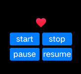
<!-- xxx.hml -->
<div class="container">
  <image-animator class="animator" ref="animator" images="{{frames}}" duration="1s" />
  <div class="btn-box">
    <input class="btn" type="button" value="start" @click="handleStart" />
    <input class="btn" type="button" value="stop" @click="handleStop" />
    <input class="btn" type="button" value="pause" @click="handlePause" />
    <input class="btn" type="button" value="resume" @click="handleResume" />
  </div>
</div>
/* xxx.css */
.container {
  flex-direction: column;
  justify-content: center;
  align-items: center;
  left: 0px;
  top: 0px;
  width: 454px;
  height: 454px;
}
.animator {
  width: 70px;
  height: 70px;
}
.btn-box {
  width: 264px;
  height: 120px;
  flex-wrap: wrap;
  justify-content: space-around;
  align-items: center;
}
.btn {
  border-radius: 8px;
  width: 120px;
  margin-top: 8px;
}
//xxx.js
export default {
  data: {
    frames: [
      {
        src: "/common/asserts/heart78.png",
      },
      {
        src: "/common/asserts/heart79.png",
      },
      {
        src: "/common/asserts/heart80.png",
      },
      {
        src: "/common/asserts/heart81.png",
      },
      {
        src: "/common/asserts/heart82.png",
      },
      {
        src: "/common/asserts/heart83.png",
      },
      {
        src: "/common/asserts/heart84.png",
      },
      {
        src: "/common/asserts/heart85.png",
      },
      {
        src: "/common/asserts/heart86.png",
      },
      {
        src: "/common/asserts/heart87.png",
      },
      {
        src: "/common/asserts/heart88.png",
      },
      {
        src: "/common/asserts/heart89.png",
      },
      {
        src: "/common/asserts/heart90.png",
      },
      {
        src: "/common/asserts/heart91.png",
      },
      {
        src: "/common/asserts/heart92.png",
      },
      {
        src: "/common/asserts/heart93.png",
      },
      {
        src: "/common/asserts/heart94.png",
      },
      {
        src: "/common/asserts/heart95.png",
      },
      {
        src: "/common/asserts/heart96.png",
      },
    ],
  },
  handleStart() {
    this.$refs.animator.start();
  },
  handlePause() {
    this.$refs.animator.pause();
  },
  handleResume() {
    this.$refs.animator.resume();
  },
  handleStop() {
    this.$refs.animator.stop();
  },
};