picker-view
Overview
The <picker-view> component provides the view that shows an embedded scrollable selector on the screen.
Child Component
Not supported
Attribute
Text selector (type is text)
Time selector (type is time)
Time format used by the time selector. Available values include: |
Date selector (type is date)
Start date of the date selector, in the format of YYYY-MM-DD. |
||||
Default value of the date selector, in the format of YYYY-MM-DD. |
||||
Date and time selector (type is datetime)
Multi-column text selector (type is multi-text)
Event
Text selector (type is text)
Time selector (type is time)
Triggered when a value is specified for the time selector. If seconds are contained, the value contains hour, minute, and second. |
Date selector (type is date)
Date and time selector (type is datetime)
{ year:year, month:month, day:day, hour:hour, minute:minute } |
Triggered when a value is specified for the date and time selector. |
Multi-text selector (type is multi-text)
Style
Font size of a candidate item. The value is of the length type, in pixels. |
||||
Font size of the selected item. The value is of the length type, in pixels. |
||||
Font color of the items that gradually disappear. Disappearing items are the top option and bottom option of a column containing five options in total. |
||||
Font size of the items that gradually disappear. Disappearing items are the top option and bottom option of a column containing five options in total. |
||||
Font type of an item. Font family, in which fonts are separated by commas (,). Each font is set using a font name or font family name. The first font in the family or the font specified in Custom Font Styles is used for the text. |
||||
|
If this attribute is not set, the width required for the element content is used. |
||||
|
If this length attribute is not set, the length required for the element content is used. |
||||
Shorthand attribute to set all padding attributes. The attribute can have one to four values:
|
||||
Shorthand attribute to set margins for all sides in a declaration. The attribute can have one to four values:
|
||||
Shorthand attribute to set all borders. You can set border-width, border-style, and border-color in sequence. Default values are used for attributes that are not set. |
||||
Shorthand attribute to set the style for all borders. Available values are as follows: |
||||
Styles of the left, top, right, and bottom borders. The available values are dotted, dashed, and solid. |
||||
Shorthand attribute to set the borders for every side respectively. You can set border-width, border-style, and border-color in sequence. Default values are used for attributes that are not set. |
||||
Shorthand attribute to set the width of all borders, or separately set the width of each border. |
||||
Attribute to set widths of left, top, right, and bottom borders. |
||||
Shorthand attribute to set the color of all borders, or separately set the color of each border. |
||||
Attribute to set colors of left, top, right, and bottom borders. |
||||
Attribute to set the radius of round borders of an element. This attribute cannot be used to set the width, color, or style of a specific border. To set the width or color, you need to set border-width, border-color, or border-style for all the borders at the same time. |
||||
Attribute to receptively set the radii of upper-left, upper-right, lower-right, and lower-left rounded corners |
||||
This attribute supports Gradient Styles only but is not compatible with background-color or background-image. |
||||
Background image. Currently, this attribute is not compatible with background-color or background. Local image resources are supported. |
||||
|
|
|||
How a background image is repeatedly drawn. By default, a background image is repeated both horizontally and vertically. |
||||
|
|
|||
Transparency of an element. The value ranges from 0 to 1. The value 1 means opaque, and 0 means completely transparent. |
||||
How and whether to display the box containing an element. Available values are as follows: |
||||
Whether to display an element. Invisible borders occupy layout space. (To remove the borders, set the display attribute to none.) Available values are as follows: |
||||
How to divide available space of the parent component for a child component. You can set one, two5+, or three5+ values for this style. Set one value in either of the following ways: Set two values5+ in the following ways: The first value must be a unitless number used to set flex-grow. The second value must be either of the following: Set three values5+ in the following ways: The first value must be a unitless number used to set flex-grow. The second value must be a unitless number used to set flex-shrink. The third value must be a valid width value used to set flex-basis. |
||||
How much a child component will grow. The value specifies allocation of the remaining space on the main axis of the parent component. Size of available space = Container size - Total size of all child components. Value 0 indicates that the child component does not grow. |
||||
How much a child component will shrink. The shrink occurs only when the sum of default child component widths is greater than that of the parent component. Value 0 indicates that the child component does not shrink. |
||||
Positioning type of an element. Dynamic changes are not supported. |
||||
left|top|right|bottom must be used together with position to determine the offset position of an element.
|
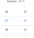
Example Code
<!-- xxx.hml -->
<div class="container" @swipe="handleSwipe">
  <text class="title">
    Selected: {{time}}
  </text>
  <picker-view class="time-picker" type="time" selected="{{defaultTime}}" @change="handleChange"></picker-view>
</div>
/* xxx.css */
.container {
  flex-direction: column;
  justify-content: center;
  align-items: center;
  left: 0px;
  top: 0px;
  width: 454px;
  height: 454px;
}
.title {
  font-size: 30px;
  text-align: center;
}
.time-picker {
  width: 500px;
  height: 400px;
  margin-top: 20px;
}
/* xxx.js */
export default {
  data: {
    defaultTime: "",
    time: "",
  },
  onInit() {
    this.defaultTime = this.now();
  },
  handleChange(data) {
    this.time = this.concat(data.hour, data.minute);
  },
  now() {
    const date = new Date();
    const hours = date.getHours();
    const minutes = date.getMinutes();
    return this.concat(hours, minutes);
  },

  fill(value) {
    return (value > 9 ? "" : "0") + value;
  },

  concat(hours, minutes) {
    return `${this.fill(hours)}:${this.fill(minutes)}`;
  },
}