div
The <div> component is a basic container that is used as the root node of the page structure or is used to group the content.
Permission List
None
Child Component
Supported
Attribute
Event
Style
Main axis direction of the flex container. Available values are as follows: |
||||
Whether flex items in the container are displayed in a single line or multiple lines. Currently, dynamic modification is not supported. Available values are as follows: |
||||
How items are aligned along the main axis of the current line in a flex container. Available values are as follows:
|
||||
How items are aligned along the cross axis of the current line in a flex container. Available values are as follows: |
||||
Multi-line alignment mode when there is extra space in the cross axis. Available values are as follows:
|
||||
Type of the view box of the element. Currently, dynamic modification is not supported. Available values are as follows: |
||||
Number of rows and columns in the current grid layout. If this attribute is not set, one row and one column are displayed by default. This attribute is valid only when display is set to grid. For example, set grid-template-columns to:
|
||||
Size of the gap between two consecutive rows or columns in a grid layout. You can also use grid-gap to set the same size of the gap between rows and columns. This attribute is valid only when display is set to grid. |
||||
Start and end row numbers of the current item in the grid layout. This attribute is valid only when display of the parent component is grid. (The display attribute of the parent component can be set to grid only for the <div> container.) |
||||
Start and end column numbers of the current item in the grid layout. This attribute is valid only when display of the parent component is grid. (The display attribute of the parent component can be set to grid only for the <div> container.) |
||||
Using an algorithm to lay out the grid automatically. Available values are as follows: |
||||
|
If this attribute is not set, the width required for the element content is used. |
||||
|
If this length attribute is not set, the length required for the element content is used. |
||||
Shorthand attribute to set all padding attributes. The attribute can have one to four values:
|
||||
Shorthand attribute to set margins for all sides in a declaration. The attribute can have one to four values:
|
||||
Shorthand attribute to set all borders. You can set border-width, border-style, and border-color in sequence. Default values are used for attributes that are not set. |
||||
Shorthand attribute to set the style for all borders. Available values are as follows: |
||||
Styles of the left, top, right, and bottom borders. The available values are dotted, dashed, and solid. |
||||
Shorthand attribute to set the borders for every side respectively. You can set border-width, border-style, and border-color in sequence. Default values are used for attributes that are not set. |
||||
Shorthand attribute to set the width of all borders, or separately set the width of each border. |
||||
Attribute to set widths of left, top, right, and bottom borders. |
||||
Shorthand attribute to set the color of all borders, or separately set the color of each border. |
||||
Attribute to set colors of left, top, right, and bottom borders. |
||||
Attribute to set the radius of round borders of an element. This attribute cannot be used to set the width, color, or style of a specific border. To set the width or color, you need to set border-width, border-color, or border-style for all the borders at the same time. |
||||
Attribute to receptively set the radii of upper-left, upper-right, lower-right, and lower-left rounded corners |
||||
This attribute supports Gradient Styles only but is not compatible with background-color or background-image. |
||||
Background image. Currently, this attribute is not compatible with background-color or background. Local image resources are supported. |
||||
|
|
|||
How a background image is repeatedly drawn. By default, a background image is repeated both horizontally and vertically. |
||||
|
|
|||
Transparency of an element. The value ranges from 0 to 1. The value 1 means opaque, and 0 means completely transparent. |
||||
Whether to display an element. Invisible borders occupy layout space. (To remove the borders, set the display attribute to none.) Available values are as follows: |
||||
How to divide available space of the parent component for a child component. You can set one, two5+, or three5+ values for this style. Set one value in either of the following ways: Set two values5+ in the following ways: The first value must be a unitless number used to set flex-grow. The second value must be either of the following: Set three values5+ in the following ways: The first value must be a unitless number used to set flex-grow. The second value must be a unitless number used to set flex-shrink. The third value must be a valid width value used to set flex-basis. |
||||
How much a child component will grow. The value specifies allocation of the remaining space on the main axis of the parent component. Size of available space = Container size - Total size of all child components. Value 0 indicates that the child component does not grow. |
||||
How much a child component will shrink. The shrink occurs only when the sum of default child component widths is greater than that of the parent component. Value 0 indicates that the child component does not shrink. |
||||
Positioning type of an element. Dynamic changes are not supported. |
||||
left|top|right|bottom must be used together with position to determine the offset position of an element.
|
Example Code
-
Flex style
<!-- xxx.hml -->
<div class="container">
  <div class="flex-box">
    <div class="flex-item color-primary"></div>
    <div class="flex-item color-warning"></div>
    <div class="flex-item color-success"></div>
  </div>
</div>
/* xxx.css */ .container { flex-direction: column; justify-content: center; align-items: center; width: 454px; height: 454px; } .flex-box { justify-content: space-around; align-items: center; width: 400px; height: 140px; background-color: #ffffff; } .flex-item { width: 120px; height: 120px; border-radius: 16px; } .color-primary { background-color: #007dff; } .color-warning { background-color: #ff7500; } .color-success { background-color: #41ba41; }
-
Flex wrap style
<!-- xxx.hml -->
<div class="container">
  <div class="flex-box">
    <div class="flex-item color-primary"></div>
    <div class="flex-item color-warning"></div>
    <div class="flex-item color-success"></div>
  </div>
</div>
/* xxx.css */ .container { flex-direction: column; justify-content: center; align-items: center; width: 454px; height: 454px; } .flex-box { justify-content: space-around; align-items: center; flex-wrap: wrap; width: 300px; height: 250px; background-color: #ffffff; } .flex-item { width: 120px; height: 120px; border-radius: 16px; } .color-primary { background-color: #007dff; } .color-warning { background-color: #ff7500; } .color-success { background-color: #41ba41; }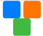
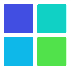
-
Grid style
<!-- xxx.hml -->
<div class="common grid-parent">
  <div class="grid-child grid-left-top"></div>
  <div class="grid-child grid-left-bottom"></div>
  <div class="grid-child grid-right-top"></div>
  <div class="grid-child grid-right-bottom"></div>
</div>
/* xxx.css */ .common { width: 400px; height: 400px; background-color: #ffffff; align-items: center; justify-content: center; margin: 24px; } .grid-parent { display: grid; grid-template-columns: 50% 50%; grid-columns-gap: 24px; grid-rows-gap: 24px; grid-template-rows: 50% 50%; } .grid-child { width: 100%; height: 100%; border-radius: 8px; } .grid-left-top { grid-row-start: 0; grid-column-start: 0; grid-row-end: 0; grid-column-end: 0; background-color: #3f56ea; } .grid-left-bottom { grid-row-start: 1; grid-column-start: 0; grid-row-end: 1; grid-column-end: 0; background-color: #00aaee; } .grid-right-top { grid-row-start: 0; grid-column-start: 1; grid-row-end: 0; grid-column-end: 1; background-color: #00bfc9; } .grid-right-bottom { grid-row-start: 1; grid-column-start: 1; grid-row-end: 1; grid-column-end: 1; background-color: #47cc47; }