Getting Started with eTS in the Low-Code Approach
NOTE
This feature is supported in DevEco Studio V3.0 Beta3 and later versions.
The component lineup that supports low-code development in eTS is now at its preliminary stage and will be expanding in coming versions.
For best possible results, use DevEco Studio V3.0.0.900 Beta3 for your development.
On the OpenHarmony low-code development pages, you can design your application UI in an efficient, intuitive manner, with a wide array of UI editing features.
You can develop applications or services in the low-code approach using either of the following methods:
-
Create a project that supports low-code development. This method is used as an example in this topic.
-
In an existing project, create a .visual file for development. For details, see Creating a .visual File That Supports Low-Code Development.
Creating a Project That Supports Low-Code Development
-
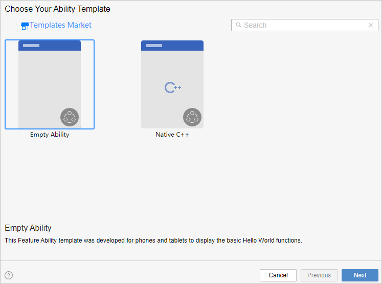
In DevEco Studio, if no project is open, click Create Project; if a project is already open, choose File > New > Create Project. Then, select Empty Ability and click Next.
-
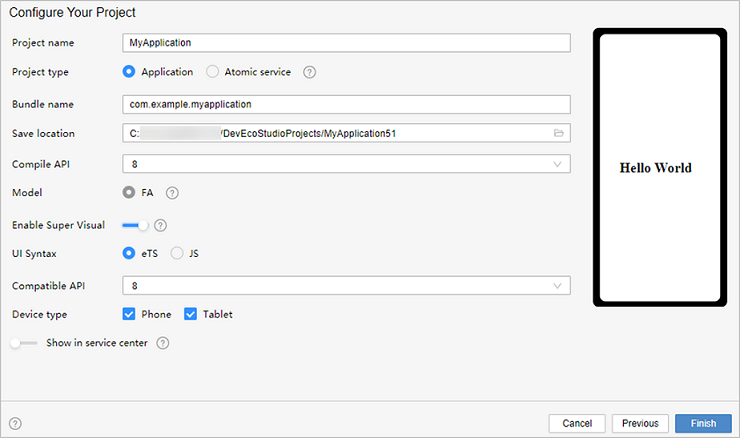
Go to the project configuration page, select Enable Super Visual, set UI Syntax to eTS, and retain the default values for other parameters.
-
Click Finish. DevEco Studio will automatically generate the sample code and resources that match your project type. Wait until the project is created.
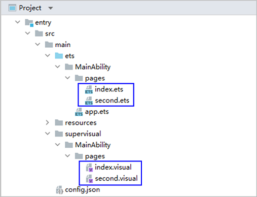
Low-code Project Files
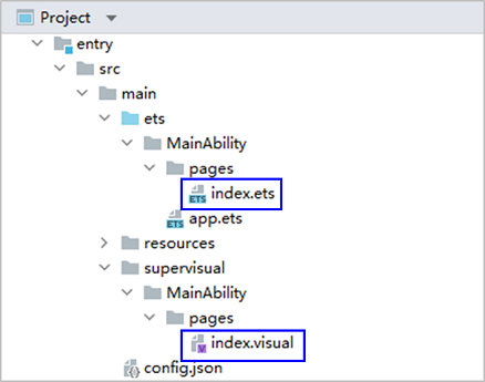
After the project synchronization is complete, a low-code directory structure is automatically generated in the project, as shown below.
-
entry > src > main > ets > MainAbility > pages > index.ets: defines logical relationships, such as data and events, used on low-code pages. For details, see About Syntactic Sugar. If multiple low-code development pages are created, a page folder and the corresponding .ets file will be created for each of these pages.
-
entry > src > main > supervisual > MainAbility > pages > index.visual: stores the data model of the low-code development page. You can double-click the file to open the low-code development page. If multiple low-code development pages are created, a page folder and the corresponding .visual file will be created for each of these pages.
Building the First Page
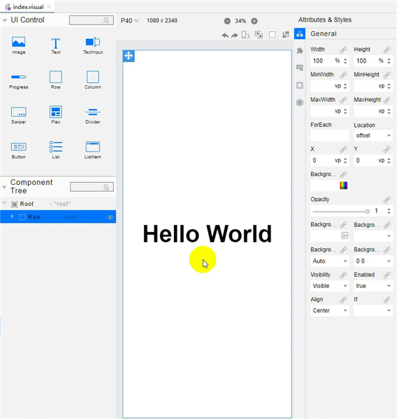
After the project synchronization is complete, the default first page contains the Column and Text (Hello World) components. To better understand low-code development, we'll delete these template components from the canvas and set the page from scratch.
Add Column, Text, and Button components to the first page. A column is a container component whose child components are vertically arranged. For details, see Column.
-
Delete the existing template components from the canvas.
Open the index.visual file, right-click the existing template components on the canvas, and choose Delete from the shortcut menu to delete them. Below is an illustration of the operations.
-
Add a Column component and set its styles and attributes.
Drag the Column component from the UI Control area to the canvas. In the Attributes & Styles area on the right, click
 General and set Height to 100% so that the component fills the entire screen. Click
  Feature and set AlignItems to center so that the child components of the Column component are centered along the horizontal axis. Below is an illustration of the operations.
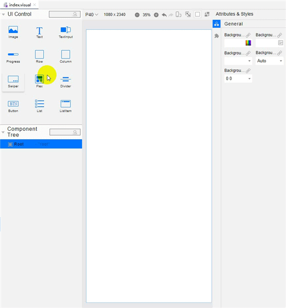
-
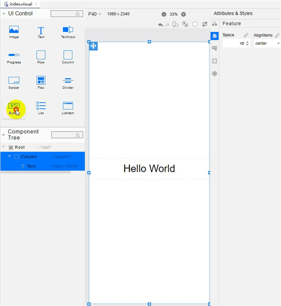
Add a Text component.
Drag the Text component from the UI Control area to the canvas and then to the center area of the Column component. In the Attributes & Styles area, click
 Feature, set Content of the Text component to this.message (that is, Hello World), set FontSize to 30fp, and set TextAlign to center. Then, select the Text component on the canvas and drag its corners to fully display the text. Below is an illustration of the operations.
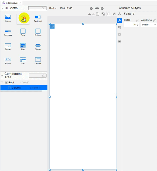
-
Add a Button component.
Drag the Button component from the UI Control area to the canvas and then to a position under the Text component. In the Attributes & Styles area on the right, click
 General and set Height of the Button component to 40vp. Click
  Feature and set Label to Next and FontSize to 25fp. Below is an illustration of the operations.
-
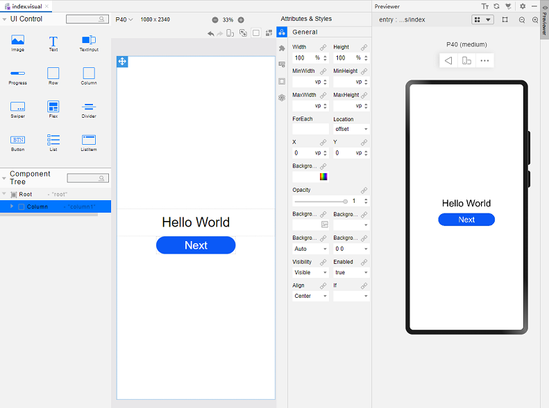
On the toolbar in the upper right corner of the editing window, click Previewer to open the Previewer.
Below is how the first page looks in the Previewer.
Building the Second Page
-
Create the second page.
In the Project window, choose entry > src > main > ets > MainAbility, right-click the pages folder, choose New > Visual, name the page second, and click Finish. Below, you can see the structure of the pages folder.
-
Add a Text component.
-
In the second.ets file, set the message text content to Hi there. The sample code is as follows:
// second.ets @Entry @Component struct Second { @State message: string = 'Hi there' /** * In low-code mode, do not add anything to the build function, as it will be * overwritten by the content generated by the .visual file in the build phase. */ build() { } } -
Drag the Text component to the canvas and then to the center area of the Column component. In the Attributes & Styles area, click
 Feature, set Content of the Text component to this.message (that is, Hi there), set FontSize to 30fp, and set TextAlign to center. Then, select the Text component on the canvas and drag its corners to fully display the text. Below is an illustration of the operations.
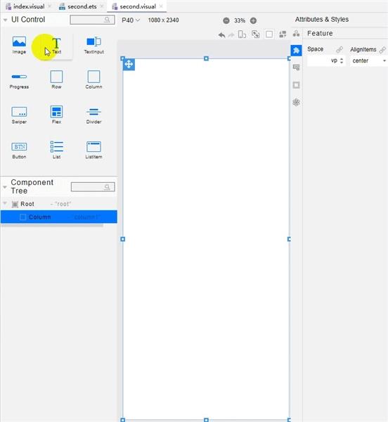
-
-
Add a Button component.
Drag the Button component from the UI Control area to the canvas and then to a position under the Text component. In the Attributes & Styles area on the right, click
 General and set Height of the Button component to 40vp. Click
  Feature and set Value to Back and FontSize to 25fp. Below is an illustration of the operations.
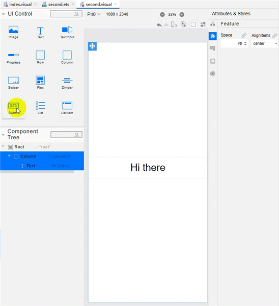
Implementing Page Redirection
You can implement page redirection through the page router, which finds the target page based on the page URL. Import the router module and then perform the steps below:
-
Implement redirection from the first page to the second page.
In the files of the first page, bind the onclick method to the button so that clicking the button redirects the user to the second page. This operation needs to be completed in both .ets and .visual files.
-
In the index.ets file:
// index.ets import router from '@ohos.router'; @Entry @Component struct Index { @State message: string = 'Hello World' /** * In low-code mode, do not add anything to the build function, as it will be * overwritten by the content generated by the .visual file in the build phase. */ onclick() { router.push({ url: 'pages/second', // Specify the page to be redirected to. }) } build() { } } -
In the index.visual file, select the Button component on the canvas. In the Attributes & Styles area, click
 Events and set OnClick to this.onclick.
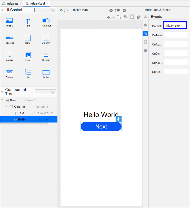
-
-
Implement redirection from the second page to the first page.
In the files of the second page, bind the back method to the Back button so that clicking the button redirects the user back to the first page. This operation needs to be completed in both .ets and .visual files.
-
In the second.ets file:
// second.ets import router from '@ohos.router'; @Entry @Component struct Second { @State message: string = 'Hi there' /** * In low-code mode, do not add anything to the build function, as it will be * overwritten by the content generated by the .visual file in the build phase. */ back() { router.back() } build() { } } -
In the second.visual file, select the Button component on the canvas. In the Attributes & Styles area, click
 Events and set OnClick to this.back.
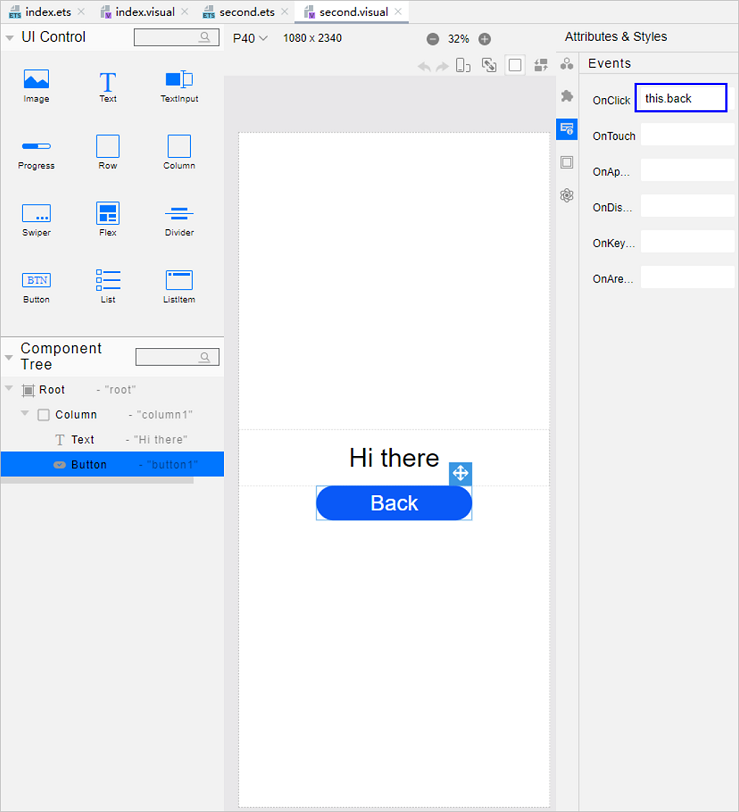
-
-
Open the index.visual or index.ets file and click
 in the Previewer to refresh the file. The figure below shows the effect.
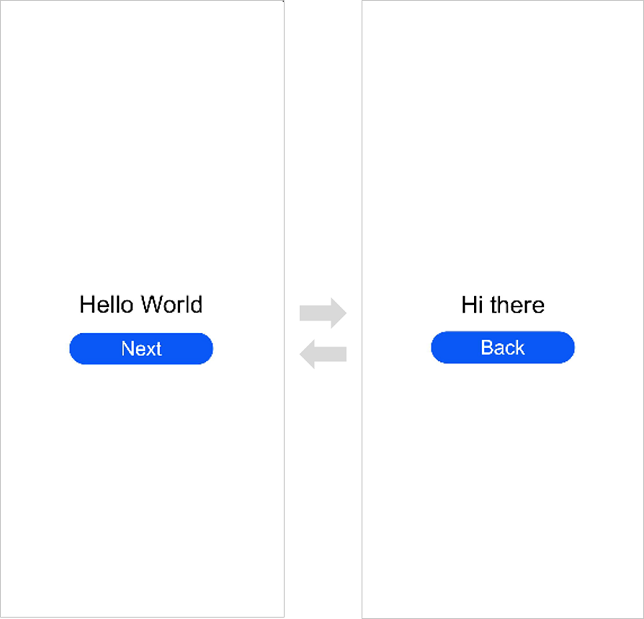
Running the Application on a Real Device
-
Connect the development board running the OpenHarmony standard system to the computer.
-
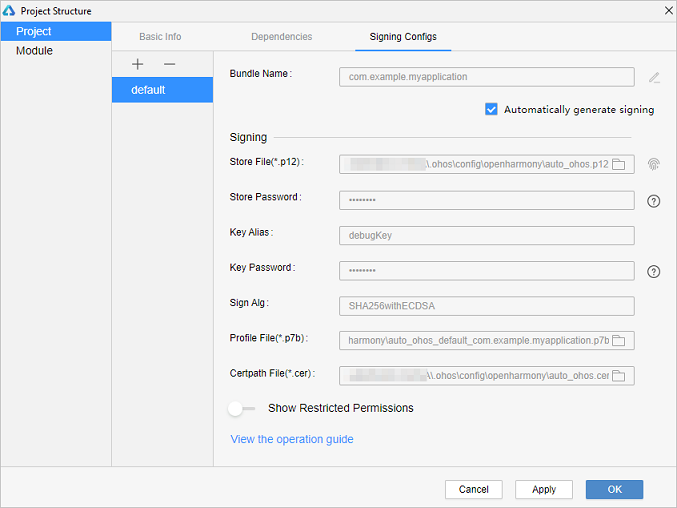
Choose File > Project Structure > Project > Signing Configs, select Automatically generate signing, wait until the automatic signing is complete, and click OK, as shown below.
-
On the toolbar in the upper right corner of the editing window, click
 . The display effect is shown in the figure below.
Congratulations! You have finished developing your OpenHarmony application in eTS in the low-code approach. To learn more about OpenHarmony, see OpenHarmony Overview.