Swiper
NOTE
This component is supported since API version 7. Updates will be marked with a superscript to indicate their earliest API version.
The <Swiper> component provides a container that allows users to switch among child components through swiping.
Required Permissions
None
Child Components
This component can contain child components.
APIs
Swiper(value:{controller?: SwiperController})
- Parameters
| Name | Type | Mandatory | Default Value | Description |
|---|---|---|---|---|
| controller | SwiperController | No | null | Controller bound to the component to control the page switching. |
Attributes
| Name | Type | Default Value | Description |
|---|---|---|---|
| index | number | 0 | Index of the child component currently displayed in the container. |
| autoPlay | boolean | false | Whether to enable automatic playback for child component switching. If this attribute is true, the indicator dots do not take effect. |
| interval | number | 3000 | Interval for automatic playback, in ms. |
| indicator | boolean | true | Whether to enable the navigation dots. |
| loop | boolean | true | Whether to enable loop playback. |
| duration | number | 400 | Duration of the animation for switching child components, in ms. |
| vertical | boolean | false | Whether vertical swiping is used. |
| itemSpace | Length | 0 | Space between child components. |
| cachedCount8+ | number | 1 | Number of child components to be cached. |
| disableSwipe8+ | boolean | false | Whether to disable the swipe feature. |
| curve8+ | Curve | Curves | Curve.Ease | Animation curve. The ease-in/ease-out curve is used by default. For details about common curves, see Curve enums. You can also create custom curves (interpolation curve objects) by using APIs provided by the interpolation calculation module. |
| indicatorStyle8+ | { left?: Length, top?: Length, right?: Length, bottom?: Length, size?: Length, color?: Color, selectedColor?: Color } |
- | Style of the navigation dots indicator. - left: distance between the navigation dots indicator and the left edge of the <Swiper> component. - top: distance between the navigation dots indicator and the top edge of the <Swiper> component. - right: distance between the navigation dots indicator and the right edge of the <Swiper> component. - bottom: distance between the navigation dots indicator and the right edge of the <Swiper> component. - size: diameter of the navigation dots indicator. - color: color of the navigation dots indicator. - selectedColor: color of the selected navigation dot. |
SwiperController
Controller of the <Swiper> component. You can bind this object to the <Swiper> component and use it to control page switching.
| Name | Description |
|---|---|
| showNext():void | Turns to the next page. |
| showPrevious():void | Turns to the previous page. |
Events
| Name | Description |
|---|---|
| onChange( index: number) => void | Triggered when the index of the currently displayed component changes. |
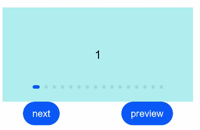
Example
// xxx.ets
class MyDataSource implements IDataSource {
  private list: number[] = []
  private listener: DataChangeListener

  constructor(list: number[]) {
    this.list = list
  }

  totalCount(): number {
    return this.list.length
  }

  getData(index: number): any {
    return this.list[index]
  }

  registerDataChangeListener(listener: DataChangeListener): void {
    this.listener = listener
  }

  unregisterDataChangeListener() {
  }
}

@Entry
@Component
struct SwiperExample {
  private swiperController: SwiperController = new SwiperController()
  private data: MyDataSource = new MyDataSource([])

  aboutToAppear(): void {
    let list = []
    for (var i = 1; i <= 10; i++) {
      list.push(i.toString());
    }
    this.data = new MyDataSource(list)
  }

  build() {
    Column({ space: 5 }) {
      Swiper(this.swiperController) {
        LazyForEach(this.data, (item: string) => {
          Text(item).width('90%').height(160).backgroundColor(0xAFEEEE).textAlign(TextAlign.Center).fontSize(20)
        }, item => item)
      }
      .cachedCount(2)
      .index(1)
      .autoPlay(true)
      .interval(4000)
      .indicator(true) // Navigation dots are enabled by default.
      .loop(false) // Loop playback is enabled by default.
      .duration(1000)
      .vertical(false) // Horizontal swiping is enabled by default.
      .itemSpace(0)
      .curve(Curve.Linear) // Animation curve
      .onChange((index: number) => {
        console.info(index.toString())
      })

      Flex({ justifyContent: FlexAlign.SpaceAround }) {
        Button('next')
          .onClick(() => {
            this.swiperController.showNext()
          })
        Button('preview')
          .onClick(() => {
            this.swiperController.showPrevious()
          })
      }
    }.margin({ top: 5 })
  }
}