Rect
说明:
该组件从API Version 7开始支持。后续版本如有新增内容,则采用上角标单独标记该内容的起始版本。
矩形绘制组件。
权限列表
无
子组件
无
接口
Rect(value:{options?: {width: Length,height: Length,radius?: Length | Array<Length>} | {width: Length,height: Length,radiusWidth?: Length,radiusHeight?: Length}})
options参数说明:
| 参数名 | 参数类型 | 必填 | 默认值 | 参数描述 |
|---|---|---|---|---|
| width | Length | 是 | - | 宽度。 |
| height | Length | 是 | - | 高度。 |
| radius | Length | Array<Length> | 否 | 0 | 圆角半径,支持分别设置四个角的圆角度数。 |
| radiusWidth | Length | 否 | 0 | 圆角宽度。 |
| radiusHeight | Length | 否 | 0 | 圆角高度。 |
属性
| 参数名称 | 参数类型 | 默认值 | 必填 | 参数描述 |
|---|---|---|---|---|
| width | Length | 0 | 否 | 宽度。 |
| height | Length | 0 | 否 | 高度。 |
| radiusWidth | Length | 0 | 否 | 圆角的宽度,仅设置宽时宽高一致。 |
| radiusHeight | Length | 0 | 否 | 圆角的高度,仅设置高时宽高一致。 |
| radius | Length | Array<Length> | 0 | 否 | 圆角大小。 |
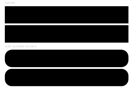
示例
// xxx.ets
@Entry
@Component
struct RectExample {
  build() {
    Column({ space: 5 }) {
      Text('normal').fontSize(9).fontColor(0xCCCCCC).width('90%')
      // 绘制90% * 50矩形
      Rect({ width: '90%', height: 50 })
      // 绘制90% * 50矩形
      Rect().width('90%').height(50)

      Text('with rounded corners').fontSize(9).fontColor(0xCCCCCC).width('90%')
      // 绘制90% * 50矩形, 圆角宽高20
      Rect({ width: '90%', height: 50 }).radiusHeight(20).radiusWidth(20)
      // 绘制90% * 50矩形, 圆角宽高20
      Rect({ width: '90%', height: 50 }).radius(20)
    }.width('100%').margin({ top: 5 })
  }
}