button
The <button> component includes capsule, circle, text, arc, and download buttons.
Child Components
Not supported
Attributes
In addition to the attributes in Universal Attributes, the following attributes are supported.
| Name | Type | Default Value | Mandatory | Description |
|---|---|---|---|---|
| type | string | - | No | Dynamic modification is not supported. If this attribute is not set, capsule-like buttons are displayed. Different from the capsule button, the four rounded corners of a capsule-like button can be configured using border-radius. Available button types are as follows: - capsule: a capsule button with fillets, background color, and text - circle: a circle button which can be used to place icons - text: a text button which displays the text onlyarc: an arc button. This value is applicable to wearables only. - download: a download button. The download progress bar is added. |
| value | string | - | No | Text value of the button. |
| icon | string | - | No | Path of the button icon. The supported icon formats are JPG, PNG, and SVG. |
| placement5+ | string | end | No | Position of the button icon in text. This attribute is valid only when type is not set. Available values are as follows: - start: The button icon is at the beginning of the text. - end: The button icon is at the end of the text. - top: The button icon is at the top of the text. - bottom: The button icon is at the bottom of the text. |
| waiting | boolean | false | No | Waiting status. When waiting is set to true, the waiting transition is displayed on the left of the text. This attribute is unavailable for download buttons and wearables. |
Styles
When the Button Type Is Not arc
In addition to the styles in Universal Styles, the following styles are supported.
| Name | Type | Default Value | Mandatory | Triggered when |
|---|---|---|---|---|
| text-color | <color> | #ff007dff | No | Text color of the button. |
| font-size | <length> | 16px | No | Font size of the button. |
| allow-scale | boolean | true | No | Whether the font size changes with the system's font size settings.NOTE:If the config-changes tag of fontSize is configured for abilities in the config.json file, the setting takes effect without application restart. |
| font-style | string | normal | No | Font style of the button. |
| font-weight | number | string | normal | No | Font weight of the button. For details, see font-weight of the text component. |
| font-family | <string> | sans-serif | No | Font family, in which fonts are separated by commas (,). Each font is set using a font name or font family name. The first font in the family or the font specified by Custom Font Styles is used for the text. |
| icon-width | <length> | - | No | Width of the internal icon of a circle button. The entire circle button is filled by default.NOTE:This style must be set when the icon uses the SVG image. |
| icon-height | <length> | - | No | Height of the internal icon of a circle button. The entire circle button is filled by default.NOTE:This style must be set when the icon uses the SVG image. |
| radius | <length> | - | No | Button radius. For a circle button, this style takes precedence over width and height in the common styles. |
![img]../public_sys-resources/icon-note.gif) NOTE:
- For capsule buttons, border-related styles are not supported.
- For circle buttons, text-related styles are not supported.
- For text buttons, the text size is automatically adaptive, and radius, width, and height cannot be set. The background-color style is not supported when the background is completely transparent.
When the Button Type Is arc
In addition to the background-color, opacity, display, visibility, position, [left|top**|right|bottom** styles in Universal Styles, the following styles are supported.
| Name | Type | Default Value | Mandatory | Triggered when |
|---|---|---|---|---|
| text-color | <color> | #de0000 | No | Text color of the arc button. |
| font-size | <length> | 37.5px | No | Font size of the arc button. |
| allow-scale | boolean | true | No | Whether the font size changes with the system's font size settings. |
| font-style | string | normal | No | Font style of the arc button. |
| font-weight | number | string | normal | No | Font weight of the arc button. For details, see font-weight of the text component. |
| font-family | <string> | sans-serif | No | Font family, in which fonts are separated by commas (,). Each font is set using a font name or font family name. The first font in the family or the font specified by Custom Font Styles is used for the text. |
Events
Events in Universal Events are supported.
Methods
Methods in Universal Methods are supported.
When the button type is download, the following methods are supported.
| Name | Parameter | Triggered when |
|---|---|---|
| setProgress | { progress:percent } | Progress bar of the download button. The value ranges from 0 to 100. The progress bar is displayed if the value is greater than 0. If the value is greater than or equal to 100, the progress bar is not displayed.NOTE:The text displayed on the progress bar is changed based on the value. |
Example
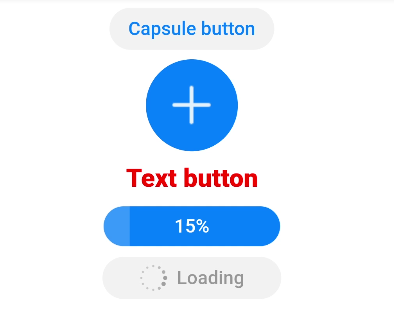
<!-- xxx.hml -->
<div class="div-button">
  <button class="first" type="capsule" value="Capsule button"></button>
  <button class="button circle" type="circle" icon="common/ic_add_default.png"></button>
  <button class="button text" type="text">Text button</button>
  <button class="button download" type="download" id="download-btn"
    onclick="progress">{{downloadText}}</button>
  <button class="last" type="capsule" waiting="true">Loading</button>
</div>
/* xxx.css */
.div-button {
  flex-direction: column;
  align-items: center;
}
.first{
  background-color: #F2F2F2;
  text-color: #0D81F2;
}
.button {
  margin-top: 15px;
}
.last{
  background-color: #F2F2F2;
  text-color: #969696;
  margin-top: 15px;
  width: 280px;
  height:72px;
}
.button:waiting {
  width: 280px;
}
.circle {
  background-color: #007dff;
  radius: 72px;
  icon-width: 72px;
  icon-height: 72px;
}
.text {
  text-color: red;
  font-size: 40px;
  font-weight: 900;
  font-family: sans-serif;
  font-style: normal;
}
.download {
  width: 280px;
  text-color: white;
  background-color: #007dff;
}
// xxx.js
export default {
  data: {
    count: 5,
    downloadText: "Download"
  },
  progress(e) {
    this.count+= 10;
    this.downloadText = this.count+ "%";
    this.$element('download-btn').setProgress({ progress: this.count});
    if (this.count>= 100) {
      this.downloadText = "Done";
    }
  }
}