TextInput
NOTE
This component is supported since API version 7. Updates will be marked with a superscript to indicate their earliest API version.
The <TextInput> component provides single-line text input.
Required Permissions
None
Child Components
Not supported
APIs
TextInput(value?:{placeholder?: string controller?: TextInputController})
- Parameters
| Name | Type | Mandatory | Default Value | Description |
|---|---|---|---|---|
| placeholder | string | No | - | Text displayed when there is no input. |
| controller8+ | TextInputController | No | - | Text input controller. |
Attributes
In addition to universal attributes, the following attributes are supported.
| Name | Type | Default Value | Description |
|---|---|---|---|
| type | InputType | InputType.Normal | Input box type. |
| placeholderColor | Color | - | Placeholder color. |
| placeholderFont | { size?: Length, weight?: number|FontWeight, family?: string, style?: FontStyle } |
- | Placeholder text style. - size: font size. If the value is of the number type, the unit fp is used. - weight: font weight. For the number type, the value ranges from 100 to 900, at an interval of 100. The default value is 400. A larger value indicates a larger font weight. - family: font family. Use commas (,) to separate multiple fonts, for example, 'Arial, sans-serif'. The priority of the fonts is the sequence in which they are placed. - style: font style. |
| enterKeyType | EnterKeyType | EnterKeyType.Done | How the Enter key is labeled. |
| caretColor | Color | - | Color of the caret (also known as the text insertion cursor). |
| maxLength | number | - | Maximum number of characters in the text input. |
| inputFilter8+ | { value: ResourceStr8+, error?: (value: string) } |
- | Regular expression for input filtering. Only inputs that comply with the regular expression can be displayed. Other inputs are ignored. The specified regular expression can match single characters, but not strings. Example: ^(? =.*\d)(? =.*[a-z])(? =.*[A-Z]).{8,10}$. Strong passwords containing 8 to 10 characters cannot be filtered. - value: regular expression to set. - error: error message containing the ignored content returned when regular expression matching fails. |
- EnterKeyType enums
| Name | Description |
|---|---|
| EnterKeyType.Go | The Enter key is labeled Go. |
| EnterKeyType.Search | The Enter key is labeled Search. |
| EnterKeyType.Send | The Enter key is labeled Send. |
| EnterKeyType.Next | The Enter key is labeled Next. |
| EnterKeyType.Done | The Enter key is labeled Done. |
- InputType enums
| Name | Description |
|---|---|
| InputType.Normal | Normal input mode. |
| InputType.Password | Password input mode. |
| InputType.Email | Email address input mode. |
| InputType.Number | Digit input mode. |
Events
| Name | Description |
|---|---|
| onChange(value: string) => void | Triggered when the input changes. |
| onSubmit(callback: (enterKey: EnterKeyType) => void) | Triggered when the Enter key on the physical or soft keyboard is pressed. |
| onEditChanged(callback: (isEditing: boolean) => void)(deprecated) | Triggered when the input status changes. |
| onEditChange(callback: (isEditing: boolean) => void) 8+ | Triggered when the input status changes. |
| onCopy8+(callback:(value: string) => void) | Triggered when the copy button on the pasteboard, which displays when the text box is long pressed, is clicked. value: text to be copied. |
| onCut8+(callback:(value: string) => void) | Triggered when the cut button on the pasteboard, which displays when the text box is long pressed, is clicked. value: text to be cut. |
| onPaste8+(callback:(value: string) => void) | Triggered when the paste button on the pasteboard, which displays when the text box is long pressed, is clicked. value: text to be pasted. |
TextInputController8+
Implements the controller of the <TextInput> component.
Objects to Import
controller: TextInputController = new TextInputController()
caretPosition
caretPosition(value: number): void
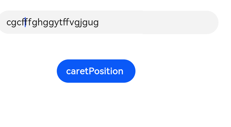
Sets the position of the caret.
- Parameters
| Name | Type | Mandatory | Default Value | Description |
|---|---|---|---|---|
| value | number | Yes | - | Length from the start of the text string to the position where the caret is located. |
Example
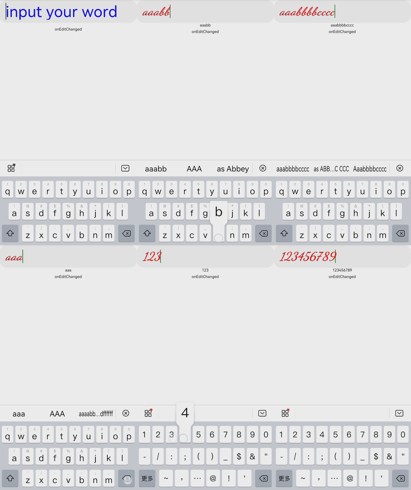
Single-line Text Input
// xxx.ets
@Entry
@Component
struct TextInputExample1 {
  @State text: string = ''

  build() {
    Column() {
      TextInput({ placeholder: 'input your word' })
        .placeholderColor("rgb(0,0,225)")
        .placeholderFont({ size: 30, weight: 100, family: 'cursive', style: FontStyle.Italic })
        .caretColor(Color.Blue)
        .height(50)
        .fontSize(30)
        .fontWeight(FontWeight.Bold)
        .fontFamily("sans-serif")
        .fontStyle(FontStyle.Normal)
        .fontColor(Color.Red)
        .onChange((value: string) => {
          this.text = value
        })
      Text(this.text).width('90%')
    }
  }
}

Setting the Caret
// xxx.ets
@Entry
@Component
struct TextInputExample2 {
    @State text: string = ''
    controller: TextInputController = new TextInputController()
    build() {
        Column() {
            TextInput({ placeholder: 'Please input your words.', controller:this.controller})
            Button('caretPosition')
                .onClick(() => {
                this.controller.caretPosition(4)
            })
        }
    }
}
