Toggle
NOTE
This component is supported since API version 8. Updates will be marked with a superscript to indicate their earliest API version.
Required Permissions
None
Child Components
Not supported
APIs
Toggle(options: { type: ToggleType, isOn?: boolean })
- Parameters
| Name | Type | Mandatory | Default Value | Description |
|---|---|---|---|---|
| type | ToggleType | Yes | - | Type of the toggle. |
| isOn | boolean | No | false | Whether the toggle is turned on. The value true means that the toggle is turned on, and false means the opposite. |
- ToggleType enums
| Name | Description |
|---|---|
| Checkbox | A checkbox is provided, where the <Text> settings can take effect only when it is placed with the current component in a layout component. > NOTE > The default value of the universal attribute padding is as follows: { top: 14 vp, right: 6 vp, bottom: 14 vp, left: 6 vp } |
| Button | A button is provided. The set text string, if any, will be displayed inside the button. |
| Switch | A switch is provided, where the <Text> settings can take effect only when it is placed with the current component in a layout component. > NOTE > The default value of the universal attribute padding is as follows: { top: 12 vp, right: 12 vp, bottom: 12 vp, left: 12 vp } |
Attributes
| Name | Parameter | Default Value | Description |
|---|---|---|---|
| selectedColor | Color | - | Background color of the component when it is turned on. |
| switchPointColor | Color | - | Color of the circular slider when the component is of the Switch type. > NOTE > This attribute is valid only when type is set to ToggleType.Switch. |
Events
| Name | Description |
|---|---|
| onChange(callback: (isOn: boolean) => void) | Triggered when the toggle status changes. |
Example
// xxx.ets
@Entry
@Component
struct ToggleExample {
build() {
Column({ space: 10 }) {
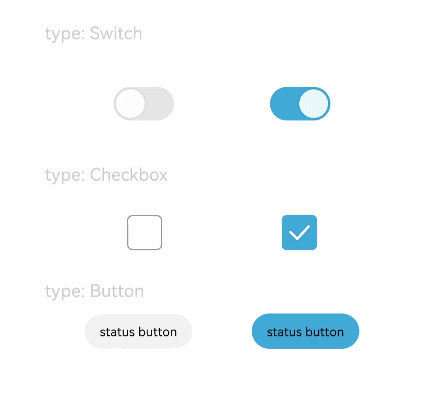
Text('type: Switch').fontSize(12).fontColor(0xcccccc).width('90%')
Flex({ justifyContent: FlexAlign.SpaceEvenly, alignItems: ItemAlign.Center }) {
Toggle({ type: ToggleType.Switch, isOn: false })
.selectedColor(0xed6f21)
.switchPointColor(0xe5ffffff)
.onChange((isOn: boolean) => {
console.info('Component status:' + isOn)
})
Toggle({ type: ToggleType.Switch, isOn: true })
.selectedColor(0x39a2db)
.switchPointColor(0xe5ffffff)
.onChange((isOn: boolean) => {
console.info('Component status:' + isOn)
})
}
Text('type: Checkbox').fontSize(12).fontColor(0xcccccc).width('90%')
Flex({ justifyContent: FlexAlign.SpaceEvenly, alignItems: ItemAlign.Center }) {
Toggle({ type: ToggleType.Checkbox, isOn: false })
.size({ width: 28, height: 28 })
.selectedColor(0xed6f21)
.onChange((isOn: boolean) => {
console.info('Component status:' + isOn)
})
Toggle({ type: ToggleType.Checkbox, isOn: true })
.size({ width: 28, height: 28 })
.selectedColor(0x39a2db)
.onChange((isOn: boolean) => {
console.info('Component status:' + isOn)
})
}
Text('type: Button').fontSize(12).fontColor(0xcccccc).width('90%')
Flex({ justifyContent: FlexAlign.SpaceEvenly, alignItems: ItemAlign.Center }) {
Toggle({ type: ToggleType.Button, isOn: false }) {
Text('status button').padding({ left: 12, right: 12 })
}
.selectedColor(0xed6f21)
.onChange((isOn: boolean) => {
console.info('Component status:' + isOn)
})
Toggle({ type: ToggleType.Button, isOn: true }) {
Text('status button').padding({ left: 12, right: 12 })
}
.selectedColor(0x39a2db)
.onChange((isOn: boolean) => {
console.info('Component status:' + isOn)
})
}
}.width('100%').padding(24)
}
}