Popup Control
NOTE This attribute is supported since API version 7. Updates will be marked with a superscript to indicate their earliest API version.
Required Permissions
None
Attributes
| Name | Type | Default Value | Description |
|---|---|---|---|
| bindPopup | show: boolean, popup: PopupOptions | CustomPopupOptions |
- | Settings of the popup bound to a component. show: whether to display the popup on the creation page by default. The default value is false. popup: parameters of the current popup. |
- PopupOptions attributes
| Name | Type | Mandatory | Default Value | Description |
|---|---|---|---|---|
| message | string | Yes | - | Content of the popup message. |
| placementOnTop | boolean | No | false | Whether to display the popup above the component. The default value is false. |
| primaryButton | { value: string, action: () => void } |
No | - | First button. value: text of the primary button in the popup. action: callback function for clicking the primary button. |
| secondaryButton | { value: string, action: () => void } |
No | - | Second button. value: text of the secondary button in the popup. action: callback function for clicking the secondary button. |
| onStateChange | (isVisible: boolean) => void | No | - | Callback for the popup status change event. The parameter isVisible indicates the visibility of the popup. |
- CustomPopupOptions8+
| Name | Type | Mandatory | Default Value | Description |
|---|---|---|---|---|
| builder | () => any | Yes | - | Builder of the tooltip content. |
| placement | Placement | No | Placement.Bottom | Preferred position of the tooltip component. If the set position is insufficient for holding the component, it will be automatically adjusted. |
| maskColor | Color | No | - | Color of the tooltip mask. |
| popupColor | Color | No | - | Color of the tooltip. |
| enableArrow | boolean | No | true | Whether to display arrows. Arrows are displayed only for tooltips in the up and down directions. |
| autoCancel | boolean | No | true | Whether to automatically close the tooltip when an operation is performed on the page. |
| onStateChange | (isVisible: boolean) => void | No | - | Callback for the popup status change event. The parameter isVisible indicates the visibility of the popup. |
- Placement8+ enums
| Name | Description |
|---|---|
| Left | The tooltip is on the left of the component. |
| Right | The tooltip is on the right of the component. |
| Top | The tooltip is on the top of the component. |
| Bottom | The tooltip is at the bottom of the component. |
| TopLeft | The tooltip is in the upper left corner of the component. |
| TopRight | The tooltip is in the upper right corner of the component. |
| BottomLeft | The tooltip is in the lower left corner of the component. |
| BottomRight | The tooltip is in the lower right corner of the component. |
Example
@Entry
@Component
struct PopupExample {
@State noHandlePopup: boolean = false
@State handlePopup: boolean = false
@State customPopup: boolean = false
@Builder popupBuilder() {
Row({ space: 2 }) {
Image('/resource/ic_public_thumbsup.svg').width(24).height(24).margin({ left: -5 })
Text('Custom Popup').fontSize(12)
}.width(100).height(50).backgroundColor(Color.White)
}
build() {
Flex({ direction: FlexDirection.Column }) {
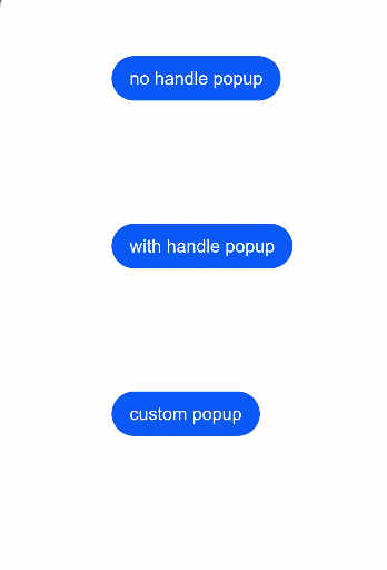
Button('no handle popup')
.onClick(() => {
this.noHandlePopup = !this.noHandlePopup
})
.bindPopup(this.noHandlePopup, {
message: 'content1 content1',
placementOnTop: false,
onStateChange: (e) => {
console.info(e.isVisible.toString())
if (!e.isVisible) {
this.noHandlePopup = false
}
}
})
.position({ x: 100, y: 50 })
Button('with handle popup')
.onClick(() => {
this.handlePopup = !this.handlePopup
})
.bindPopup(this.handlePopup, {
message: 'content2 content2',
placementOnTop: true,
primaryButton: {
value: 'ok',
action: () => {
this.handlePopup = !this.handlePopup
console.info('secondaryButton click')
}
},
onStateChange: (e) => {
console.info(e.isVisible.toString())
}
})
.position({ x: 100, y: 200 })
Button('custom popup')
.onClick(() => {
this.customPopup = !this.customPopup
})
.bindPopup(this.customPopup, {
builder: this.popupBuilder,
placement: Placement.Bottom,
maskColor: 0x33000000,
popupColor: Color.White,
enableArrow: true,
onStateChange: (e) => {
if (!e.isVisible) {
this.customPopup = false
}
}
})
.position({ x: 100, y: 350 })
}.width('100%').padding({ top: 5 })
}
}