Popup控制
说明:
从API Version 7开始支持。后续版本如有新增内容,则采用上角标单独标记该内容的起始版本。
权限列表
无
属性
| 名称 | 参数类型 | 默认值 | 描述 |
|---|---|---|---|
| bindPopup | show: boolean, popup: PopupOptions| CustomPopupOptions |
- | 给组件绑定Popup,点击弹出弹窗。 show: 创建页面弹窗提示是否默认显示,默认值为false。 popup: 配置当前弹窗提示的参数。 |
PopupOptions类型接口说明
| 名称 | 类型 | 必填 | 默认值 | 描述 |
|---|---|---|---|---|
| message | string | 是 | - | 弹窗信息内容。 |
| placementOnTop | boolean | 否 | false | 是否在组件上方显示,默认值为false。 |
| primaryButton | { value: string, action: () => void } |
否 | - | 第一个按钮。 value: 弹窗里主按钮的文本。 action: 点击主按钮的回调函数。 |
| secondaryButton | { value: string, action: () => void } |
否 | - | 第二个按钮。 value: 弹窗里辅助按钮的文本。 action: 点击辅助按钮的回调函数。 |
| onStateChange | (isVisible: boolean) => void | 否 | - | 弹窗状态变化事件回调,参数isVisible为弹窗当前的显示状态。 |
CustomPopupOptions8+类型接口说明
| 名称 | 类型 | 必填 | 默认值 | 描述 |
|---|---|---|---|---|
| builder | () => any | 是 | - | 提示气泡内容的构造器。 |
| placement | Placement | 否 | Placement.Bottom | 气泡组件优先显示的位置,当前位置显示不下时,会自动调整位置。 |
| maskColor | Color | 否 | - | 提示气泡遮障层的颜色。 |
| popupColor | Color | 否 | - | 提示气泡的颜色。 |
| enableArrow | boolean | 否 | true | 是否显示箭头,只有上、下方向的气泡会显示箭头。 |
| autoCancel | boolean | 否 | true | 页面有操作时,是否自动关闭气泡 |
| onStateChange | (isVisible: boolean) => void | 否 | - | 弹窗状态变化事件回调,参数为弹窗当前的显示状态。 |
示例
// xxx.ets
@Entry
@Component
struct PopupExample {
@State noHandlePopup: boolean = false
@State handlePopup: boolean = false
@State customPopup: boolean = false
@Builder popupBuilder() {
Row({ space: 2 }) {
Image('/resource/ic_public_thumbsup.svg').width(24).height(24).margin({ left: -5 })
Text('Custom Popup').fontSize(10)
}.width(100).height(50).backgroundColor(Color.White)
}
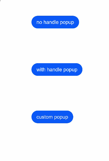
build() {
Flex({ direction: FlexDirection.Column }) {
Button('no handle popup')
.onClick(() => {
this.noHandlePopup = !this.noHandlePopup
})
.bindPopup(this.noHandlePopup, {
message: 'content1 content1',
placementOnTop: false,
onStateChange: (e) => {
console.info(e.isVisible.toString())
if (!e.isVisible) {
this.noHandlePopup = false
}
}
})
.position({ x: 100, y: 50 })
Button('with handle popup')
.onClick(() => {
this.handlePopup = !this.handlePopup
})
.bindPopup(this.handlePopup, {
message: 'content2 content2',
placementOnTop: true,
primaryButton: {
value: 'ok',
action: () => {
this.handlePopup = !this.handlePopup
console.info('secondaryButton click')
}
},
onStateChange: (e) => {
console.info(e.isVisible.toString())
}
})
.position({ x: 100, y: 200 })
Button('custom popup')
.onClick(() => {
this.customPopup = !this.customPopup
})
.bindPopup(this.customPopup, {
builder: this.popupBuilder,
placement: Placement.Bottom,
maskColor: 0x33000000,
popupColor: Color.White,
enableArrow: true,
onStateChange: (e) => {
if (!e.isVisible) {
this.customPopup = false
}
}
})
.position({ x: 100, y: 350 })
}.width('100%').padding({ top: 5 })
}
}