panel
The <panel> component is a slidable panel. It provides a lightweight content display window with flexible sizes. The <panel> component pops up when it is displayed.
Child Components
Yes
Attributes
In addition to the attributes in Universal Attributes, the following attributes are supported.
| Name | Type | Default Value | Mandatory | Triggered when |
|---|---|---|---|---|
| type | string | foldable | Yes | Type of the slidable panel. This attribute cannot be dynamically changed. Available values are as follows: - minibar: A minibar panel displays content in the minibar area or a large (fullscreen-like) area. - foldable: A foldable panel displays permanent content in a large (fullscreen-like), medium-sized (halfscreen-like), or small area. - temporary: A temporary panel displays content in a large (fullscreen-like) or medium-sized (halfscreen-like) area. |
| mode | string | full | No | Initial status of the slidable panel. Available values are as follows: - mini: Displays a minibar or foldable panel in its minimum size. This attribute does not take effect for temporary panels. - half: Displays a foldable or temporary panel in a medium-sized (halfscreen-like) area. This attribute does not take effect for minibar panels. - full: Displays a panel in a large (fullscreen-like) area. |
| dragbar | boolean | true | No | Whether to enable a drag bar. The value true indicates that the drag bar will be displayed, and false indicates the opposite. |
| fullheight | <length> | - | No | Panel height in the full mode. The default value is the screen height minus 8 px. |
| halfheight | <length> | - | No | Panel height in the half mode. The default value is half of the screen height. |
| miniheight | <length> | - | No | Panel height in the mini mode. The default value is 48px. |
NOTE:
- Rendering attributes, including for, if, and show, are not supported.
- The focusable and disabled attributes are not supported.
Styles
Only the following style attributes are supported.
| Name | Type | Default Value | Mandatory | Triggered when |
|---|---|---|---|---|
| padding | <length> | 0 | No | The attribute can have one to four values: - If you set only one value, it specifies the padding for four sides. - If you set two values, the first value specifies the top and bottom padding, and the second value specifies the left and right padding. - If you set three values, the first value specifies the top padding, the second value specifies the left and right padding, and the third value specifies the bottom padding. - If you set four values, they respectively specify the padding for top, right, bottom, and left sides (in clockwise order). |
| padding-[left|top|right|bottom] | <length> | 0 | No | Left, top, right, and bottom padding. |
| padding-[start|end] | <length> | 0 | No | Start and end padding. |
| margin | <length> | 0 | No | Shorthand attribute to set margins for all sides in a declaration. The attribute can have one to four values: - If you set only one value, it specifies the margin for all the four sides. - If you set two values, the first value is for the top and bottom sides and the second value for the left and right sides. - If you set three values, the first value is for the top, the second value for the left and right, and the third value for the bottom. - If you set four values, they are margins for top, right, bottom, and left sides, respectively. |
| margin-[left|top|right|bottom] | <length> | 0 | No | Left, top, right, and bottom margins. |
| margin-[start|end] | <length> | 0 | No | Start and end margins. |
| border | - | 0 | No | Shorthand attribute to set all borders. Set border-width, border-style, and border-color in sequence. Default values are used for attributes that are not set. |
| border-style | string | solid | No | Shorthand attribute to set the style for all borders. Available values are as follows: - dotted: dotted border. The radius of a dot is half of border-width. - dashed: dashed border - solid: solid border |
| border-[left|top|right|bottom]-style | string | solid | No | Styles of the left, top, right, and bottom borders. The available values are dotted, dashed, and solid. |
| border-[left|top|right|bottom] | - | - | No | Shorthand attribute to set the borders for every side respectively. You set border-width, border-style, and border-color in sequence. Default values are used for attributes that are not set. |
| border-width | <length> | 0 | No | Shorthand attribute to set the width of all borders, or separately set the width of each border. |
| border-[left|top|right|bottom]-width | <length> | 0 | No | Attribute to set widths of left, top, right, and bottom borders. |
| border-color | <color> | black | No | Shorthand attribute to set the color of all borders, or separately set the color of each border. |
| border-[left|top|right|bottom]-color | <color> | black | No | Attribute to set colors of left, top, right, and bottom borders. |
| border-radius | <length> | - | No | Attribute to set the radius of round-corner borders. This attribute cannot be used to set the width or color of a specific border. To set the width or color, you need to set border-width or border-color for all the borders at the same time. |
| border-[top|bottom]-[left|right]-radius | <length> | - | No | Attribute to receptively set the radii of upper-left, upper-right, lower-right, and lower-left rounded corners |
| background | <linear-gradient> | - | No | This attribute supports Gradient Styles only but is not compatible with background-color or background-image. |
| background-color | <color> | - | No | Background color. |
| background-image | string | - | No | Background image. Currently, this attribute is not compatible with background-color or background. Local image resources are supported. |
| background-size | - string - <length> <length> - <percentage> <percentage> |
auto | No | Background image size. - The string values are as follows: - contain: Expands the image to the maximum size so that the height and width of the image are applicable to the content area. - cover: Extends the background image to a large enough size so that the background image completely covers the background area. Some parts of the image may not be displayed in the background area. - auto: The original image width-height ratio is retained. - The two <length> values are as follows:Width and height of the background image. The first value indicates the width, and the second value indicates the height. If you only set one value, the other value is set to auto by default. - The two <percentage> values are as follows:Width and height of the background image in percentage of the parent element. The first value indicates the width, and the second value indicates the height. If you only set one value, the other value is set to auto by default. |
| background-repeat | string | repeat | No | Repeating attribute of a background image. By default, a background image is repeated both horizontally and vertically. - repeat: Repeatedly draws images along the x-axis and y-axis at the same time. - repeat-x: Repeatedly draws images along the x-axis. - repeat-y: Repeatedly draws images along the y-axis. - no-repeat: The image is not drawn repeatedly. |
| background-position | - string string - <length> <length> - <percentage> <percentage> |
0px 0px | No | - Using keywords: If only one keyword is specified, the other value is center by default. The two values define the horizontal position and vertical position, respectively. - left: leftmost in the horizontal direction - right: rightmost in the horizontal direction - top: top in the vertical direction - bottom: bottom in the vertical direction - center: center position - Using <length>: The first value indicates the horizontal position, and the second value indicates the vertical position. 0 0 indicates the upper left corner. The unit is pixel. If only one value is specified, the other one is 50%. - Using <percentage>: The first value indicates the horizontal position, and the second value indicates the vertical position. 0% 0% indicates the upper left corner. 100% 100% indicates the lower right corner. If only one value is specified, the other one is 50%. - Using both <percentage> and <length>. |
| opacity | number | 1 | No | Opacity of an element. The value ranges from 0 to 1. The value 1 means opaque, and 0 means completely transparent. |
Events
The following events are supported.
| Name | Parameter | Triggered when |
|---|---|---|
| sizechange | { size: { height: heightLength, width: widthLength }, mode: modeStr } | Triggered when the status of the slidable panel changes. Available mode values are as follows: - mini: Displays a minibar or foldable panel in its minimum size. - half: Displays a foldable panel in a medium-sized (halfscreen-like) area. - full: Displays a panel in a large (fullscreen-like) area.NOTE:The returned height value indicates the content area height. However, when the dragbar attribute is true, the height value is the height of the drag bar plus that of the content area. |
Methods
Only the following methods are supported.
| Name | Parameter | Triggered when |
|---|---|---|
| show | - | Pops the slidable panel up. |
| close | - | Closes the slidable panel that has been popped up. |
Example
<!-- xxx.hml -->
<div class="doc-page">
<div class="btn-div">
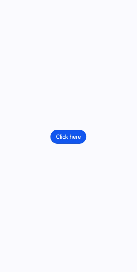
<button type="capsule" value="Click here" onclick="showPanel"></button>
</div>
<panel id="simplepanel" type="foldable" mode="half" onsizechange="changeMode" miniheight="200px">
<div class="panel-div">
<div class="inner-txt">
<text class="txt">Simple panel in {{modeFlag}} mode</text>
</div>
<div class="inner-btn">
<button type="capsule" value="Close" onclick="closePanel"></button>
</div>
</div>
</panel>
</div>
/* xxx.css */
.doc-page {
flex-direction: column;
justify-content: center;
align-items: center;
}
.btn-div {
width: 100%;
height: 200px;
flex-direction: column;
align-items: center;
justify-content: center;
}
.txt {
color: #000000;
font-weight: bold;
font-size: 39px;
}
.panel-div {
width: 100%;
flex-direction: column;
align-items: center;
}
.inner-txt {
width: 100%;
height: 160px;
flex-direction: column;
align-items: center;
justify-content: center;
}
.inner-btn {
width: 100%;
height: 120px;
justify-content: center;
align-items: center;
}
// xxx.js
export default {
data: {
modeFlag: "half"
},
showPanel() {
this.$element('simplepanel').show()
},
closePanel() {
this.$element('simplepanel').close()
},
changeMode(e) {
this.modeFlag = e.mode
}
}