QRCode
NOTE This component is supported since API version 7. Updates will be marked with a superscript to indicate their earliest API version.
The <QRCode> component is used to display QR code information.
Required Permissions
None
Child Components
None
APIs
QRCode(value: string)
- Parameters
| Name | Type | Mandatory | Default Value | Description |
|---|---|---|---|---|
| value | string | Yes | - | QR code content string. |
Attributes
| Name | Type | Default Value | Description |
|---|---|---|---|
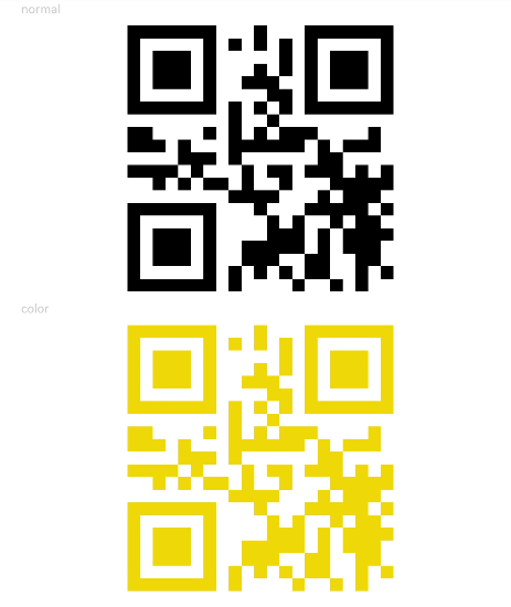
| color | Color | Black | QR code color. |
Events
Among all the universal events, only the click event is supported.
Example
@Entry
@Component
struct QRCodeExample {
  private value: string = 'hello world'

  build() {
    Column({ space: 5 }) {
      Text('normal').fontSize(9).width('90%').fontColor(0xCCCCCC)
      QRCode(this.value).width(200).height(200)

      Text('color').fontSize(9).width('90%').fontColor(0xCCCCCC)
      QRCode(this.value).color(0xF7CE00).width(200).height(200)
    }.width('100%').margin({ top: 5 })
  }
}