Badge
说明:
该组件从API Version 7开始支持。后续版本如有新增内容,则采用上角标单独标记该内容的起始版本。
新事件标记组件,在组件上提供事件信息展示能力。
权限列表
无
子组件
支持单个子组件。
接口
方法1:Badge(value: {count: number, position?: BadgePosition, maxCount?: number, style: BadgeStyle})
创建数字标记组件。
参数:
| 参数名 | 参数类型 | 必填 | 默认值 | 参数描述 |
|---|---|---|---|---|
| count | number | 是 | - | 设置提醒消息数。 |
| position | BadgePosition | 否 | BadgePosition.RightTop | 设置提示点显示位置。 |
| maxCount | number | 否 | 99 | 最大消息数,超过最大消息时仅显示maxCount+。 |
| style | BadgeStyle | 是 | - | Badge组件可设置样式,支持设置文本颜色、尺寸、圆点颜色和尺寸。 |
方法2: Badge(value: {value: string, position?: BadgePosition, style: BadgeStyle})
根据字符串创建标记组件。
参数:
| 参数名 | 参数类型 | 必填 | 默认值 | 参数描述 |
|---|---|---|---|---|
| value | string | 是 | - | 提示内容的文本字符串。 |
| position | BadgePosition | 否 | BadgePosition.RightTop | 设置提示点显示位置。 |
| style | BadgeStyle | 是 | - | Badge组件可设置样式,支持设置文本颜色、尺寸、圆点颜色和尺寸。 |
BadgeStyle对象说明
| 名称 | 类型 | 必填 | 默认值 | 描述 |
|---|---|---|---|---|
| color | ResourceColor | 否 | Color.White | 文本颜色。 |
| fontSize | number | string | 否 | 10 | 文本大小。 |
| badgeSize | number | string | 否 | - | badge的大小。 |
| badgeColor | ResourceColor | 否 | Color.Red | badge的颜色。 |
BadgePosition枚举说明
| 名称 | 描述 |
|---|---|
| RightTop | 圆点显示在右上角。 |
| Right | 圆点显示在右侧纵向居中。 |
| Left | 圆点显示在左侧纵向居中。 |
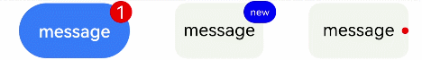
示例
// xxx.ets
@Entry
@Component
struct BadgeExample {
  @State counts: number = 1
  @State message: string = 'new'

  build() {
    Flex({ justifyContent: FlexAlign.SpaceAround }) {
      Badge({
        count: this.counts,
        maxCount: 99,
        style: { color: 0xFFFFFF, fontSize: 16, badgeSize: 20, badgeColor: Color.Red }
      }) {
        Button('message')
          .onClick(() => {
            this.counts++
          })
          .width(100).height(50).backgroundColor(0x317aff)
      }.width(100).height(50)

      Badge({
        value: this.message,
        style: { color: 0xFFFFFF, fontSize: 9, badgeSize: 20, badgeColor: Color.Blue }
      }) {
        Text('message')
          .width(80).height(50).fontSize(16).lineHeight(37)
          .borderRadius(10).textAlign(TextAlign.Center).backgroundColor(0xF3F4ED)
      }.width(80).height(50)

      Badge({
        value: '',
        position: 1,
        style: { badgeSize: 6, badgeColor: Color.Red }
      }) {
        Text('message')
          .width(90).height(50).fontSize(16).lineHeight(37)
          .borderRadius(10).textAlign(TextAlign.Center).backgroundColor(0xF3F4ED)
      }.width(90).height(50)
    }.width('100%').margin({ top: 5 })
  }
}