label
The <label> component defines labels for the <input>, <button>, and <textarea> components. When a label is clicked, the click effect of the component associated with the label will be triggered.
Required Permissions
None
Child Component
Not supported
Attributes
In addition to the attributes in Universal Attributes, the following attributes are supported.
| Name | Type | Default Value | Mandatory | Description |
|---|---|---|---|---|
| target | string | - | No | Attribute ID of the target component. |
Styles
In addition to the styles in Universal Styles, the following styles are supported.
| Name | Type | Default Value | Mandatory | Description |
|---|---|---|---|---|
| color | <color> | #e5000000 | No | Text color. |
| font-size | <length> | 30px | No | Font size (px). |
| allow-scale | boolean | true | No | Whether the text size changes with the system's font size settings.NOTE:For details about how to make the configuration take effect dynamically, see the config-changes attribute in the config.json file. |
| letter-spacing | <length> | 0px | No | Character spacing (px). |
| font-style | string | normal | No | Font style. Available values are as follows: -normal: standard font style -italic: italic font style |
| font-weight | number | string | normal | No | Font width. For the number type, the value ranges from 100 to 900. The default value is 400. A larger value indicates a larger font width.NOTE:The value must be an integer multiple of 100.The value of the string type can be lighter, normal, bold, or bolder. |
| text-decoration | string | none | No | Text decoration. Available values are as follows: -underline: An underline is used. -line-through: A strikethrough is used. -none: The standard text is used. |
| text-align | string | start | No | Text alignment mode. Available values are as follows: -left: The text is left-aligned. -center: The text is center-aligned. -right: The text is right-aligned. -start: The text is aligned with the direction in which the text is written. -end: The text is aligned with the opposite direction in which the text is written.NOTE:If the text width is not specified, the alignment effect may not be obvious when the text width is the same as the width of the parent container. |
| line-height | <length> | 0px | No | Text line height. When this parameter is set to 0px, the text line height is not limited and the font size is adaptive. |
| text-overflow | string | clip | No | Takes effect when the maximum number of lines is specified. Available values are as follows: -clip: The text is clipped and displayed based on the size of the parent container. -ellipsis: The text is displayed based on the size of the parent container. The text that cannot be displayed is replaced with ellipsis. This style must be used together with max-lines. |
| font-family | string | sans-serif | No | Font family, in which fonts are separated by commas (,). Each font is set using a font name or font family name. The first font that exists in the system or the font specified by Custom Font Styles in the family is selected as the font for the text. |
| max-lines | number | - | No | Maximum number of lines in the text. |
| min-font-size | <length> | - | No | Minimum font size in the text. This style must be used together with max-font-size. The font size can be changed dynamically. After the maximum and minimum font sizes are set, font-size does not take effect. |
| max-font-size | <length> | - | No | Maximum font size in the text. This style must be used together with min-font-size. The font size can be changed dynamically. After the maximum and minimum font sizes are set, font-size does not take effect. |
| font-size-step | <length> | 1px | No | Step for dynamically adjusting the font size in the text. The minimum and maximum font sizes must be set. |
| prefer-font-sizes | <array> | - | No | Preset preferred font sizes. For dynamic font size adjustment, the preset sizes are used to match the maximum number of lines in the text. If the preferred font sizes were not set, the font size will be adjusted based on the maximum and minimum font sizes and the step you have set. If the maximum number of lines in the text cannot be met, text-overflow is used to truncate the text. If this parameter is set, font-size, max-font-size, min-font-size, and font-size-step do not take effect.Example values: 12px,14px,16px |
Events
Not supported
Methods
Not supported
Example Code
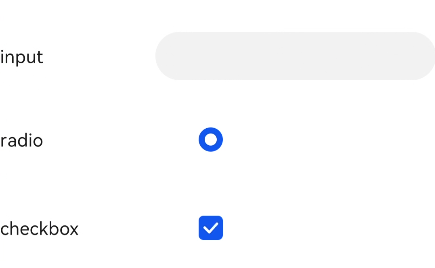
<!--xxx.hml -->
<div class="container">
  <div class="row">
    <label class="label" target="textId">input</label>
    <input class="input" id="textId" type="text"></input>
  </div>
  <div class="row">
    <label class="label" target="radioId">radio</label>
    <input class="input" id="radioId" type="radio" name="group" value="group"></input>
  </div>
  <div class="row">
    <label class="label" target="checkboxId">checkbox</label>
    <input class="input" id="checkboxId" type="checkbox"></input>
  </div>
</div>
/*xxx.css */
.container {
  flex-direction: column;
  align-items: center;
}
.row {
  flex-direction: row;
}
.label {
  width: 200px;
  margin-top: 50px;
}
.input {
  margin-left: 100px;
  margin-top: 50px;
}