Universal Methods
After a component is assigned the id attribute, you can use the ID to obtain the component objects and call functions.
animate
animate( keyframes: Keyframes, options: Options): void
- Name
| Name | Type | Mandatory | Description |
|---|---|---|---|
| keyframes | keyframes | Yes | Sets the animation style. |
| options | Options | Yes | Array of objects used to set animation attributes. For details, see Options. |
Table 1 keyframes
| Attribute | Type | Description |
|---|---|---|
| frames | Array<Style> | Array of objects used to set animation attributes. For details about style attributes, see Style attributes. |
Table 2 Style attributes
| Name | Type | Default Value | Description |
|---|---|---|---|
| width | number | - | Width set for the component during playback of the animation. |
| height | number | - | Height set for the component during playback of the animation. |
| backgroundColor | <color> | none | Background color set for the component during playback of the animation. |
| opacity | number | 1 | Opacity set for the component. The value ranges from 0 to 1. |
| backgroundPosition | string | - | The value format is x y, in percentage or pixels. The first value indicates the horizontal position, and the second value indicates the vertical position. If only one value is specified, the other value is 50% by default. |
| transformOrigin | string | 'center center' | Origin position of the transformed element. The first value indicates the x-axis position. The value can be left, center, right, a length, or a percentage. The second value indicates the y-axis position. The value can be top, center, bottom, a length, or a percentage. |
| transform | Transform | - | Transformation type set for a transformed element. |
| offset | number | - | The value of offset must be within (0.0,1.0] and sorted in ascending order if it is provided. If there are only two frames, offset can be left empty. If there are more than two frames, offset is mandatory. |
Table 3 Options description
| Name | Type | Default Value | Description |
|---|---|---|---|
| duration | number | 0 | Duration for playing the animation, in milliseconds. |
| easing | string | linear | Time curve of the animation. For details about the supported types, see Available values of the easing attribute. |
| delay | number | 0 | Delay for the animation start. The default value indicates no delay. |
| iterations | number | string | 1 | Number of times the animation will be played. number indicates a fixed number of playback operations, and Infinity indicates an unlimited number of playback operations. |
| direction6+ | string | normal | Mode of playing the animation. - normal: Plays the animation in forward loop mode. - reverse: Plays the animation in reverse loop mode. - alternate: Plays the animation in alternating loop mode. When the animation is played for an odd number of times, the playback is in forward direction. When the animation is played for an even number of times, the playback is in backward direction. - alternate-reverse: Plays the animation in reverse-alternating loop mode. When the animation is played for an odd number of times, the playback is in backward direction. When the animation is played for an even number of times, the playback is in forward direction. |
| fill | string | none | Start and end styles of the animation. - none: No style is applied to the target before or after the animation is executed. - forwards: The target keeps the state at the end of the animation (defined in the last key frame) after the animation is executed. - backwards6+: The animation uses the value defined in the first key frame during the animation-delay. When animation-direction is set to normal or alternate, the value in the from key frame is used. When animation-direction is set to reverse or alternate-reverse, the value in the to key frame is used. - both6+: The animation follows the forwards and backwards rules. |
Table 4 Available values of the easing attribute
| Type | Description |
|---|---|
| linear | The animation speed keeps unchanged. |
| ease-in | The animation starts at a low speed. cubic-bezier(0.42, 0.0, 1.0, 1.0). |
| ease-out | The animation ends at a low speed. cubic-bezier(0.0, 0.0, 0.58, 1.0). |
| ease-in-out | The animation starts and ends at a low speed. cubic-bezier(0.42, 0.0, 0.58, 1.0). |
| friction | Damping curve, cubic-bezier(0.2, 0.0, 0.2, 1.0). |
| extreme-deceleration | Extreme deceleration curve, cubic-bezier(0.0, 0.0, 0.0, 1.0). |
| sharp | Sharp curve, cubic-bezier(0.33, 0.0, 0.67, 1.0). |
| rhythm | Rhythm curve, cubic-bezier(0.7, 0.0, 0.2, 1.0). |
| smooth | Smooth curve, cubic-bezier(0.4, 0.0, 0.4, 1.0). |
| cubic-bezier(x1, y1, x2, y2) | You can customize an animation speed curve in the cubic-bezier() function. The x and y values of each input parameter must be between 0 and 1. |
| steps(number, step-position)6+ | Step curve. The number must be set and only an integer is supported. step-position is optional. It can be set to start or end. The default value is end. |
-
Return values
The animation attributes are as follows.
| Attribute | Type | Description |
|---|---|---|
| finished | boolean | Read-only attribute, which indicates whether the animation playback is complete. |
| pending | boolean | Read-only attribute, which indicates whether the animation is waiting for the completion of other asynchronous operations (for example, start an animation with a delay). |
| playState | string | Read-write attribute, which indicates the playback status of the animation: - idle: The animation is not running (playback ended or not started). - running: The animation is running. - paused: The animation is paused. - finished: Animation playback ends. |
| startTime | number | Read-write attribute, which indicates the animation start time. This attribute is similar to delay in the options attribute. |
Methods for animation
| Method | Parameter | Description |
|---|---|---|
| play | - | Plays the animation. |
| finish | - | Ends the animation. |
| pause | - | Pauses the animation. |
| cancel | - | Cancels the animation. |
| reverse | - | Plays the animation in reverse. |
Events for animation
| Event | Description |
|---|---|
| start6+ | The animation starts. |
| cancel | The animation is forcibly canceled. |
| finish | The animation playback is complete. |
| repeat | The animation repeats. |
-
Example
<!-- xxx.hml -->
<div class="container">
  <div id="idName" class="box"></div>
  <div class="buttonBox">
    <button @click="start">
      start
    </button>
    <button @click="cancel">
      cancels
    </button>
  </div>
</div>
/* xxx.css */ .container { flex-direction: column; justify-content: center; align-items: center; width: 100%; } .box{ width: 200px; height: 200px; background-color: #ff0000; margin-top: 30px; } .buttonBox{ margin-top: 30px; width: 250px; justify-content: space-between; } button{ background-color: #8e8b89; color: white; width: 100px; height: 40px; font-size: 24px; }// xxx.js import prompt from '@system.prompt'; export default{ data:{ animation:'', }, onInit(){ }, onShow(){ var options = { duration: 1500, easing: 'friction', delay: 500, fill: 'forwards', iterations: 2, direction: 'normal', }; var frames = [ {transform: {translate: '-120px -0px'}, opacity: 0.1, offset: 0.0}, {transform: {translate: '120px 0px'}, opacity: 1.0, offset: 1.0} ]; this.animation = this.$element('idName').animate(frames, options); // handle finish event this.animation.onfinish = function(){ prompt.showToast({ message: "The animation is finished." }); }; // handle cancel event this.animation.oncancel = function(){ prompt.showToast({ message: "The animation is canceled." }); }; // handle repeat event this.animation.onrepeat = function(){ prompt.showToast({ message: "The animation is repeated." }); }; }, start(){ this.animation.play(); }, cancel(){ this.animation.cancel(); } }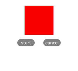
getBoundingClientRect
getBoundingClientRect(): <Rect>
Obtains the size of the element and its position relative to the window.
-
Return values
Table 5 Rect attributes6+
| Attribute | Type | Description |
|---|---|---|
| width | number | Width of an element. |
| height | number | Height of an element. |
| left | number | Offset between the left boundary of the element and the window. |
| top | number | Offset between the upper boundary of the element and the window. |
-
Example
// xxx.js
var rect = this.$element('id').getBoundingClientRect();
console.info(`current element position is ${rect.left}, ${rect.top}`);
createIntersectionObserver
createIntersectionObserver(param?: ObserverParam):Observer
Gets notified of the visibility of an element on the current page.
- Name
| Name | Type | Mandatory | Description |
|---|---|---|---|
| param | ObserverParam | - | Obtains the observer callback. |
Table 6 ObserverParam attributes6+
| Attribute | Type | Description |
|---|---|---|
| ratios | Array<number> | When the component is out of the range or is less than the range, the observer callback is triggered. |
-
Return values
Table 7 Methods supported by the Observer object6+
| Name | Parameter | Description |
|---|---|---|
| observe | callback: function | Subscribes to events of the observed object. The callback method is called when the value is greater than or less than the threshold. |
| unobserve | - | Unsubscribes from events of the observed object. |
-
Example
// xxx.js
let observer = this.$element('broad').createIntersectionObserver({
  ratios: [0.2, 0.5], // number
});

observer.observe((isVisible, ratio)=> {
    console.info('this element is ' + isVisible + 'ratio is ' + ratio)
})

observer.unobserve()