AlphabetIndexer
NOTE This component is supported since API version 7. Updates will be marked with a superscript to indicate their earliest API version.
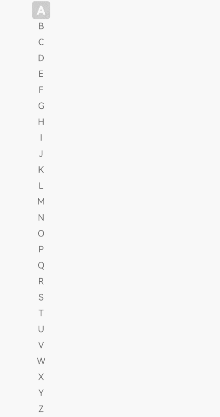
The <AlphabetIndexer> component provides an alphabetic index bar.
Required Permissions
None
Child Components
None
APIs
AlphabetIndexer(value: {arrayValue : Array<string>, selected : number})
- Parameters
| Name | Type | Mandatory | Default Value | Description |
|---|---|---|---|---|
| arrayValue | Array<string> | Yes | - | Array of strings to be displayed in the alphabetic index bar. |
| selected | number | Yes | - | ID of a selected item. |
Attributes
| Name | Type | Description |
|---|---|---|
| selectedColor | Color | Font color of the selected text. |
| popupColor | Color | Font color of the pop-up text. |
| selectedBackgroundColor | Color | Background color of the selected text. |
| popupBackground | Color | Background color of the pop-up text. |
| usingPopup | boolean | Whether to use pop-up text. |
| selectedFont | { size?: number, weight?: FontWeight, family?: string, style?: FontStyle } |
Font style of the selected text. |
| popupFont | { size?: number, weight?: FontWeight, family?: string, style?: FontStyle } |
Font style of the pop-up text. |
| font | { size?: number, weight?: FontWeight, family?: string, style?: FontStyle } |
Default font style of the alphabetic index bar. |
| itemSize | Length | Size of an item in the alphabetic index bar. The item is a square, and the side length needs to be set. |
| alignStyle | IndexerAlign | Alignment style of the alphabetic index bar. Left alignment and right alignment are supported. The alignment style affects the position of the pop-up window. |
- IndexerAlign enums
| Name | Description |
|---|---|
| Left | The pop-up window is displayed on the right of the alphabetic indexer bar. |
| Right | The pop-up window is displayed on the left of the alphabetic indexer bar. |
Events
| Name | Description |
|---|---|
| onSelected(index: number) => void(deprecated) | Invoked when an item in the alphabetic indexer bar is selected. |
| onSelect(index: number) => void8+ | Invoked when an item in the alphabetic indexer bar is selected. |
| onRequestPopupData(callback: (index: number) => Array<string>)8+ | Invoked when a request for displaying content in the index prompt window is sent when an item in the alphabetic indexer bar is selected. The return value is a string array corresponding to the indexes. The string array is displayed vertically in the pop-up window. It can display up to five strings at a time and allows scrolling. |
| onPopupSelect(callback: (index: number) => void)8+ | Invoked when an item in the index pop-up window is selected. |
Example
@Entry
@Component
struct AlphabetIndexerSample {
  private value: string[] = ['A', 'B', 'C', 'D', 'E', 'F', 'G', 'H', 'I', 'J', 'K', 'L', 'M', 'N', 'O', 'P', 'Q', 'R', 'S', 'T', 'U', 'V', 'W', 'X', 'Y', 'Z']

  build() {
    AlphabetIndexer({ arrayValue: this.value, selected: 0 })
      .selectedColor(0xffffff) // Font color of the selected text
      .popupColor(0xFFFAF0) // Font color of the pop-up text
      .selectedBackgroundColor(0xCCCCCC) // Background color of the selected text
      .popupBackground(0xD2B48C) // Background color of the pop-up text
      .usingPopup(true) // Whether to use pop-up text
      .selectedFont({ size: 16, weight: FontWeight.Bolder }) // Font style of the selected text
      .popupFont({ size: 30, weight: FontWeight.Bolder }) // Font style of the pop-up text
      .itemSize(28) // Size of each item (square)
      .alignStyle(IndexerAlign.Left) // Left aligned
      .onSelect((index: number) => {
        console.info(this.value[index] + 'Selected') // Event indicating that an item is selected
      })
      .margin({ left: 50 })
  }
}