search
The <search> component provides an input area for users to search.
Child Components
Not supported
Attributes
In addition to the attributes in Universal Attributes, the following attributes are supported.
| Name | Type | Default Value | Mandatory | Description |
|---|---|---|---|---|
| icon | string | - | No | Search icon. By default, the system search icon is used. The supported icon format is SVG, JPG, and PNG. |
| hint | string | - | No | Hint text. |
| value | string | - | No | Text in the search box. |
| searchbutton5+ | string | - | No | Text on the search button at the end of the search box. |
| menuoptions5+ | Array<MenuOption> | - | No | Menu options displayed after users click the More button in the pop menu. |
Table 1 MenuOption5+
| Name | Type | Description |
|---|---|---|
| icon | string | Path of the icon for a menu option. |
| content | string | Text content in a menu option. |
Styles
In addition to the styles in Universal Styles, the following styles are supported.
| Name | Type | Default Value | Mandatory | Description |
|---|---|---|---|---|
| color | <color> | #e6000000 | No | Font color of the search box. |
| font-size | <length> | 16px | No | Font size of the search box. |
| allow-scale | boolean | true | No | Whether the font size changes with the system's font size settings. NOTE: If the config-changes tag of fontSize is configured for abilities in the config.json file, the setting takes effect without application restart. |
| placeholder-color | <color> | #99000000 | No | Color of the hint text. |
| font-weight | number | string | normal | No | Font weight. For details, see font-weight of the text component. |
| font-family | string | sans-serif | No | Font family, in which fonts are separated by commas (,). Each font is set using a font name or font family name. The first font that exists in the system or the font specified by Custom Font Styles in the family is selected as the font for the text. |
| caret-color6+ | <color> | - | No | Color of the input cursor. |
Events
In addition to the events in Universal Events, the following events are supported.
| Name | Parameter | Description |
|---|---|---|
| change | { text:newText } | Triggered when the content entered in the text box changes. NOTE: If you change the value attribute directly, this event will not be triggered. |
| submit | { text:submitText } | Triggered when users click the search icon or the search button5+, or tap the search button on a soft keyboard. |
| translate5+ | { value: selectedText } | Triggered when users click the translate button in the pop menu displayed after they select a text segment. The selected text content is returned. |
| share5+ | { value: selectedText } | Triggered when users click the share button in the pop menu displayed after they select a text segment. The selected text content is returned. |
| search5+ | { value: selectedText } | Triggered when users click the search button in the pop menu displayed after they select a text segment. The selected text content is returned. |
| optionselect5+ | { index:optionIndex, value: selectedText } | Triggered when users click a menu option in the pop menu displayed after they select a text segment. This event is valid only when the menuoptions attribute is set. The option index and selected text content are returned. |
Methods
Methods in Universal Methods are supported.
Example Code
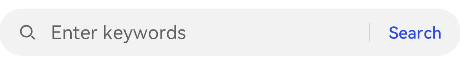
<!-- xxx.hml -->
<div class="container">
  <search hint="Enter keywords" searchbutton="Search" @search="search">
  </search>
</div>
/* xxx.css */
.container {
  display: flex;
  justify-content: center;
  align-items: center;
}