Stack
NOTE This component is supported since API version 7. Updates will be marked with a superscript to indicate their earliest API version.
The <Stack> component provides a stack container where child components are successively stacked and the latter one overwrites the previous one.
Required Permissions
None
Child Components
Supported
APIs
Stack(value:{alignContent?: Alignment})
- Parameters
| Name | Type | Mandatory | Default Value | Description |
|---|---|---|---|---|
| alignContent | Alignment | No | Center | Alignment of child components in the container. |
Example
@Entry
@Component
struct StackExample {
build() {
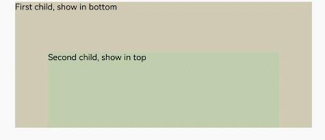
Stack({ alignContent: Alignment.Bottom }) {
Text('First child, show in bottom').width('90%').height('100%').backgroundColor(0xd2cab3).align(Alignment.Top)
Text('Second child, show in top').width('70%').height('60%').backgroundColor(0xc1cbac).align(Alignment.Top)
}.width('100%').height(150).margin({ top: 5 })
}
}