Button
NOTE
This component is supported since API version 7. Updates will be marked with a superscript to indicate their earliest API version.
The <Button> component represents a component that can trigger actions.
Required Permissions
None
Child Components
Supported
APIs
-
Button(options?: {type?: ButtonType, stateEffect?: boolean})
Table 1 options parameters
| Name | Type | Mandatory | Default Value | Description |
|---|---|---|---|---|
| type | ButtonType | No | Capsule | Button type. |
| stateEffect | boolean | No | true | Whether to enable the state switchover effect when a button is pressed. When the state is set to false, the state switchover effect is disabled. |
-
Button(label?: string, options?: { type?: ButtonType, stateEffect?: boolean })
Creates a button component based on text content. In this case, the <Button> component cannot contain child components.
Table 2 value parameters
| Name | Type | Mandatory | Default Value | Description |
|---|---|---|---|---|
| label | string | No | - | Button text. |
| options | Object | No | - | For details, see the options parameters. |
Attributes
| Name | Type | Default Value | Description |
|---|---|---|---|
| type | ButtonType | Capsule | Button type. |
| stateEffect | boolean | true | Whether to enable the state switchover effect. When the state is set to false, the state switchover effect is disabled. |
- ButtonType enums
| Name | Description |
|---|---|
| Capsule | Capsule-type button (the round corner is half of the height by default). |
| Circle | Circle button. |
| Normal | Normal button (without rounded corners by default). |
NOTE
- The rounded corner of a button is set by using Border. (The rounded corner cannot be set by using a border API.)
- When the button type is Capsule, the borderRadius settings do not take effect, and the rounded corner of the button is always half of the button height.
- When the button type is Circle, the value of borderRadius is used as the button radius. If borderRadius is not set, the button radius is half of the width or height, whichever is smaller.
- The button text is set using the common text style.
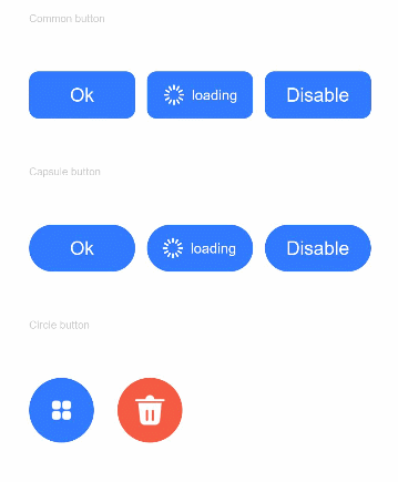
Example
@Entry
@Component
struct ButtonExample {
  build() {
    Flex({ direction: FlexDirection.Column, alignItems: ItemAlign.Start, justifyContent: FlexAlign.SpaceBetween }) {
      Text('Common button').fontSize(9).fontColor(0xCCCCCC)
      Flex({ alignItems: ItemAlign.Center, justifyContent: FlexAlign.SpaceBetween }) {
        Button('Ok', { type: ButtonType.Normal, stateEffect: true }).borderRadius(8).backgroundColor(0x317aff).width(90)
        Button({ type: ButtonType.Normal, stateEffect: true }) {
          Row() {
            Image($r('app.media.loading')).width(20).height(20).margin({ left: 12 })
            Text('loading').fontSize(12).fontColor(0xffffff).margin({ left: 5, right: 12 })
          }.alignItems(VerticalAlign.Center)
        }.borderRadius(8).backgroundColor(0x317aff).width(90)
        Button('Disable', { type: ButtonType.Normal, stateEffect: false }).opacity(0.5)
          .borderRadius(8).backgroundColor(0x317aff).width(90)
      }

      Text('Capsule button').fontSize(9).fontColor(0xCCCCCC)
      Flex({ alignItems: ItemAlign.Center, justifyContent: FlexAlign.SpaceBetween }) {
        Button('Ok', { type: ButtonType.Capsule, stateEffect: true }).backgroundColor(0x317aff).width(90)
        Button({ type: ButtonType.Capsule, stateEffect: true }) {
          Row() {
            Image($r('app.media.loading')).width(20).height(20).margin({ left: 12 })
            Text('loading').fontSize(12).fontColor(0xffffff).margin({ left: 5, right: 12 })
          }.alignItems(VerticalAlign.Center).width(90)
        }.backgroundColor(0x317aff)
        .onClick((event: ClickEvent) => {
          AlertDialog.show({ message: 'The login is successful' })
        })
        Button('Disable', { type: ButtonType.Capsule, stateEffect: false }).opacity(0.5)
          .backgroundColor(0x317aff).width(90)
      }

      Text('Circle button').fontSize(9).fontColor(0xCCCCCC)
      Flex({ alignItems: ItemAlign.Center, wrap: FlexWrap.Wrap }) {
        Button({ type: ButtonType.Circle, stateEffect: true }) {
          Image($r('app.media.ic_public_app_filled')).width(20).height(20)
        }.width(55).height(55).backgroundColor(0x317aff)
        Button({ type: ButtonType.Circle, stateEffect: true }) {
          Image($r('app.media.ic_public_delete_filled')).width(30).height(30)
        }.width(55).height(55).margin({ left: 20 }).backgroundColor(0xF55A42)
      }
    }.height(400).padding({ left: 35, right: 35, top: 35 })
  }
}