Grid
NOTE
This component is supported since API version 7. Updates will be marked with a superscript to indicate their earliest API version.
The <Grid> component consists of cells formed by rows and columns. You can specify the cells where items are located to form various layouts.
Required Permissions
None
Child Components
This component contains the child component <GridItem>.
APIs
Grid()
Attributes
| Name | Type | Default Value | Description |
|---|---|---|---|
| columnsTemplate | string | '1fr' | Number of columns in the current grid layout. If this parameter is not set, one column is used by default. For example, '1fr 1fr 2fr' divides the component into three columns, with four equal parts. The first column occupies one part, the second column occupies one part, and the third column occupies two parts. |
| rowsTemplate | string | '1fr' | Number of rows in the current grid layout. If this parameter is not set, one row is used by default. For example, '1fr 1fr 2fr' divides the component into three rows. The width allowed by the parent component is divided into four equal parts. The first row occupies one part, the second row occupies one part, and the third row occupies two parts. |
| columnsGap | Length | 0 | Spacing between columns. |
| rowsGap | Length | 0 | Spacing between rows. |
| editMode8+ | boolean | flase | Whether to enter editing mode. In editing mode, you can drag the <GridItem> in the <Grid> component. |
| layoutDirection8+ | number | 0 | Main axis direction of the layout. The options are as follows: - 0: Horizontal layout, where the child components are arranged in the same direction as the main axis runs along the rows. - 1: Vertical layout, where the child components are arranged in the same direction as the main axis runs down the columns. |
| maxCount8+ | number | 1 | When layoutDirection is Row: maximum number of rows that can be displayed. When layoutDirection is Column: maximum number of columns that can be displayed. |
| minCount8+ | number | 1 | When layoutDirection is Row: minimum number of rows that can be displayed. When layoutDirection is Column: minimum number of columns that can be displayed. |
| cellLength8+ | number | 0 | When layoutDirection is Row: fixed height per row. When layoutDirection is Column: fixed width per column. |
| multiSelectable8+ | boolean | false | Whether to enable mouse frame selection. - false: The mouse frame selection is disabled. - true: The mouse frame selection is enabled. |
Events
| Name | Description |
|---|---|
| onScrollIndex(first: number) => void | Triggered when the start item of the grid changes. |
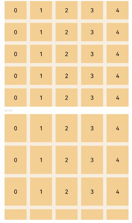
Example
// xxx.ets
@Entry
@Component
struct GridExample {
  @State Number: String[] = ['0', '1', '2', '3', '4']

  build() {
    Column({ space: 5 }) {
      Grid() {
        ForEach(this.Number, (day: string) => {
          ForEach(this.Number, (day: string) => {
            GridItem() {
              Text(day)
                .fontSize(16)
                .backgroundColor(0xF9CF93)
                .width('100%')
                .height('100%')
                .textAlign(TextAlign.Center)
            }
          }, day => day)
        }, day => day)
      }
      .columnsTemplate('1fr 1fr 1fr 1fr 1fr')
      .rowsTemplate('1fr 1fr 1fr 1fr 1fr')
      .columnsGap(10)
      .rowsGap(10)
      .width('90%')
      .backgroundColor(0xFAEEE0)
      .height(300)

      Text('scroll').fontColor(0xCCCCCC).fontSize(9).width('90%')
      Grid() {
        ForEach(this.Number, (day: string) => {
          ForEach(this.Number, (day: string) => {
            GridItem() {
              Text(day)
                .fontSize(16)
                .backgroundColor(0xF9CF93)
                .width('100%')
                .height(80)
                .textAlign(TextAlign.Center)
            }
          }, day => day)
        }, day => day)
      }
      .columnsTemplate('1fr 1fr 1fr 1fr 1fr')
      .columnsGap(10)
      .rowsGap(10)
      .onScrollIndex((first: number) => {
        console.info(first.toString())
      })
      .width('90%')
      .backgroundColor(0xFAEEE0)
      .height(300)
    }.width('100%').margin({ top: 5 })
  }
}