边框设置
说明: 从API Version 7开始支持。后续版本如有新增内容,则采用上角标单独标记该内容的起始版本。
设置组件边框样式。
权限列表
无
属性
| 名称 | 参数类型 | 默认值 | 描述 |
|---|---|---|---|
| border | { width?: Length, color?: Color, radius?: Length, style?: BorderStyle } |
- | 统一边框样式设置接口。 |
| borderStyle | BorderStyle | BorderStyle.Solid | 设置元素的边框样式。 |
| borderWidth | Length | 0 | 设置元素的边框宽度。 |
| borderColor | Color | - | 设置元素的边框颜色。 |
| borderRadius | Length | 0 | 设置元素的边框圆角半径。 |
示例
// xxx.ets
@Entry
@Component
struct BorderExample {
build() {
Flex({ justifyContent: FlexAlign.SpaceAround, alignItems: ItemAlign.Center }) {
// 线段
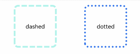
Text('dashed')
.borderStyle(BorderStyle.Dashed).borderWidth(5).borderColor(0xAFEEEE).borderRadius(10)
.width(120).height(120).textAlign(TextAlign.Center).fontSize(16)
// 点线
Text('dotted')
.border({ width: 5, color: 0x317AF7, radius: 10, style: BorderStyle.Dotted })
.width(120).height(120).textAlign(TextAlign.Center).fontSize(16)
}.width('100%').height(150)
}
}