switch
The <switch> component is used to enable or disable a function.
Required Permissions
None
Child Components
None
Attributes
In addition to the attributes in Universal Attributes, the following attributes are supported.
| Name | Type | Default Value | Mandatory | Description |
|---|---|---|---|---|
| checked | boolean | false | No | Whether the component is checked or not. |
| showtext | boolean | false | No | Whether the component displays text. |
| texton | string | "On" | No | Text displayed when the component is checked. |
| textoff | string | "Off" | No | Text displayed when the component is not checked. |
Styles
In addition to the styles in Universal Styles, the following styles are supported.
| Name | Type | Default Value | Mandatory | Description |
|---|---|---|---|---|
| texton-color(Rich) | <color> | #000000 | No | Text color displayed when the component is checked. |
| textoff-color(Rich) | <color> | #000000 | No | Text color displayed when the component is not checked. |
| text-padding(Rich) | number | 0px | No | Distance between the two sides of the longest text in texton and textoff and the border of the slider. |
| font-size(Rich) | <length> | - | No | Font size. This attribute is available only when texton and textoff are set. |
| allow-scale(Rich) | boolean | true | No | Whether the font size changes with the system's font size settings.NOTE:If the config-changes tag of fontSize is configured for abilities in the config.json file, the setting takes effect without application restart. |
| font-style(Rich) | string | normal | No | Font style. This attribute is available only when texton and textoff are set. For details, see font-style of the text component. |
| font-weight(Rich) | number | string | normal | No | Font weight. This attribute is available only when texton and textoff are set. For details, see font-weight of the text component. |
| font-family(Rich) | string | sans-serif | No | Font family, in which fonts are separated by commas (,). Each font is set using a font name or font family name. The first font in the family or the font specified by Custom Font Styles is used for the text. This attribute is available only when texton and textoff are set. |
Events
In addition to the events in Universal Events, the following events are supported.
| Name | Parameter | Description |
|---|---|---|
| change | { checked: checkedValue } | Triggered when the checked state changes. |
Method
Methods in Universal Methods are supported.
Example Code
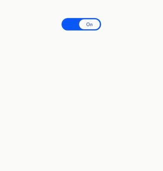
<!-- xxx.hml -->
<div class="container">
  <switch showtext="true" texton="On" textoff="Off" checked="true" @change="switchChange">
  </switch>
</div>
/* xxx.css */
.container {
  display: flex;
  justify-content: center;
  align-items: center;
}
switch{
  texton-color:#002aff;
  textoff-color:silver;
  text-padding:20px;
}
// xxx.js
import prompt from '@system.prompt';
export default {
  data: {
    title: 'World'
  },
  switchChange(e){
    console.log(e.checked);
    if(e.checked){
      prompt.showToast({
        message: "Switch on."
      });
    }else{
      prompt.showToast({
        message: "Switch off."
      });
    }
  }
}