Blank
NOTE
This component is supported since API version 7. Updates will be marked with a superscript to indicate their earliest API version.
The <Blank> component supports automatic filling of the empty part of the container along the main axis. This component is valid only when the parent component is <Row> or <Column>.
Required Permissions
None
Child Components
None
APIs
Blank(min?: Length)
- Parameters
| Name | Type | Mandatory | Default Value | Description |
|---|---|---|---|---|
| min | Length | No | 0 | Minimum size of the <Blank> component in the container along the main axis. |
Attributes
| Name | Type | Default Value | Description |
|---|---|---|---|
| color | Color | 0x00000000 | Color to fill the blank. |
NOTE
- Universal attribute methods are not supported.
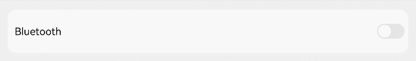
Example
@Entry
@Component
struct BlankExample {
  build() {
    Column() {
      Row() {
        Text('Bluetooth').fontSize(18)
        Blank()
        Toggle({ type: ToggleType.Switch })
      }.width('100%').backgroundColor(0xFFFFFF).borderRadius(15).padding({ left: 12 })
    }.backgroundColor(0xEFEFEF).padding(20)
  }
}
Portrait mode
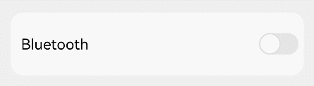
Landscape mode