ScrollBar
NOTE This component is supported since API version 8. Updates will be marked with a superscript to indicate their earliest API version.
The <ScrollBar> is used together with scrollable components, such as <List>, <Grid>, and <Scroll>.
Required Permissions
None
Child Components
This component can contain a single child component.
APIs
ScrollBar(value: ScrollBarOptions)
- ScrollBarOptions parameters
| Name | Type | Mandatory | Default Value | Description |
|---|---|---|---|---|
| scroller | Scroller | Yes | - | Scroller, which can be bound to and control scrollable components. |
| direction | ScrollBarDirection | No | ScrollBarDirection.Vertical | Scrollbar direction in which scrollable components scroll. |
| state | BarState | No | BarState.Auto | Scrollbar state. |
This component is bound to a scrollable component through scroller, and can be used to scroll the scrollable component only when their directions are the same. The <ScrollBar> component can be bound to only one scrollable component, and vice versa.
- ScrollBarDirection enums
| Name | Description |
|---|---|
| Vertical | Vertical scrollbar. |
| Horizontal | Horizontal scrollbar. |
- BarState enums
| Name | Description |
|---|---|
| On | Always display. |
| Off | Hide. |
| Auto | Display on demand (displays when the screen is touched and disappears after 2s of inactivity). |
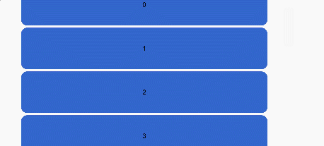
Example
@Entry
@Component
struct ScrollBarExample {
  private scroller: Scroller = new Scroller()
  private arr: number[] = [0, 1, 2, 3, 4, 5, 6, 7, 8, 9]

  build() {
    Column() {
      Stack({ alignContent: Alignment.End }) {
        Scroll(this.scroller) {
          Flex({ direction: FlexDirection.Column }) {
            ForEach(this.arr, (item) => {
              Row() {
                Text(item.toString())
                  .width('90%')
                  .height(100)
                  .backgroundColor('#3366CC')
                  .borderRadius(15)
                  .fontSize(16)
                  .textAlign(TextAlign.Center)
                  .margin({ top: 5 })
              }
            }, item => item)
          }.margin({ left: 52 })
        }
        .scrollBar(BarState.Off)
        .scrollable(ScrollDirection.Vertical)
        ScrollBar({ scroller: this.scroller, direction: ScrollBarDirection.Vertical,state: BarState.Auto }) {
          Text()
            .width(30)
            .height(100)
            .borderRadius(10)
            .backgroundColor('#C0C0C0')
        }.width(30).backgroundColor('#ededed')
      }
    }
  }
}