ImageAnimator
NOTE This component is supported since API version 7. Updates will be marked with a superscript to indicate their earliest API version.
The <ImageAnimator> component enables images to be played frame by frame. The list of images to be played can be configured, and the duration of each image can be configured.
Required Permissions
None
Child Components
Not supported
APIs
ImageAnimator()
Attributes
| Name | Type | Default Value | Mandatory | Description |
|---|---|---|---|---|
| images | Array<{ src:string, width?:Length, height?:Length, top?:Length, left?:Length, duration?:number }> |
[] | Yes | Image frame information. The information of each frame includes the image path, image size, image position, and image playback duration. The detailed description is as follows: src: image path. The image format can be SVG, PNG, or JPG. width: image width. height: image height. top: vertical coordinate of the image relative to the upper left corner of the component. left: horizontal coordinate of the image relative to the upper left corner of the component. duration: playback duration of the image, in ms. |
| state | AnimationStatus | AnimationStatus.Initial | No | Playback status of the animation. The default status is Initial. |
| duration | number | 1000 | No | Playback duration, in ms. The default duration is 1000 ms. When the duration is 0, no image is played. The value change takes effect only at the beginning of the next cycle. When a separate duration is set in images, the setting of this attribute is invalid. |
| reverse | boolean | false | No | Playback sequence. The value false indicates that images are played from the first one to the last one, and true indicates that images are played from the last one to the first one. |
| fixedSize | boolean | true | No | Whether the image size is the same as the component size. true: The image size is the same as the component size. In this case, the width, height, top, and left attributes of the image are invalid. false: The width, height, top, and left attributes of each image must be set separately. |
| preDecode | number | 0 | No | Whether to enable pre-decoding. The default value 0 indicates that pre-decoding is disabled. If this attribute is set to 2, two images following the currently playing frame will be cached in advance to improve performance. |
| fillMode | FillMode | FillMode.Forwards | No | Status before and after the animation starts. For details about the options, see FillMode. |
| iterations | number | 1 | No | By default, the animation is played once. The value -1 indicates that the animation is played for an unlimited number of times. |
- AnimationStatus enums
| Name | Description |
|---|---|
| Initial | The animation is in the initial state. |
| Running | The animation is being played. |
| Paused | The animation is paused. |
| Stopped | The animation is stopped. |
- FillMode enums
| Name | Description |
|---|---|
| None | After the playback is complete, the animation restores to the initial state. |
| Forwards | After the playback is complete, the animation remains in the end state. |
Events
| Name | Description |
|---|---|
| onStart() => void | Triggered when the animation starts to play. |
| onPause() => void | Triggered when the animation playback is paused. |
| onRepeat() => void | Triggered when the animation playback is repeated. |
| onCancel() => void | Triggered when the animation playback is canceled. |
| onFinish() => void | Triggered when the animation playback is complete. |
Example
@Entry
@Component
struct ImageAnimatorExample {
@State state: AnimationStatus = AnimationStatus.Initial
@State reverse: boolean = false
@State iterations: number = 1
build() {
Column({ space:5 }) {
ImageAnimator()
.images([
{
// The comment folder is at the same level as the pages folder.
src: '/comment/bg1.jpg',
duration: 500,
width: 325,
height: 200,
top: 0,
left: 0
},
{
src: '/comment/bg2.jpg',
duration: 500,
width: 325,
height: 200,
top: 0,
left: 0
},
{
src: '/comment/bg3.jpg',
duration: 500,
width: 325,
height: 200,
top: 0,
left: 0
},
{
src: '/comment/bg4.jpg',
duration: 500,
width: 325,
height: 200,
top: 0,
left: 0
}
])
.state(this.state).reverse(this.reverse).fixedSize(false).preDecode(2)
.fillMode(FillMode.None).iterations(this.iterations).width(325).height(210)
.margin({top:100})
.onStart(() => { // Triggered when the frame animation playback starts.
console.info('Start')
})
.onPause(() => {
console.info('Pause')
})
.onRepeat(() => {
console.info('Repeat')
})
.onCancel(() => {
console.info('Cancel')
})
.onFinish(() => { // Triggered after the frame animation playback is complete.
console.info('Finish')
})
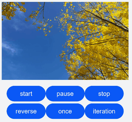
Row() {
Button('start').width(100).padding(5).onClick(() => {
this.state = AnimationStatus.Running
})
Button('pause').width(100).padding(5).onClick(() => {
this.state = AnimationStatus.Paused
})
Button('stop').width(100).padding(5).onClick(() => {
this.state = AnimationStatus.Stopped
})
}
Row() {
Button('reverse').width(100).padding(5).onClick(() => {
this.reverse = !this.reverse
})
Button('once').width(100).padding(5).onClick(() => {
this.iterations = 1
})
Button('iteration').width(100).padding(5).onClick(() => {
this.iterations = -1
})
}
}.width('100%').height('100%').backgroundColor(0xF1F3F5)
}
}