button
The <button> component includes capsule, circle, text, arc, and download buttons.
Child Components
Not supported
Attributes
In addition to the attributes in Universal Attributes, the following attributes are supported.
Styles
When the Button Type Is Not arc
In addition to the styles in Universal Styles, the following styles are supported.
Whether the font size changes with the system's font size settings. |
||||
Font weight of the button. For details, see font-weight of the text component. |
||||
Font family, in which fonts are separated by commas (,). Each font is set using a font name or font family name. The first font in the family or the font specified by Custom Font Styles is used for the text. |
||||
Width of the internal icon of a circle button. The entire circle button is filled by default. |
||||
Height of the internal icon of a circle button. The entire circle button is filled by default. |
||||
Button radius. For a circle button, this style takes precedence over width and height in the common styles. |
NOTE:
- For capsule buttons, border-related styles are not supported.
- For circle buttons, text-related styles are not supported.
- For text buttons, the text size is automatically adaptive, and radius, width, and height cannot be set. The background-color style is not supported when the background is completely transparent.
When the Button Type Is arc
In addition to the background-color, opacity, display, visibility, position, [left|top**|right|bottom** styles in Universal Styles, the following styles are supported.
Whether the font size changes with the system's font size settings. |
||||
Font weight of the arc button. For details, see font-weight of the text component. |
||||
Font family, in which fonts are separated by commas (,). Each font is set using a font name or font family name. The first font in the family or the font specified by Custom Font Styles is used for the text. |
Events
Events in Universal Events are supported.
Methods
Methods in Universal Methods are supported.
When the button type is download, the following methods are supported.
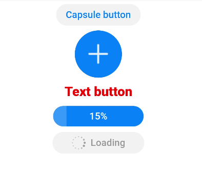
Example
<!-- xxx.hml -->
<div class="div-button">
  <button class="first" type="capsule" value="Capsule button"></button>
  <button class="button circle" type="circle" icon="common/ic_add_default.png"></button>
  <button class="button text" type="text">Text button</button>
  <button class="button download" type="download" id="download-btn"
    onclick="progress">{{downloadText}}</button>
  <button class="last" type="capsule" waiting="true">Loading</button>
</div>
/* xxx.css */
.div-button {
  flex-direction: column;
  align-items: center;
}
.first{
  background-color: #F2F2F2;
  text-color: #0D81F2;
}
.button {
  margin-top: 15px;
}
.last{
  background-color: #F2F2F2;
  text-color: #969696;
  margin-top: 15px;
  width: 280px;
  height:72px;
}
.button:waiting {
  width: 280px;
}
.circle {
  background-color: #007dff;
  radius: 72px;
  icon-width: 72px;
  icon-height: 72px;
}
.text {
  text-color: red;
  font-size: 40px;
  font-weight: 900;
  font-family: sans-serif;
  font-style: normal;
}
.download {
  width: 280px;
  text-color: white;
  background-color: #007dff;
}
// xxx.js
export default {
  data: {
    count: 5,
    downloadText: "Download"
  },
  progress(e) {
    this.count+= 10;
    this.downloadText = this.count+ "%";
    this.$element('download-btn').setProgress({ progress: this.count});
    if (this.count>= 100) {
      this.downloadText = "Done";
    }
  }
}