Radio
NOTE This component is supported since API version 8. Updates will be marked with a superscript to indicate their earliest API version.
The <Radio> component allows users to select from a set of mutually exclusive options.
Required Permissions
None
Child Components
None
APIs
Radio(options: {value: string, group: string})
- Parameters
| Name | Type | Mandatory | Default Value | Description |
|---|---|---|---|---|
| value | string | Yes | - | Value of the current radio button. |
| group | string | Yes | - | Name of the group to which the radio button belongs. Only one radio button in a given group can be selected at a time. |
Attributes
| Name | Type | Default Value | Description |
|---|---|---|---|
| checked | boolean | false | Whether the radio button is selected. |
Events
| Name | Description |
|---|---|
| onChange(callback: (value: boolean) => void) | Triggered when the selected state of the radio button changes. -The value true means that the radio button is selected. -The value false means that the radio button is not selected. |
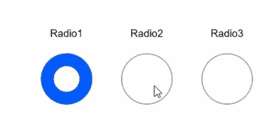
Example
@Entry
@Component
struct RadioExample {
  build() {
    Flex({ direction: FlexDirection.Row, justifyContent: FlexAlign.Center, alignItems: ItemAlign.Center }) {
      Column() {
        Text('Radio1')
        Radio({ value: 'Radio1', group: 'radioGroup' }).checked(true)
          .height(50)
          .width(50)
          .onChange((value: boolean) => {
            console.log('Radio1 status is ' + value)
          })
      }
      Column() {
        Text('Radio2')
        Radio({ value: 'Radio2', group: 'radioGroup' }).checked(false)
          .height(50)
          .width(50)
          .onChange((value: boolean) => {
            console.log('Radio2 status is ' + value)
          })
      }
      Column() {
        Text('Radio3')
        Radio({ value: 'Radio3', group: 'radioGroup' }).checked(false)
          .height(50)
          .width(50)
          .onChange((value: boolean) => {
            console.log('Radio3 status is ' + value)
          })
      }
    }.padding({ top: 30 })
  }
}