picker-view
The <picker-view> component provides the view that shows an embedded scrollable selector on the screen.
Child Components
Not supported
Attributes
In addition to the attributes in Universal Attributes, the following attributes are supported.
Name
|
Type
|
Default Value
|
Mandatory
|
Description
|
|---|
type
|
string
|
text
|
No
|
Type of the scrollable selector, which cannot be changed dynamically. Available values are as follows:
- text: text selector
- time: time selector
- date: date selector
- datetime: date and time selector
- multi-text: multi-column text selector
|
Text selector (type is text)
Name
|
Type
|
Default Value
|
Mandatory
|
Description
|
|---|
range
|
Array
|
-
|
No
|
Value range of the text selector.
NOTE: Use the data binding mode, for example, range = {{data}}. Declare the corresponding variable data: ["15", "20", "25"] in JavaScript.
|
selected
|
string
|
0
|
No
|
Default value of the text selector. The value is the index of range.
|
indicatorprefix
|
string
|
-
|
No
|
Prefix field added when a value is specified for the text selector.
|
indicatorsuffix
|
string
|
-
|
No
|
Suffix field added when a value is specified for the text selector.
|
Time selector (type is time)
Name
|
Type
|
Default Value
|
Mandatory
|
Description
|
|---|
containsecond
|
boolean
|
false
|
No
|
Whether seconds are contained.
|
selected
|
string
|
Current time
|
No
|
Default value of the time selector, in the format of HH:mm.
If seconds are contained, the format is HH:mm:ss.
|
hours
|
number
|
241-4
-5+
|
No
|
Time format used by the time selector. Available values include:
- 12: displayed in 12-hour format and distinguished by a.m. and p.m.
- 24: displayed in 24-hour format
NOTE: The default value is the most commonly-used hour format in the current locale. 5+
|
Date selector (type is date)
Name
|
Type
|
Default Value
|
Mandatory
|
Description
|
|---|
start
|
<time>
|
1970-1-1
|
No
|
Start date of the date selector, in the format of YYYY-MM-DD.
|
end
|
<time>
|
2100-12-31
|
No
|
End date of the date selector, in the format of YYYY-MM-DD.
|
selected
|
string
|
Current date
|
No
|
Default value of the date selector, in the format of YYYY-MM-DD.
|
lunar5+
|
boolean
|
false
|
No
|
Whether the pop-up window displays the lunar calendar.
|
lunarswitch
|
boolean
|
false
|
No
|
Whether to display the lunar calendar switch in the date selector. When this switch is displayed, you can switch between the lunar calendar and Gregorian calendar. Turn on the switch to display the lunar calendar, and turn off the switch to hide the lunar calendar.
|
Date and time selector (type is datetime)
Name
|
Type
|
Default Value
|
Mandatory
|
Description
|
|---|
selected
|
string
|
Current date and time
|
No
|
Default value of the date and time selector. The value can be in the format of MM-DD-HH-mm or YYYY-MM-DD-HH-mm. If the year is not set, the current year is used by default. The value you set is the date selected by default in the pop-up window.
|
hours
|
number
|
241-4
-5+
|
No
|
Time format used by the date and time selector. Available values include:
- 12: displayed in 12-hour format and distinguished by a.m. and p.m.
- 24: displayed in 24-hour format
NOTE: The default value is the most commonly-used hour format in the current locale. 5+
|
lunar5+
|
boolean
|
false
|
No
|
Whether the pop-up window displays the lunar calendar.
|
lunarswitch
|
boolean
|
false
|
No
|
Whether to display the lunar calendar switch in the date and time selector. When this switch is displayed, you can switch between the lunar calendar and Gregorian calendar. Turn on the switch to display the lunar calendar, and turn off the switch to hide the lunar calendar.
|
Multi-column text selector (type is multi-text)
Name
|
Type
|
Default Value
|
Mandatory
|
Description
|
|---|
columns
|
number
|
-
|
Yes
|
Number of columns in the multi-column text selector.
|
range
|
Two-dimensional array
|
-
|
No
|
Items of the multi-column text selector. range is a two-dimensional array that indicates the number of columns. Each item in the array indicates the data of each column, for example, [["a","b"], ["c","d"]].
NOTE: Use the data binding mode, for example, range = {{data}}. Declare the corresponding variable data: [["a","b"], ["c","d"]] in the JavaScript.
|
selected
|
Array
|
0,0,0,...
|
No
|
Default value of the multi-column text selector, which is an array consisting of the indexes of the selected items in each column.
|
Styles
In addition to the styles in Universal Styles, the following styles are supported.
Name
|
Type
|
Default Value
|
Mandatory
|
Description
|
|---|
color
|
<color>
|
#ffffff
|
No
|
Font color of a candidate item.
|
font-size
|
<length>
|
16px
|
No
|
Font size of a candidate item. The value is of the length type, in pixels.
|
selected-color
|
<color>
|
#ff0a69f7
|
No
|
Font color of the selected item.
|
selected-font-size
|
<length>
|
20px
|
No
|
Font size of the selected item. The value is of the length type, in pixels.
|
disappear-color5+
|
<color>
|
#ffffff
|
No
|
Font color of the items that gradually disappear. Disappearing items are the top option and bottom option of a column containing five options in total.
|
disappear-font-size5+
|
<length>
|
14px
|
No
|
Font size of the items that gradually disappear. Disappearing items are the top option and bottom option of a column containing five options in total.
|
font-family
|
string
|
sans-serif
|
No
|
Font type of an item. Font family, in which fonts are separated by commas (,). Each font is set using a font name or font family name. The first font in the family or the font specified by Custom Font Styles is used for the text
|
Events
The following events are supported.
Text selector (type is text)
Name
|
Parameter
|
Description
|
|---|
change
|
{ newValue: newValue, newSelected: newSelected }
|
Triggered when a value is specified for the text selector.
|
Time selector (type is time)
Name
|
Parameter
|
Description
|
|---|
change
|
{ hour: hour, minute: minute, [second:second] }
|
Triggered when a value is specified for the time selector.
If seconds are contained, the value contains hour, minute, and second.
|
Date selector (type is date)
Name
|
Parameter
|
Description
|
|---|
change
|
{ year:year, month:month, day:day }
|
Triggered when a value is specified for the date selector.
|
Date and time selector (type is datetime)
Name
|
Parameter
|
Description
|
|---|
change
|
{ year:year, month:month, day:day, hour:hour, minute:minute }
|
Triggered when a value is specified for the date and time selector.
|
Multi-text selector (type is multi-text)
Name
|
Parameter
|
Description
|
|---|
columnchange
|
{ column:column, newValue:newValue, newSelected:newSelected }
|
Triggered when the value of a column in the multi-column selector changes. column indicates the column whose value has changed, newValue indicates the selected value, and newSelected indicates the index of the selected value.
|
Methods
Not supported
Example Code
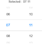
<div class="container" @swipe="handleSwipe">
<text class="title">
Selected: {{time}}
</text>
<picker-view class="time-picker" type="time" selected="{{defaultTime}}" @change="handleChange"></picker-view>
</div>
.container {
flex-direction: column;
justify-content: center;
align-items: center;
left: 0px;
top: 0px;
width: 454px;
height: 454px;
}
.title {
font-size: 30px;
text-align: center;
}
.time-picker {
width: 500px;
height: 400px;
margin-top: 20px;
}
export default {
data: {
defaultTime: "",
time: "",
},
onInit() {
this.defaultTime = this.now();
},
handleChange(data) {
this.time = this.concat(data.hour, data.minute);
},
now() {
const date = new Date();
const hours = date.getHours();
const minutes = date.getMinutes();
return this.concat(hours, minutes);
},
fill(value) {
return (value > 9 ? "" : "0") + value;
},
concat(hours, minutes) {
return `${this.fill(hours)}:${this.fill(minutes)}`;
},
}