Flex
说明: 该组件从API Version 7开始支持。后续版本如有新增内容,则采用上角标单独标记该内容的起始版本。
弹性布局组件。
权限列表
无
子组件
可以包含子组件。
接口
Flex(options?: { direction?: FlexDirection, wrap?: FlexWrap, justifyContent?: FlexAlign, alignItems?: ItemAlign, alignContent?: FlexAlign })
标准Flex布局容器。
- 参数
| 参数名 | 参数类型 | 必填 | 默认值 | 参数描述 |
|---|---|---|---|---|
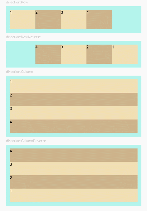
| direction | FlexDirection | 否 | FlexDirection.Row | 子组件在Flex容器上排列的方向,即主轴的方向。 |
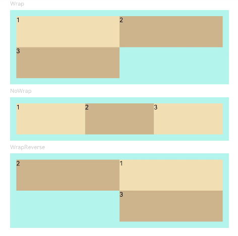
| wrap | FlexWrap | 否 | FlexWrap.NoWrap | Flex容器是单行/列还是多行/列排列。 |
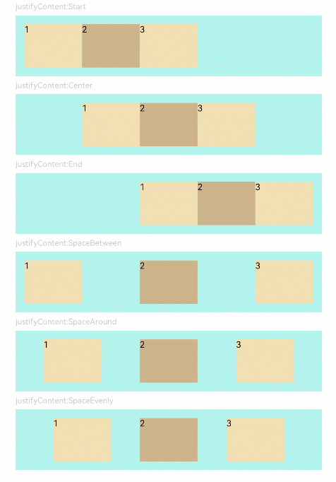
| justifyContent | FlexAlign | 否 | FlexAlign.Start | 子组件在Flex容器主轴上的对齐格式。 |
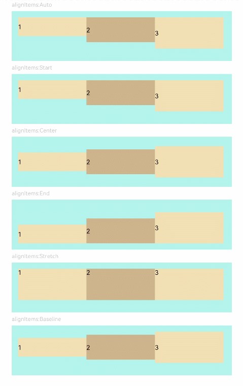
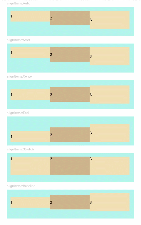
| alignItems | ItemAlign | 否 | ItemAlign.Stretch | 子组件在Flex容器交叉轴上的对齐格式。 |
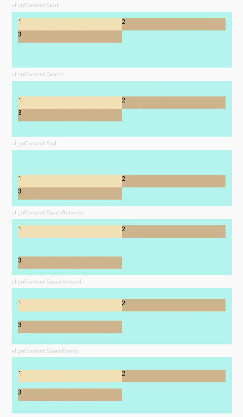
| alignContent | FlexAlign | 否 | FlexAlign.Start | 交叉轴中有额外的空间时,多行内容的对齐方式。仅在wrap为Wrap或WrapReverse下生效。 |
- FlexDirection枚举说明
| 名称 | 描述 |
|---|---|
| Row | 主轴与行方向一致作为布局模式。 |
| RowReverse | 与Row方向相反方向进行布局。 |
| Column | 主轴与列方向一致作为布局模式。 |
| ColumnReverse | 与Column相反方向进行布局。 |
- FlexWrap枚举说明
| 名称 | 描述 |
|---|---|
| NoWrap | Flex容器的元素单行/列布局,子项允许超出容器。 |
| Wrap | Flex容器的元素多行/列排布,子项允许超出容器。 |
| WrapReverse | Flex容器的元素反向多行/列排布,子项允许超出容器。 |
- FlexAlign枚举说明
| 名称 | 描述 |
|---|---|
| Start | 元素在主轴方向首端对齐, 第一个元素与行首对齐,同时后续的元素与前一个对齐。 |
| Center | 元素在主轴方向中心对齐,第一个元素与行首的距离与最后一个元素与行尾距离相同。 |
| End | 元素在主轴方向尾部对齐, 最后一个元素与行尾对齐,其他元素与后一个对齐。 |
| SpaceBetween | Flex主轴方向均匀分配弹性元素,相邻元素之间距离相同。 第一个元素与行首对齐,最后一个元素与行尾对齐。 |
| SpaceAround | Flex主轴方向均匀分配弹性元素,相邻元素之间距离相同。 第一个元素到行首的距离和最后一个元素到行尾的距离是相邻元素之间距离的一半。 |
| SpaceEvenly | Flex主轴方向元素等间距布局, 相邻元素之间的间距、第一个元素与行首的间距、最后一个元素到行尾的间距都完全一样。 |
示例
// Example 01
@Entry
@Component
struct FlexExample1 {
  build() {
    Column() {
      Column({ space: 5 }) {
        Text('direction:Row').fontSize(9).fontColor(0xCCCCCC).width('90%')
        Flex({ direction: FlexDirection.Row }) {
          Text('1').width('20%').height(50).backgroundColor(0xF5DEB3)
          Text('2').width('20%').height(50).backgroundColor(0xD2B48C)
          Text('3').width('20%').height(50).backgroundColor(0xF5DEB3)
          Text('4').width('20%').height(50).backgroundColor(0xD2B48C)
        }
        .height(70)
        .width('90%')
        .padding(10)
        .backgroundColor(0xAFEEEE)

        Text('direction:RowReverse').fontSize(9).fontColor(0xCCCCCC).width('90%')
        Flex({ direction: FlexDirection.RowReverse }) {
          Text('1').width('20%').height(50).backgroundColor(0xF5DEB3)
          Text('2').width('20%').height(50).backgroundColor(0xD2B48C)
          Text('3').width('20%').height(50).backgroundColor(0xF5DEB3)
          Text('4').width('20%').height(50).backgroundColor(0xD2B48C)
        }
        .height(70)
        .width('90%')
        .padding(10)
        .backgroundColor(0xAFEEEE)

        Text('direction:Column').fontSize(9).fontColor(0xCCCCCC).width('90%')
        Flex({ direction: FlexDirection.Column }) {
          Text('1').width('100%').height(40).backgroundColor(0xF5DEB3)
          Text('2').width('100%').height(40).backgroundColor(0xD2B48C)
          Text('3').width('100%').height(40).backgroundColor(0xF5DEB3)
          Text('4').width('100%').height(40).backgroundColor(0xD2B48C)
        }
        .height(160)
        .width('90%')
        .padding(10)
        .backgroundColor(0xAFEEEE)

        Text('direction:ColumnReverse').fontSize(9).fontColor(0xCCCCCC).width('90%')
        Flex({ direction: FlexDirection.ColumnReverse }) {
          Text('1').width('100%').height(40).backgroundColor(0xF5DEB3)
          Text('2').width('100%').height(40).backgroundColor(0xD2B48C)
          Text('3').width('100%').height(40).backgroundColor(0xF5DEB3)
          Text('4').width('100%').height(40).backgroundColor(0xD2B48C)
        }
        .height(160)
        .width('90%')
        .padding(10)
        .backgroundColor(0xAFEEEE)
      }.width('100%').margin({ top: 5 })
    }.width('100%')
  }
}
// Example 02
@Entry
@Component
struct FlexExample2 {
  build() {
    Column() {
      Column({ space: 5 }) {
        Text('Wrap').fontSize(9).fontColor(0xCCCCCC).width('90%')
        Flex({ wrap: FlexWrap.Wrap }) {
          Text('1').width('50%').height(50).backgroundColor(0xF5DEB3)
          Text('2').width('50%').height(50).backgroundColor(0xD2B48C)
          Text('3').width('50%').height(50).backgroundColor(0xD2B48C)
        }
        .width('90%')
        .padding(10)
        .backgroundColor(0xAFEEEE)

        Text('NoWrap').fontSize(9).fontColor(0xCCCCCC).width('90%')
        Flex({ wrap: FlexWrap.NoWrap }) {
          Text('1').width('50%').height(50).backgroundColor(0xF5DEB3)
          Text('2').width('50%').height(50).backgroundColor(0xD2B48C)
          Text('3').width('50%').height(50).backgroundColor(0xF5DEB3)
        }
        .width('90%')
        .padding(10)
        .backgroundColor(0xAFEEEE)

        Text('WrapReverse').fontSize(9).fontColor(0xCCCCCC).width('90%')
        Flex({ wrap: FlexWrap.WrapReverse , direction:FlexDirection.Row }) {
          Text('1').width('50%').height(50).backgroundColor(0xF5DEB3)
          Text('2').width('50%').height(50).backgroundColor(0xD2B48C)
          Text('3').width('50%').height(50).backgroundColor(0xD2B48C)
        }
        .width('90%')
        .height(120)
        .padding(10)
        .backgroundColor(0xAFEEEE)
      }.width('100%').margin({ top: 5 })
    }.width('100%')
  }
}
// Example 03
@Component
struct JustifyContentFlex {
  @Prop justifyContent : number

  build() {
    Flex({ justifyContent: this.justifyContent }) {
      Text('1').width('20%').height(50).backgroundColor(0xF5DEB3)
      Text('2').width('20%').height(50).backgroundColor(0xD2B48C)
      Text('3').width('20%').height(50).backgroundColor(0xF5DEB3)
    }
    .width('90%')
    .padding(10)
    .backgroundColor(0xAFEEEE)
  }
}

@Entry
@Component
struct FlexExample3 {
  build() {
    Column() {
      Column({ space: 5 }) {
        Text('justifyContent:Start').fontSize(9).fontColor(0xCCCCCC).width('90%')
        JustifyContentFlex({ justifyContent: FlexAlign.Start })

        Text('justifyContent:Center').fontSize(9).fontColor(0xCCCCCC).width('90%')
        JustifyContentFlex({ justifyContent: FlexAlign.Center })

        Text('justifyContent:End').fontSize(9).fontColor(0xCCCCCC).width('90%')
        JustifyContentFlex({ justifyContent: FlexAlign.End })

        Text('justifyContent:SpaceBetween').fontSize(9).fontColor(0xCCCCCC).width('90%')
        JustifyContentFlex({ justifyContent: FlexAlign.SpaceBetween })

        Text('justifyContent:SpaceAround').fontSize(9).fontColor(0xCCCCCC).width('90%')
        JustifyContentFlex({ justifyContent: FlexAlign.SpaceAround })

        Text('justifyContent:SpaceEvenly').fontSize(9).fontColor(0xCCCCCC).width('90%')
        JustifyContentFlex({ justifyContent: FlexAlign.SpaceEvenly })
      }.width('100%').margin({ top: 5 })
    }.width('100%')
  }
}
// Example 04
@Component
struct AlignItemsFlex {
  @Prop alignItems : number

  build() {
    Flex({ alignItems: this.alignItems }) {
      Text('1').width('33%').height(30).backgroundColor(0xF5DEB3)
      Text('2').width('33%').height(40).backgroundColor(0xD2B48C)
      Text('3').width('33%').height(50).backgroundColor(0xF5DEB3)
    }
    .size({width: '90%', height: 80})
    .padding(10)
    .backgroundColor(0xAFEEEE)
  }
}

@Entry
@Component
struct FlexExample4 {
  build() {
    Column() {
      Column({ space: 5 }) {
        Text('alignItems:Auto').fontSize(9).fontColor(0xCCCCCC).width('90%')
        AlignItemsFlex({ alignItems: ItemAlign.Auto })

        Text('alignItems:Start').fontSize(9).fontColor(0xCCCCCC).width('90%')
        AlignItemsFlex({ alignItems: ItemAlign.Start })

        Text('alignItems:Center').fontSize(9).fontColor(0xCCCCCC).width('90%')
        AlignItemsFlex({ alignItems: ItemAlign.Center })

        Text('alignItems:End').fontSize(9).fontColor(0xCCCCCC).width('90%')
        AlignItemsFlex({ alignItems: ItemAlign.End })

        Text('alignItems:Stretch').fontSize(9).fontColor(0xCCCCCC).width('90%')
        AlignItemsFlex({ alignItems: ItemAlign.Stretch })

        Text('alignItems:Baseline').fontSize(9).fontColor(0xCCCCCC).width('90%')
        AlignItemsFlex({ alignItems: ItemAlign.Baseline })
      }.width('100%').margin({ top: 5 })
    }.width('100%')
  }
}
// Example 05
@Component
struct AlignContentFlex {
  @Prop alignContent: number

  build() {
    Flex({ wrap: FlexWrap.Wrap, alignContent: this.alignContent }) {
      Text('1').width('50%').height(20).backgroundColor(0xF5DEB3)
      Text('2').width('50%').height(20).backgroundColor(0xD2B48C)
      Text('3').width('50%').height(20).backgroundColor(0xD2B48C)
    }
    .size({ width: '90%', height: 90 })
    .padding(10)
    .backgroundColor(0xAFEEEE)
  }
}

@Entry
@Component
struct FlexExample5 {
  build() {
    Column() {
      Column({ space: 5 }) {
        Text('alignContent:Start').fontSize(9).fontColor(0xCCCCCC).width('90%')
        AlignContentFlex({ alignContent: FlexAlign.Start })

        Text('alignContent:Center').fontSize(9).fontColor(0xCCCCCC).width('90%')
        AlignContentFlex({ alignContent: FlexAlign.Center })

        Text('alignContent:End').fontSize(9).fontColor(0xCCCCCC).width('90%')
        AlignContentFlex({ alignContent: FlexAlign.End })

        Text('alignContent:SpaceBetween').fontSize(9).fontColor(0xCCCCCC).width('90%')
        AlignContentFlex({ alignContent: FlexAlign.SpaceBetween })

        Text('alignContent:SpaceAround').fontSize(9).fontColor(0xCCCCCC).width('90%')
        AlignContentFlex({ alignContent: FlexAlign.SpaceAround })

        Text('alignContent:SpaceEvenly').fontSize(9).fontColor(0xCCCCCC).width('90%')
        AlignContentFlex({ alignContent: FlexAlign.SpaceEvenly })
      }.width('100%').margin({ top: 5 })
    }.width('100%')
  }
}