Progress
说明: 该组件从API Version 7开始支持。后续版本如有新增内容,则采用上角标单独标记该内容的起始版本。
进度条,用于显示内容加载或操作处理进度。
权限列表
无
子组件
无
接口说明
Progress(value: {value: number, total?: number, type?: ProgressType})
创建进度组件,用于显示内容加载或操作处理进度。
- 参数
| 参数名 | 参数类型 | 必填 | 默认值 | 参数描述 |
|---|---|---|---|---|
| value | number | 是 | - | 指定当前进度值。 |
| total | number | 否 | 100 | 指定进度总长。 |
| type | ProgressType | 否 | ProgressType.Linear | 指定进度条样式。 |
- ProgressType枚举说明
| 名称 | 描述 |
|---|---|
| Linear | 线性样式。 |
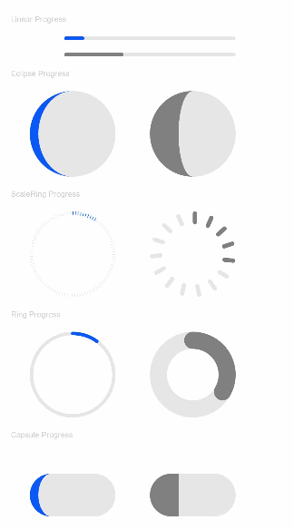
| Ring8+ | 环形无刻度样式,环形圆环逐渐填充完成过程。 |
| Eclipse | 圆形样式,展现类似月圆月缺的进度展示效果,从月牙逐渐到满月的这个过程代表了下载的进度。 |
| ScaleRing8+ | 环形有刻度样式,类似时钟刻度形式加载进度。 |
| Capsule8+ | 胶囊样式,头尾两端处,进度条由弧形变成直线和直线变成弧形的过程;中段处,进度条正常往右走的过程。 |
属性
| 名称 | 参数类型 | 默认值 | 描述 |
|---|---|---|---|
| value | number | - | 设置当前进度值。 |
| color | Color | - | 设置进度条前景色。 |
| style8+ | { strokeWidth?: Length, scaleCount?: number, scaleWidth?: Length } |
- | 定义组件的样式。 strokeWidth: 设置进度条宽度。 scaleCount: 设置环形进度条总刻度数。 scaleWidth: 设置环形进度条刻度粗细。 刻度粗细大于进度条宽度时,刻度粗细为系统默认粗细。 |
示例
@Entry
@Component
struct ProgressExample {
  build() {
    Column({ space: 15 }) {
      Text('Linear Progress').fontSize(9).fontColor(0xCCCCCC).width('90%')
      Progress({ value: 10, type: ProgressType.Linear }).width(200)
      Progress({ value: 20, total: 150, type: ProgressType.Linear }).color(Color.Grey).value(50).width(200)

      Text('Eclipse Progress').fontSize(9).fontColor(0xCCCCCC).width('90%')
      Row({ space: 40 }) {
        Progress({ value: 10, type: ProgressType.Eclipse }).width(100)
        Progress({ value: 20, total: 150, type: ProgressType.Eclipse }).color(Color.Grey).value(50).width(100)
      }

      Text('ScaleRing Progress').fontSize(9).fontColor(0xCCCCCC).width('90%')
      Row({ space: 40 }) {
        Progress({ value: 10, type: ProgressType.ScaleRing }).width(100)
        Progress({ value: 20, total: 150, type: ProgressType.ScaleRing })
          .color(Color.Grey).value(50).width(100)
          .style({ strokeWidth: 15, scaleCount: 15, scaleWidth: 5 })
      }

      Text('Ring Progress').fontSize(9).fontColor(0xCCCCCC).width('90%')
      Row({ space: 40 }) {
        Progress({ value: 10, type: ProgressType.Ring }).width(100)
        Progress({ value: 20, total: 150, type: ProgressType.Ring })
          .color(Color.Grey).value(50).width(100)
          .style({ strokeWidth: 20, scaleCount: 30, scaleWidth: 20 })
      }

      Text('Capsule Progress').fontSize(9).fontColor(0xCCCCCC).width('90%')
      Row({ space: 40 }) {
        Progress({ value: 10, type: ProgressType.Capsule }).width(100)
        Progress({ value: 20, total: 150, type: ProgressType.Capsule }).color(Color.Grey).value(50).width(100)
      }
    }.width('100%').margin({ top: 30 })
  }
}