Alert Dialog Box
NOTE This method is supported since API version 7. Updates will be marked with a superscript to indicate their earliest API version.
You can set the text content and response callback for an alert dialog box.
Attributes
| Name | Type | Default Value | Description |
|---|---|---|---|
| show | options: { paramObject1| paramObject2} | - | Defines and displays the <AlertDialog> component. |
- paramObject1 parameters
| Name | Type | Mandatory | Default Value | Description |
|---|---|---|---|---|
| title | string |Resource | Title of a dialog box. | ||
| message | string |Resource | Content of the dialog box. | ||
| autoCancel | boolean | No | true | Whether to close the dialog box when the overlay is clicked. |
| confirm | { value: string |Resource, fontColor?: Color|number |string |Resource, backgroundColor?:Color |number|string|Resource, action: () => void } |
Text content, text color, background color, and click callback of the confirm button. | ||
| cancel | () => void | No | - | Callback invoked when the dialog box is closed after the overlay is clicked. |
| alignment | DialogAlignment | No | DialogAlignment.Default | Alignment mode of the dialog box in the vertical direction. |
| offset | { dx: Length |Resource, dy: Length |Resource } |
Offset of the dialog box relative to the alignment position. | ||
| gridCount | number | No | - | Number of grid columns occupied by the width of the dialog box. |
- paramObject2 parameters
| Name | Type | Mandatory | Default Value | Description |
|---|---|---|---|---|
| title | string |Resource | No | - | Title of a dialog box. |
| message | string |Resource | Yes | - | Content of the dialog box. |
| autoCancel | boolean | No | true | Whether to close the dialog box when the overlay is clicked. |
| primaryButton | { value: string |Resource, fontColor?: Color|number |string |Resource, backgroundColor?:Color |number|string|Resource, action: () => void } |
Text content, text color, background color, and click callback of the primary button. | ||
| secondaryButton | { value: string |Resource, fontColor?: Color|number |string |Resource, backgroundColor?:Color |number|string|Resource, action: () => void } |
Text content, text color, background color, and click callback of the secondary button. | ||
| cancel | () => void | No | - | Callback invoked when the dialog box is closed after the overlay is clicked. |
| alignment | DialogAlignment | No | DialogAlignment.Default | Alignment mode of the dialog box in the vertical direction. |
| offset | { dx: Length |Resource, dy: Length |Resource } |
Offset of the dialog box relative to the alignment position. | ||
| gridCount | number | No | - | Number of grid columns occupied by the width of the dialog box. |
Example
@Entry
@Component
struct AlertDialogExample {
build() {
Column({ space: 5 }) {
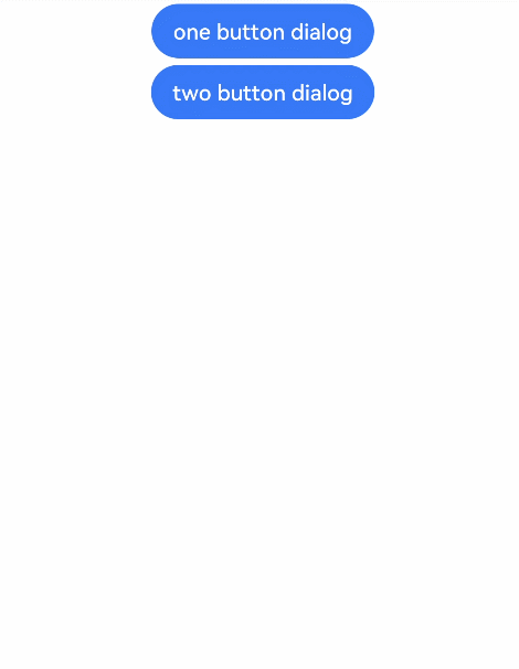
Button('one button dialog')
.onClick(() => {
AlertDialog.show(
{
title: 'title',
message: 'text',
confirm: {
value: 'button',
action: () => {
console.info('Button-clicking callback')
}
},
cancel: () => {
console.info('Closed callbacks')
}
}
)
})
.backgroundColor(0x317aff)
Button('two button dialog')
.onClick(() => {
AlertDialog.show(
{
title: 'title',
message: 'text',
primaryButton: {
value: 'cancel',
action: () => {
console.info('Callback when the first button is clicked')
}
},
secondaryButton: {
value: 'ok',
action: () => {
console.info('Callback when the second button is clicked')
}
},
cancel: () => {
console.info('Closed callbacks')
}
}
)
}).backgroundColor(0x317aff)
}.width('100%').margin({ top: 5 })
}
}