Divider
NOTE This component is supported since API version 7. Updates will be marked with a superscript to indicate their earliest API version.
The <Divider> component is used to separate content blocks and content elements.
Required Permissions
None
Child Components
None
APIs
Divider()
Attributes
| Name | Type | Default Value | Description |
|---|---|---|---|
| vertical | boolean | false | Whether a vertical divider is used. The value true means that a vertical divider is used, and false means that a horizontal divider is used. |
| color | Color | - | Color of the divider. |
| strokeWidth | Length | 1 | Width of the divider. |
| lineCap | LineCapStyle | LineCapStyle.Butt | Cap style of the divider. |
Events
Universal events are not supported.
Example
@Entry
@Component
struct DividerExample {
build() {
Flex({ direction: FlexDirection.Column, alignItems: ItemAlign.Start, justifyContent: FlexAlign.SpaceBetween }) {
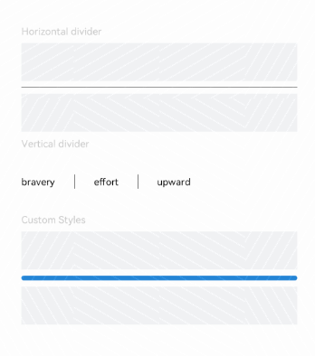
Text('Horizontal divider').fontSize(9).fontColor(0xCCCCCC)
Row().width('100%').height(40).backgroundColor(0xF1F3F5)
Divider()
Row().width('100%').height(40).backgroundColor(0xF1F3F5)
Text('Vertical divider').fontSize(9).fontColor(0xCCCCCC)
Flex({ alignItems: ItemAlign.Center, wrap: FlexWrap.Wrap }) {
Text('bravery')
Divider().vertical(true).margin(20).height(15)
Text('effort')
Divider().vertical(true).margin(20).height(15)
Text('upward')
}.width(250)
Text('Custom Styles').fontSize(9).fontColor(0xCCCCCC)
Row().width('100%').height(40).backgroundColor(0xF1F3F5)
Divider().vertical(false).strokeWidth(5).color(0x2788D9).lineCap(LineCapStyle.Round)
Row().width('100%').height(40).backgroundColor(0xF1F3F5)
}.width('100%').height(350).padding({ left: 35, right: 35, top: 35 })
}
}