svg
The <svg> component is a basic container. It can be used as the root node of an SVG document or be used to nest an SVG fragment into an SVG document.
NOTE:
- This component is supported since API version 7. Updates will be marked with a superscript to indicate their earliest API version.
- The width and height must be defined for the <svg> parent component or <svg> component. Otherwise, the component is not drawn.
Required Permissions
None
Child Components
svg, rect, circle, ellipse, path, line, polygon, polyline, text, animate, and animateTransform are supported.
Attributes
The universal attributes and the attributes listed below are supported. The configured universal attributes are passed to the child components.
Example
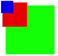
<!-- xxx.hml -->
<div class="container">
  <svg width="400" height="400">
    <svg width="200" height="200" viewBox="0 0 100 100">
      <rect x="10" y="10" width="80" height="80" fill="#00FF00"></rect>
    </svg>
    <rect x="10" y="10" width="80" height="80" fill="red" ></rect>
    <svg x="0" y="0" width="200" height="200" viewBox="0 0 200 200">
      <rect x="10" y="10" width="80" height="80" fill="red"></rect>
    </svg>
    <svg x="0" y="0" width="200" height="200" viewBox="0 0 400 400">
      <rect x="10" y="10" width="80" height="80" fill="blue"></rect>
    </svg>
  </svg>
</div>