text
The <text> component is used to display a piece of textual information.
NOTE:
- The text content must be written in the content area.
Required Permissions
None
Child Component
<span> is supported.
Attributes
Attributes in Universal Attributes are supported.
Styles
In addition to the styles in Universal Styles, the following styles are supported.
Whether the font size changes with the system's font size settings. |
||||
Font style. Available values are as follows: |
||||
Font width. For the number type, the value ranges from 100 to 900. The default value is 400. A larger value indicates a larger font width. The value of the string type can be lighter, normal, bold, or bolder. |
||||
Text decoration. Available values are as follows: |
||||
Text alignment mode. Available values are as follows: |
||||
Text line height. When this parameter is set to 0px, the text line height is not limited and the font size is adaptive. The string values are as follows: |
||||
Takes effect when the maximum number of lines is specified. Available values are as follows: |
||||
Font family, in which fonts are separated by commas (,). Each font is set using a font name or font family name. The first font that exists in the system or the font specified by Custom Font Styles in the family is selected as the font for the text. |
||||
Maximum number of text lines. The string values are as follows: |
||||
Minimum font size in the text. This style must be used together with max-font-size. The font size can be changed dynamically. After the maximum and minimum font sizes are set, font-size does not take effect. |
||||
Maximum font size in the text. This style must be used together with min-font-size. The font size can be changed dynamically. After the maximum and minimum font sizes are set, font-size does not take effect. |
||||
Step for dynamically adjusting the font size in the text. The minimum and maximum font sizes must be set. |
||||
Preset preferred font sizes. For dynamic font size adjustment, the preset sizes are used to match the maximum number of lines in the text. If the preferred font sizes were not set, the font size will be adjusted based on the maximum and minimum font sizes and the step you have set. If the maximum number of lines in the text cannot be met, text-overflow is used to truncate the text. If this parameter is set, font-size, max-font-size, min-font-size, and font-size-step do not take effect. |
||||
Text line breaking mode. The options are as follows:
|
||||
Mode for processing blanks in the component. The options are as follows:
|
||||
- In dynamic font adjustment, both the preset size set and the minimum/maximum font sizes are used to adjust the font size to display the text within the maximum number of lines. The preset size set is checked from left to right, and the minimum/maximum font sizes are checked from large to small, to find a size meeting the requirement.
- Use the escape character \r\n for newline.
- The following escape characters are supported: \a, \b, \f, \n, \r, \t, \v, \', \", and \0.
- When you use <span> as a child component to form a text paragraph, note that if a <span> style is abnormal, the text paragraph cannot be displayed.
- The letter-spacing, text-align, line-height, text-overflow, and max-lines styles take effect on text content held by the <text> component and its child components (<span>).
- The <text> component does not support the coexistence of the text content and <span> subcomponents. (If both of them exist, only the content in <span> is displayed.)
Events
Events in Universal Events are supported.
Method
Methods in Universal Methods are supported.
Example Code
<!-- xxx.hml -->
<div class="container">
  <div class="content">
    <text class="title">
      Hello {{ title }}
    </text>
  </div>
</div>
/* xxx.css */
.container {
  display: flex;
  justify-content: center;
  align-items: center;
}
.content{
  width: 400px;
  height: 400px;
  border: 20px;
}
.title {
  font-size: 80px;
  text-align: center;
  width: 400px;
  height: 400px;
}
// xxx.js
export default {
  data: {
    title: 'World'
  }
}

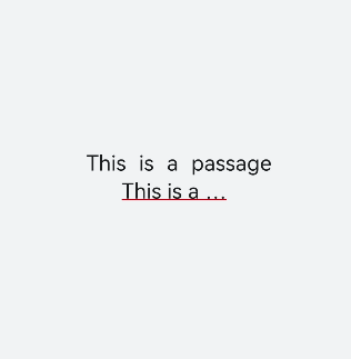
<!-- xxx.hml -->
<div class="container">
  <text class="text1">
    This is a passage
  </text>
  <text class="text2">
    This is a passage
  </text>
</div>
/* xxx.css */
.container {
  flex-direction: column;
  align-items: center;
  background-color: #F1F3F5;
  justify-content: center;
}
.text1{
  word-spacing: 10px;
  adapt-height: true;
}
.text2{
  width: 200px;
  max-lines: 1;
  text-overflow: ellipsis;
  text-valign: middle;
  line-height: 40px;
  text-decoration: underline;
  text-decoration-color: red;
  text-indent: 20px;
  white-space: pre;
}