image
The <image> component is used to render and display images.
Child Component
Not supported
Attributes
In addition to the attributes in Universal Attributes, the following attributes are supported.
Styles
In addition to the styles in Universal Styles, the following style attributes are supported.
Image scale type. For details about available values, see Types of the object-fit style. The SVG format is not supported. |
||||
Whether image orientation changes with the text direction. The SVG format is not supported. |
||||
Whether the <image> component adapts to the image source size when the width and height are not set. If this attribute is set to true, the object-fit attribute does not take effect. SVG images do not support this attribute. |
||||
Position of an image in the component. 1. Pixels. For example, 15px 15px indicates the moving position along the x-axis or y-axis. 2. Characters. Optional values are as follows: |
Table 1 Types of the object-fit style
NOTE: When using an SVG image, note that:
- The SVG image will not be drawn if the length or width of the <image> component is infinity.
- If the image length and width are not specified in the SVG description, the SVG fills the <image> component area.
- If the image length and width are specified in the SVG description, the following rules are adopted to decide the final display effect:
- If the <image> component is too small to afford the SVG image, the SVG image is cropped and only its upper left part is displayed in the component.
- If the <image> component is big enough to afford the SVG image, this SVG image is displayed in the upper left corner of the component.
Events
In addition to the events in Universal Events, the following events are supported.
Triggered when an image is successfully loaded. The loaded image is returned. |
||
Triggered when an exception occurs during image loading. In this case, the width and height are 0. |
Methods
Methods in Universal Methods are supported.
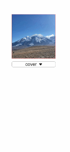
Example Code
<!-- xxx.hml -->
<div class="container">
  <image src="common/images/example.png" style="width: 300px; height: 300px; object-fit:{{fit}}; object-position: center center; border: 1px solid red; ">
  </image>
  <select class="selects" onchange="change_fit">
    <option for="{{fits}}" value="{{$item}}">{{$item}}</option>
  </select>
</div>
/* xxx.css */
.container {
  justify-content: center;
  align-items: center;
  flex-direction: column;


}
.selects{
  margin-top: 20px;
  width:300px;
  border:1px solid #808080;
  border-radius: 10px;
}
// xxx.js
export default {
  data: {
    fit:"cover",
    fits: ["cover", "contain", "fill", "none", "scale-down"],
  },
  change_fit(e) {
    this.fit = e.newValue;
  },
}