Rating
说明: 该组件从API Version 7开始支持。后续版本如有新增内容,则采用上角标单独标记该内容的起始版本。
评分条组件。
权限列表
无
子组件
无
接口说明
Rating(options?: { rating: number, indicator?: boolean })
- 参数
| 参数名 | 参数类型 | 必填 | 默认值 | 参数描述 |
|---|---|---|---|---|
| rating | number | 是 | 0 | 设置并接收评分值。 |
| indicator | boolean | 否 | false | 仅作为指示器使用,不可操作。 |
属性
| 名称 | 参数类型 | 默认值 | 描述 |
|---|---|---|---|
| stars | number | 5 | 设置评星总数。 |
| stepSize | number | 0.5 | 操作评级的步长。 |
| starStyle | { backgroundUri: string, foregroundUri: string, secondaryUri?: string } |
- | backgroundSrc:未选中的星级的图片链接,可由用户自定义或使用系统默认图片,仅支持本地。 foregroundSrc:选中的星级的图片路径,可由用户自定义或使用系统默认图片,仅支持本地。 secondarySrc:部分选中的星级的图片路径,可由用户自定义或使用系统默认图片,仅支持本地。 |
事件
| 名称 | 功能描述 |
|---|---|
| onChange(callback:(value: number) => void) | 操作评分条的评星发生改变时触发该回调。 |
示例
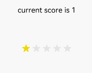
@Entry
@Component
struct RatingExample {
  @State rating: number = 1
  @State indicator: boolean = false

  build() {
    Flex({ direction: FlexDirection.Column, alignItems: ItemAlign.Center, justifyContent: FlexAlign.SpaceBetween }) {
      Text('current score is ' + this.rating).fontSize(20)
      Rating({ rating: this.rating, indicator: this.indicator })
        .stars(5)
        .stepSize(0.5)
        .onChange((value: number) => {
          this.rating = value
        })
    }.width(350).height(200).padding(35)
  }
}