chart
The <chart> component displays line charts, gauge charts, and bar charts.
Required Permissions
None
Child Component
Not supported
Attributes
In addition to the attributes in Universal Attributes, the following attributes are supported.
Chart type. Dynamic modification is not supported. Available values include: |
||||
Chart parameters. You must set parameters for bar charts and line charts. Parameter settings for gauge charts do not take effect. You can set the minimum value, maximum value, scale, and line width of the x-axis or y-axis, whether to display the x-axis and y-axis, and whether the line is smooth. Dynamic modification is not supported. |
||||
Array<ChartDataset> |
Data set. You must set data sets for bar charts and line charts. Data set for a gauge chart does not take effect. You can set multiple datasets and their background colors. |
|||
DataSegment | Array<DataSegment> |
Data structures used by progress, loading, and rainbow charts. DataSegment is available for progress and loading charts. Array<DataSegment> is available for rainbow charts. A maximum of nine DataSegment are supported in the array. |
|||
Whether to enable the effects for progress and rainbow charts. |
||||
Animation duration for expanding a rainbow chart, in milliseconds. |
Table 1 ChartOptions
Table 2 ChartDataset
Fill color. For line charts, the value indicates the gradient color to fill. |
||||
Array<number> | Array<Point>5+ |
||||
Table 3 ChartAxis
Table 4 ChartSeries
Line style, such as the line width and whether the line is smooth. |
||||
Table 5 ChartLineStyle
Table 6 PointStyle
Shape of the highlight point. Available values are as follows:
|
||||
Table 7 ChartLoop
Table 8 Point5+
Table 9 DataSegment5+
For gauge charts, the following attribute is supported.
Percentage of the current value to the total value. The value ranges from 0 to 100. |
Styles
In addition to the styles in Universal Styles, the following styles are supported.
Start angle of the scale bar for gauge and rainbow charts, which starts from the direction of zero o'clock. The value ranges from 0 to 360. |
||||
Total length of the scale bar for gauge and rainbow charts. The value ranges from –360 to 360. A negative number indicates the anticlockwise direction. |
||||
Center of the scale bar of the gauge component. This style is supported by the gauge chart only. This style takes precedence over the position style in the common styles, and must be used together with center-y and radius. This style is supported by the gauge chart only. |
||||
Center of the scale bar of the gauge component. This style is supported by the gauge chart only. This style takes precedence over the position style in the common styles, and must be used together with center-x and radius. This style is supported by the gauge chart only. |
||||
Radius of the scale bar of the gauge component. This style is supported by the gauge chart only. This style takes precedence over the width and height in the common styles, and must be used together with center-x and center-y. This style is supported by the gauge chart only. |
||||
Color of each section for the scale bar of the gauge component. For example, colors: #ff0000, #00ff00. This style is supported by the gauge chart only. |
||||
Weight of each section for the scale bar of the gauge component. For example, weights: 2, 2. This style is supported by the gauge chart only. |
||||
Font style of the description text. You can use Custom Font Styles. |
||||
Events
Events in Universal Events are supported.
Methods
In addition to the methods in Universal Methods, the following events are supported.
Example Code
-
Line chart
<!-- xxx.hml -->
<div class="container">
  <stack class="chart-region">
    <image class="chart-background" src="common/background.png"></image>
    <chart class="chart-data" type="line" ref="linechart" options="{{lineOps}}" datasets="{{lineData}}"></chart>
  </stack>
  <button value="Add data" onclick="addData"></button>
</div>
/* xxx.css */ .container { flex-direction: column; justify-content: center; align-items: center; } .chart-region { height: 400px; width: 700px; } .chart-background { object-fit: fill; } .chart-data { width: 700px; height: 600px; } button { width: 100%; height: 50px; background-color: #F4F2F1; text-color: #0C81F3; }// xxx.js export default { data: { lineData: [ { strokeColor: '#0081ff', fillColor: '#cce5ff', data: [763, 550, 551, 554, 731, 654, 525, 696, 595, 628, 791, 505, 613, 575, 475, 553, 491, 680, 657, 716], gradient: true, } ], lineOps: { xAxis: { min: 0, max: 20, display: false, }, yAxis: { min: 0, max: 1000, display: false, }, series: { lineStyle: { width: "5px", smooth: true, }, headPoint: { shape: "circle", size: 20, strokeWidth: 5, fillColor: '#ffffff', strokeColor: '#007aff', display: true, }, loop: { margin: 2, gradient: true, } } }, }, addData() { this.$refs.linechart.append({ serial: 0, data: [Math.floor(Math.random() * 400) + 400] }) } }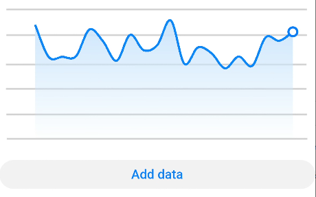
-
Bar chart
<!-- xxx.hml -->
<div class="container">
  <stack class="data-region">
    <image class="data-background" src="common/background.png"></image>
    <chart class="data-bar" type="bar" id="bar-chart" options="{{barOps}}" datasets="{{barData}}"></chart>
  </stack>
</div>
/* xxx.css */ .container { flex-direction: column; justify-content: center; align-items: center; } .data-region { height: 400px; width: 700px; } .data-background { object-fit: fill; } .data-bar { width: 700px; height: 400px; }// xxx.js export default { data: { barData: [ { fillColor: '#f07826', data: [763, 550, 551, 554, 731, 654, 525, 696, 595, 628], }, { fillColor: '#cce5ff', data: [535, 776, 615, 444, 694, 785, 677, 609, 562, 410], }, { fillColor: '#ff88bb', data: [673, 500, 574, 483, 702, 583, 437, 506, 693, 657], }, ], barOps: { xAxis: { min: 0, max: 20, display: false, axisTick: 10, }, yAxis: { min: 0, max: 1000, display: false, }, }, } }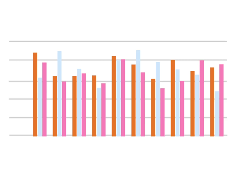
-
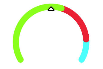
Gauge chart
<!-- xxx.hml -->
<div class="container">
  <div class="gauge-region">
    <chart class="data-gauge" type="gauge" percent = "50"></chart>
  </div>
</div>
/* xxx.css */ .container { flex-direction: column; justify-content: center; align-items: center; } .gauge-region { height: 400px; width: 400px; } .data-gauge { colors: #83f115, #fd3636, #3bf8ff; weights: 4, 2, 1; }