禁用控制
说明: 从API Version 7开始支持。后续版本如有新增内容,则采用上角标单独标记该内容的起始版本。
权限列表
无
属性
| 名称 | 参数类型 | 默认值 | 描述 |
|---|---|---|---|
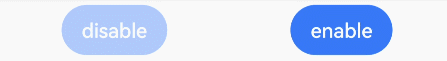
| enabled | boolean | true | 值为true表示组件可用,可响应点击等操作;值为false时,不响应点击等操作。 |
示例
@Entry
@Component
struct EnabledExample {
  build() {
    Flex({ justifyContent: FlexAlign.SpaceAround }) {
      // 点击没有反应
      Button('disable').enabled(false).backgroundColor(0x317aff).opacity(0.4)
      Button('enable').backgroundColor(0x317aff)
    }
    .width('100%')
    .padding({ top: 5 })
  }
}