Panel
NOTE
This component is supported since API version 7. Updates will be marked with a superscript to indicate their earliest API version.
The <Panel> component is a slidable panel that presents lightweight content with flexible sizes. It is a pop-up component.
Required Permissions
None
Child Components
This component can contain child components.
APIs
Panel(value:{show:boolean})
- Parameters
| Name | Type | Mandatory | Default Value | Description |
|---|---|---|---|---|
| show | boolean | Yes | - | Whether the panel is shown or hidden. |
Attributes
| Name | Type | Default Value | Description |
|---|---|---|---|
| type | PanelType | PanelType.Foldable | Type of the panel. |
| mode | PanelMode | - | Initial status of the panel. |
| dragBar | boolean | true | Whether to enable a drag bar. The value true means that the drag bar will be displayed, and false means the opposite. |
| fullHeight | Length | - | Panel height in the PanelMode.Full mode. |
| halfHeight | Length | - | Panel height in the PanelMode.Half mode. The default value is half of the screen height. |
| miniHeight | Length | - | Panel height in the PanelMode.Mini mode. |
- PanelType enums
| Name | Description |
|---|---|
| Minibar | A minibar panel displays content in the minibar area or a large (fullscreen-like) area. |
| Foldable | A foldable panel displays permanent content in a large (fullscreen-like), medium-sized (halfscreen-like), or small area. |
| Temporary | A temporary panel displays content in a large (fullscreen-like) or medium-sized (halfscreen-like) area. |
- PanelMode enums
| Name | Description |
|---|---|
| Mini | Displays a minibar or foldable panel in its minimum size. This attribute does not take effect for temporary panels. |
| Half | Displays a foldable or temporary panel in a medium-sized (halfscreen-like) area. This attribute does not take effect for minibar panels. |
| Full | Displays a panel in a large (fullscreen-like) area. |
Events
| Name | Description |
|---|---|
| onChange(callback: (width: number, height: number, mode: PanelMode) => void) | Triggered when the status of the panel changes. The returned height value is the height of the content area. When the value of dragbar is true, the height of the panel is the drag bar height plus the height of the content area. |
Example
@Entry
@Component
struct PanelExample {
@State show: boolean = false
build() {
Column() {
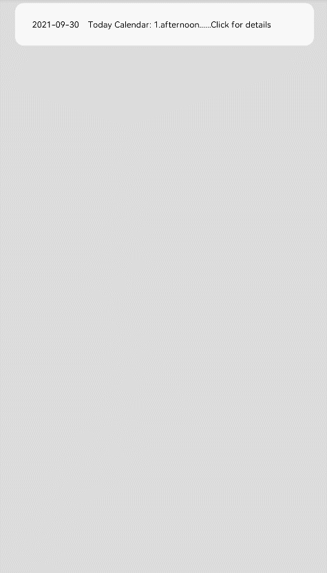
Text('2021-09-30 Today Calendar: 1.afternoon......Click for details')
.width('90%').height(50).borderRadius(10)
.backgroundColor(0xFFFFFF).padding({ left: 20 })
.onClick(() => {
this.show = !this.show
})
Panel(this.show) { // Display the agenda.
Column() {
Text('Today Calendar')
Divider()
Text('1. afternoon 4:00 The project meeting')
}
}
.type(PanelType.Foldable).mode(PanelMode.Half)
.dragBar(true) // The drag bar is enabled by default.
.halfHeight(500) // The default value is half of the screen height.
.onChange((width: number, height: number, mode: PanelMode) => {
console.info(`width:${width},height:${height},mode:${mode}`)
})
}.width('100%').height('100%').backgroundColor(0xDCDCDC).padding({ top: 5 })
}
}