Flex布局
说明:
从API Version 7开始支持。后续版本如有新增内容,则采用上角标单独标记该内容的起始版本。
仅当父组件是Flex组件时生效。
权限列表
无
属性
| 名称 | 参数说明 | 默认值 | 描述 |
|---|---|---|---|
| flexBasis | 'auto' | Length | 'auto' | 此属性所在的组件在Flex容器中主轴方向上基准尺寸。 |
| flexGrow | number | 0 | Flex容器的剩余空间分配给此属性所在组件的比例。 |
| flexShrink | number | 1 | Flex容器压缩尺寸分配给此属性所在组件的比例。 |
| alignSelf | ItemAlign | Auto | 覆盖Flex布局容器中alignItems默认配置。 |
示例
@Entry
@Component
struct FlexExample {
build() {
Column({ space: 5 }) {
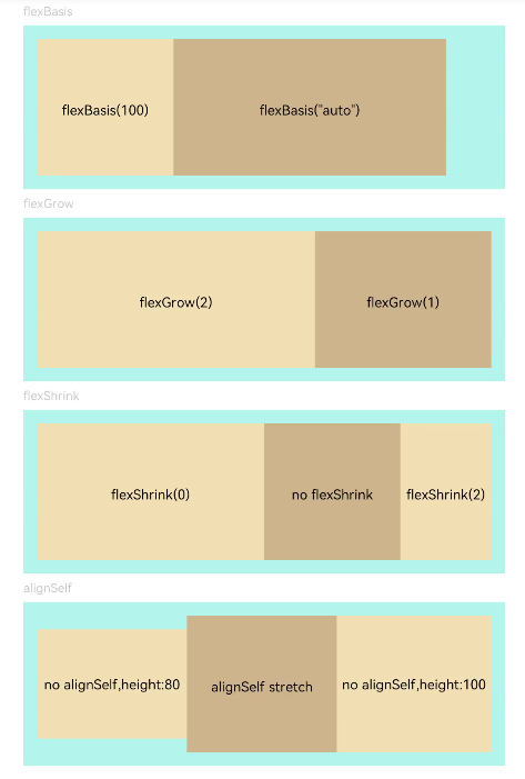
Text('flexBasis').fontSize(9).fontColor(0xCCCCCC).width('90%')
// 基于主轴基准尺寸
// flexBasis()值可以是'auto'(默认值)元素本来的大小 ,如果是数字则类似于.width()/.height() ,基于主轴
Flex() {
Text('flexBasis(100)')
.flexBasis('100').height(100).lineHeight(70)
.backgroundColor(0xF5DEB3).textAlign(TextAlign.Center)
Text('flexBasis("auto")')
.flexBasis('auto').width('60%').height(100).lineHeight(70)
.backgroundColor(0xD2B48C).textAlign(TextAlign.Center)
}.width('90%').height(120).padding(10).backgroundColor(0xAFEEEE)
Text('flexGrow').fontSize(9).fontColor(0xCCCCCC).width('90%')
// 剩余空间所占比例
// flexGrow()剩余空间分配给该元素的比例
Flex() {
Text('flexGrow(2)')
.flexGrow(2).height(100).lineHeight(70)
.backgroundColor(0xF5DEB3).textAlign(TextAlign.Center)
Text('flexGrow(1)')
.flexGrow(1).height(100).lineHeight(70)
.backgroundColor(0xD2B48C).textAlign(TextAlign.Center)
}.width('90%').height(120).padding(10).backgroundColor(0xAFEEEE)
Text('flexShrink').fontSize(9).fontColor(0xCCCCCC).width('90%')
// flexShrink()此属性所在的组件的比例
// text1比例是0,其他都是默认值1,放不下时直接等比例缩放后两个,第一个不缩放
Flex({ direction: FlexDirection.Row }) {
Text('flexShrink(0)')
.flexShrink(0).width('50%').height(100).lineHeight(70)
.backgroundColor(0xF5DEB3).textAlign(TextAlign.Center)
Text('no flexShrink')
.width('40%').height(100).lineHeight(70).backgroundColor(0xD2B48C).textAlign(TextAlign.Center)
Text('flexShrink(2)')
.flexShrink(2).width('40%').height(100) .lineHeight(70)
.backgroundColor(0xF5DEB3).textAlign(TextAlign.Center)
}.width('90%').height(120).padding(10).backgroundColor(0xAFEEEE)
Text('alignSelf').fontSize(9).fontColor(0xCCCCCC).width('90%')
// alignSelf()覆盖Flex布局容器中alignItems默认配置
Flex({ direction: FlexDirection.Row, alignItems: ItemAlign.Center }) {
Text('no alignSelf,height:80').width('33%').height(80)
.backgroundColor(0xF5DEB3).textAlign(TextAlign.Center)
Text('alignSelf stretch')
.alignSelf(ItemAlign.Stretch).width('33%').height(80).lineHeight(70)
.backgroundColor(0xD2B48C).textAlign(TextAlign.Center)
Text('no alignSelf,height:100').width('34%').height(100)
.backgroundColor(0xF5DEB3).textAlign(TextAlign.Center)
}.width('90%').height(120).padding(10).backgroundColor(0xAFEEEE)
}.width('100%').margin({ top: 5 })
}
}