Circle
NOTE This component is supported since API version 7. Updates will be marked with a superscript to indicate their earliest API version.
The <Circle> component is used to draw a circle.
Required Permissions
None
Child Components
None
APIs
Circle(options?: {width: Length, height: Length})
- Parameters
| Name | Type | Mandatory | Default Value | Description |
|---|---|---|---|---|
| options | Object | No | - | For details, see the options parameters. |
- options parameters
| Name | Type | Mandatory | Default Value | Description |
|---|---|---|---|---|
| width | Length | Yes | - | Width. |
| height | Length | Yes | - | Height. |
Attributes
| Name | Type | Default Value | Mandatory | Description |
|---|---|---|---|---|
| width | Length | 0 | No | Width of the rectangle where the circle is located. |
| height | Length | 0 | No | Height of the rectangle where the circle is located. |
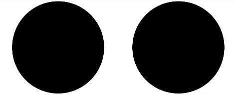
Example
@Entry
@Component
struct CircleExample {
  build() {
    Flex({ justifyContent: FlexAlign.SpaceAround }) {
      // Draw a circle whose diameter is 150.
      Circle({ width: 150, height: 150 })
      // Draw a circle whose diameter is 150.
      Circle().width(150).height(150)
    }.width('100%').margin({ top: 5 })
  }
}