select
The <select> component provides a drop-down list that allows users to select among multiple options.
Required Permissions
None
Child Component
The <option> child component is supported.
Attributes
Attributes in Universal Attributes are supported.
Styles
In addition to the styles in Universal Styles, the following styles are supported.
Font family, in which fonts are separated by commas (,). Each font is set using a font name or font family name. The first font that exists in the system or the font specified by Custom Font Styles in the family is selected as the font for the text. |
Events
In addition to the events in Universal Events, the following events are supported.
Triggered after a value is selected from the drop-down list. The value of newValue is the attribute value of the child component option. |
NOTE:
- The <select> component does not support the click event.
Method
Methods in Universal Methods are supported.
Example Code
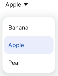
<!-- xxx.hml -->
<div class="container">
  <select @change="changeFruit">
    <option value="bananaValue">
      Banana
    </option>
    <option value="appleValue" selected="true">
      Apple
    </option>
    <option value="pearValue">
      Pear
    </option>
  </select>
</div>
/* xxx.css */
.container {
  display: flex;
  justify-content: center;
  align-items: center;
}