div
The <div> component is a basic container that is used as the root node of the page structure or is used to group the content.
Required Permissions
None
Child Components
Supported
Attributes
Attributes in Universal Attributes are supported.
Styles
In addition to the styles in Universal Styles, the following styles are supported.
Events
In addition to the events in Universal Events, the following events are supported.
Methods
In addition to the methods in Universal Methods, the following events are supported.
Table 1 ScrollOffset6+
Table 2 ScrollParam6+
Offset for scrolling the list in the horizontal direction, in px. |
||
Offset for scrolling the list in the vertical direction, in px. |
||
Example
-
Flex style
<!-- xxx.hml -->
<div class="container">
  <div class="flex-box">
    <div class="flex-item color-primary"></div>
    <div class="flex-item color-warning"></div>
    <div class="flex-item color-success"></div>
  </div>
</div>
/* xxx.css */ .container { flex-direction: column; justify-content: center; align-items: center; width: 454px; height: 454px; } .flex-box { justify-content: space-around; align-items: center; width: 400px; height: 140px; background-color: #ffffff; } .flex-item { width: 120px; height: 120px; border-radius: 16px; } .color-primary { background-color: #007dff; } .color-warning { background-color: #ff7500; } .color-success { background-color: #41ba41; }
-
Flex wrap style
<!-- xxx.hml -->
<div class="container">
  <div class="flex-box">
    <div class="flex-item color-primary"></div>
    <div class="flex-item color-warning"></div>
    <div class="flex-item color-success"></div>
  </div>
</div>
/* xxx.css */ .container { flex-direction: column; justify-content: center; align-items: center; width: 454px; height: 454px; } .flex-box { justify-content: space-around; align-items: center; flex-wrap: wrap; width: 300px; height: 250px; background-color: #ffffff; } .flex-item { width: 120px; height: 120px; border-radius: 16px; } .color-primary { background-color: #007dff; } .color-warning { background-color: #ff7500; } .color-success { background-color: #41ba41; }
-
Grid style
<!-- xxx.hml -->
<div class="common grid-parent">
  <div class="grid-child grid-left-top"></div>
  <div class="grid-child grid-left-bottom"></div>
  <div class="grid-child grid-right-top"></div>
  <div class="grid-child grid-right-bottom"></div>
</div>
/* xxx.css */ .common { width: 400px; height: 400px; background-color: #ffffff; align-items: center; justify-content: center; margin: 24px; } .grid-parent { display: grid; grid-template-columns: 35% 35%; grid-columns-gap: 24px; grid-rows-gap: 24px; grid-template-rows: 35% 35%; } .grid-child { width: 100%; height: 100%; border-radius: 8px; } .grid-left-top { grid-row-start: 0; grid-column-start: 0; grid-row-end: 0; grid-column-end: 0; background-color: #3f56ea; } .grid-left-bottom { grid-row-start: 1; grid-column-start: 0; grid-row-end: 1; grid-column-end: 0; background-color: #00aaee; } .grid-right-top { grid-row-start: 0; grid-column-start: 1; grid-row-end: 0; grid-column-end: 1; background-color: #00bfc9; } .grid-right-bottom { grid-row-start: 1; grid-column-start: 1; grid-row-end: 1; grid-column-end: 1; background-color: #47cc47; }
-
Dragging7+
<!-- xxx.hml -->
<div class="container">
  <div class="content" ondragstart="dragstart" ondrag="drag" ondragend="dragend" style="position: absolute;left: {{left}};top:{{top}};">
  </div>
</div>
/* xxx.css */ .container { flex-direction: column; } .content{ width: 200px; height: 200px; background-color: red; }// xxx.js import prompt from '@system.prompt'; export default { data:{ left:0, top:0, }, dragstart(e){ prompt.showToast({ message: 'Start to be dragged' }) }, drag(e){ this.left = e.globalX; this.top = e.globalY; }, dragend(e){ prompt.showToast({ message: 'End Drag' }) }, }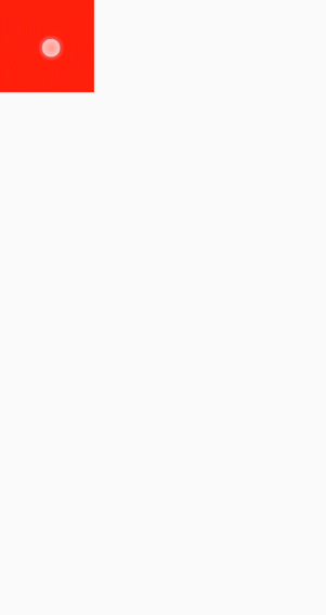
<!-- xxx.hml -->
<div class="container">
  <div class="content" ondrag="drag" style="position: absolute;left: {{left}};top: {{top}};"></div>
  <div style="width: 500px; height: 500px; background-color: yellow; position: fixed; left: 15%; top: 30%; opacity:0.3"
    ondragenter="dragenter" ondragover="dragover" ondragleave="dragleave" ondrop="drop">
  </div>
</div>
/* xxx.css */ .container { flex-direction: column; width: 100%; position: relative; max-width: 100%; } .content{ width: 200px; height: 200px; background-color: red; position: absolute; }// xxx.js import prompt from '@system.prompt'; export default { data:{ left:0, top:0, }, drag(e){ this.left = e.globalX; this.top = e.globalY; }, dragenter(e){ prompt.showToast({ message: 'enter' }) }, dragover(e){ prompt.showToast({ message: 'over' }) }, dragleave(e){ prompt.showToast({ message: 'leave' }) }, drop(e){ prompt.showToast({ message: 'drop' }) } }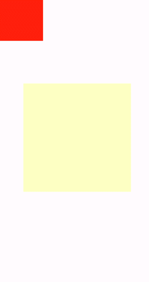
-
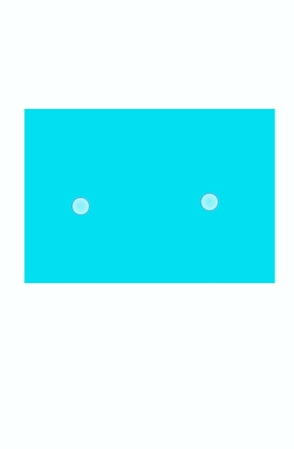
Pinching7+
<!-- xxx.hml -->
<div class="container">
  <div class="content "onpinchstart="pinchstart" onpinchend="pinchend" onpinchupdate="pinchupdate"
    onpinchcancel=" pinchcancel">
  </div>
</div>
/* xxx.css */ .container { flex-direction: column; justify-content: center; align-items: center; width: 454px; height: 454px;} .content{ width: 400px; height: 400px; background-color: aqua; margin:30px }// xxx.js import prompt from '@system.prompt'; export default { pinchstart(e){ prompt.showToast({ message: 'pinchstart!!!' }) }, pinchupdate(e){ prompt.showToast({ message: 'Two-finger pinch update' }) }, pinchend(e){ prompt.showToast({ message: 'Finished with two fingers pinching' }) }, pinchcancel(e){ prompt.showToast({ message: 'Finger pinching is interrupted' }) } }