颜色渐变
说明: 从API Version 7开始支持。后续版本如有新增内容,则采用上角标单独标记该内容的起始版本。
权限列表
无
属性
| 名称 | 参数类型 | 默认值 | 描述 |
|---|---|---|---|
| linearGradient | { angle?: Angle, direction?: GradientDirection, colors: Array<ColorStop> repeating?: boolean } |
- | 线性渐变。 angle: 线性渐变的角度。 direction: 线性渐变的方向。 colors: 为渐变的颜色描述。 repeating: 为渐变的颜色重复着色。 |
| sweepGradient | { center: Point, start?: angle, end?: angle, colors: Array<ColorStop> repeating?: boolean } |
- | 角度渐变。 center:为角度渐变的中心点。 start:角度渐变的起点。 end:角度渐变的终点。 colors: 为渐变的颜色描述。 repeating: 为渐变的颜色重复着色。 |
| radialGradient | { center: Point, radius: Length, colors: Array<ColorStop> repeating: boolean } |
- | 径向渐变。 center:径向渐变的中心点。 radius:径向渐变的半径。 colors: 为渐变的颜色描述。 repeating: 为渐变的颜色重复着色。 |
- GradientDirection枚举说明
GradientDirection用于描述渐变方向。
| 名称 | 描述 |
|---|---|
| Left | 从右向左。 |
| Top | 从下向上。 |
| Right | 从左向右。 |
| Bottom | 从上向下。 |
| LeftTop | 左上。 |
| LeftBottom | 左下。 |
| RightTop | 右上。 |
| RightBottom | 右下。 |
| None | 无。 |
示例
@Entry
@Component
struct ColorGradientExample {
build() {
Column({ space: 5 }) {
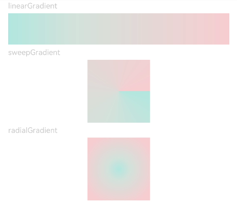
Text('linearGradient').fontSize(12).width('90%').fontColor(0xCCCCCC)
Row()
.width('90%')
.height(50)
.linearGradient({
angle: 90,
direction: GradientDirection.Left,
colors: [[0xAEE1E1, 0.0], [0xD3E0DC, 0.3], [0xFCD1D1, 1.0]]
})
Text('sweepGradient').fontSize(12).width('90%').fontColor(0xCCCCCC)
Row()
.width(100)
.height(100)
.sweepGradient({
center: [50, 50],
start: 0,
end: 359,
colors: [[0xAEE1E1, 0.0], [0xD3E0DC, 0.3], [0xFCD1D1, 1.0]]
})
Text('radialGradient').fontSize(12).width('90%').fontColor(0xCCCCCC)
Row()
.width(100)
.height(100)
.radialGradient({
center: [50, 50],
radius: 60,
colors:[[0xAEE1E1, 0.0], [0xD3E0DC, 0.3], [0xFCD1D1, 1.0]]
})
}
.width('100%')
.padding({ top: 5 })
}
}